Predicting the top design trends of November ‘21 that will definitely anticipate the top design trends of ‘22

Ah, the future. Who knows what it holds? That uncertainty might seem like a monster under the bed situation lately, especially with the world being….the way it is. But here’s our chance to see it as something else. A new frontier, unexplored and un-shitty. A spotless horizon that we haven’t even had a chance to screw up yet.
Let’s take a much-needed break from wondering if the big blue marble will keep on spinning and instead try to think of the promise of a new year — like what’s going to be cool? And for the answer, we’re tapping our authority on the subject: our graphic design team, all blessed with that Adobe-powered third eye that makes them aware of everything cool before the rest of us have a chance to catch up.
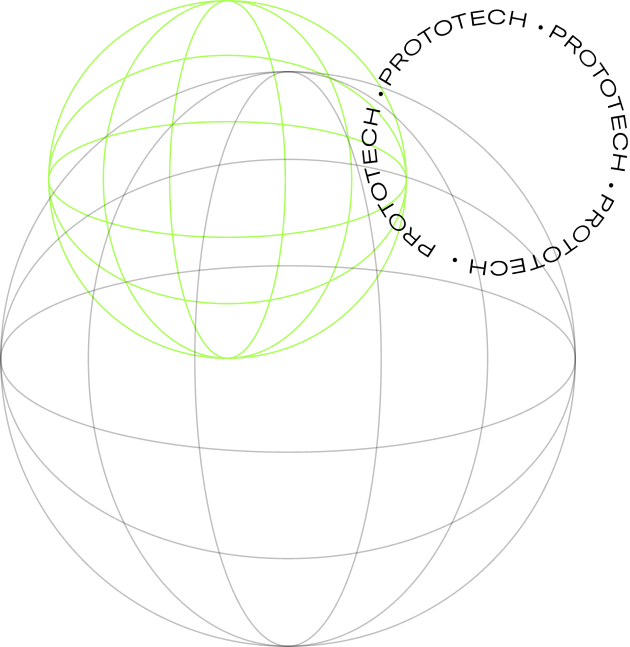
TREND 1: PROTOTECH
Welcome to the cool kids table of graphic design. This is street style in a minimalist, techy mood and best done by people who listen to Radiohead like they discovered them.
(And yes, I do like Radiohead.)
40.71288895919349,
-74.01337552910215


At the risk of telling you again how intense this last year (or like, five) has been like you haven’t lived every second, this is all we’ll say: a good old-fashioned dose of unironic cheer is just what the doctor ordered. After all, who wouldn’t order a little word cotton candy to soften the blow between them and the world right now?
P.S. You’re great!


TREND 7: GRADIENTS 4EVER
Honestly, at this point you’re kinda lying if you act like you don’t love a gradient. So let’s embrace the trend that’s never going to die for one very real reason: they look too cool.
Is there anything better than a design that makes you feel like you’re actually having a good trip for once in your life while you stare at your computer screen? Didn’t think so.


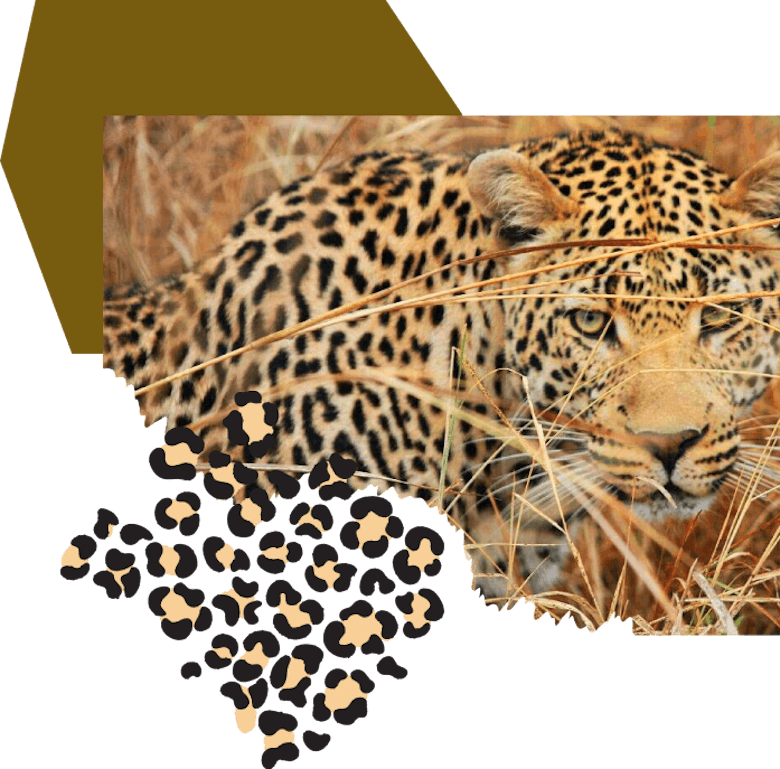
This is cottage-core at its best — there’s a very good reason your grandpa was always trying to get you to use that embroidered hankie from his pocket, and it’s because the classics will never not be cool.


If time at home has made us realize anything, it's that we love TV. Like, base your personality around it level love it. And our next design trend is borrowed from the intros of our favorite tv shows — tons of minimalist motion with geometric symbols we all want to get tattooed on ourselves. Squid Game, anyone? (No spoilers but if you haven’t watched it yet that’s officially a you-problem.) This gets everyone’s attention, kind of makes you look like you’re from the Matrix and is basically just shapes. But like, cool.
Trend 10: Color codes in lieu of actual color
Color codes in lieu of actual color is the new minimalism, because why see a color when you can read it as a piece of data like a very cool robot? Let’s be real: it’s kinda sick that these mean something and aren’t just typos from designers falling asleep on their desks after yet another all-nighter.

In other words, the future looks vague, crocheted, animalistic and optimistic. That’s all true, we promise you!
COPYWRITER
LEAH KEITER
ART DIRECTOR
KEGGEN GRIFFITH