DuJour
Links
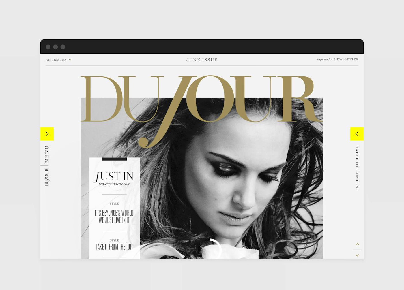
Dujour.comIn 2012, Jason Binn (formerly of Niche Media) endeavored to create the ultimate luxury lifestyle magazine for affluent tastemakers. His goal: establish DuJour as a cultural force by combining print magazine design quality with an adaptive, cross-platform publishing model.
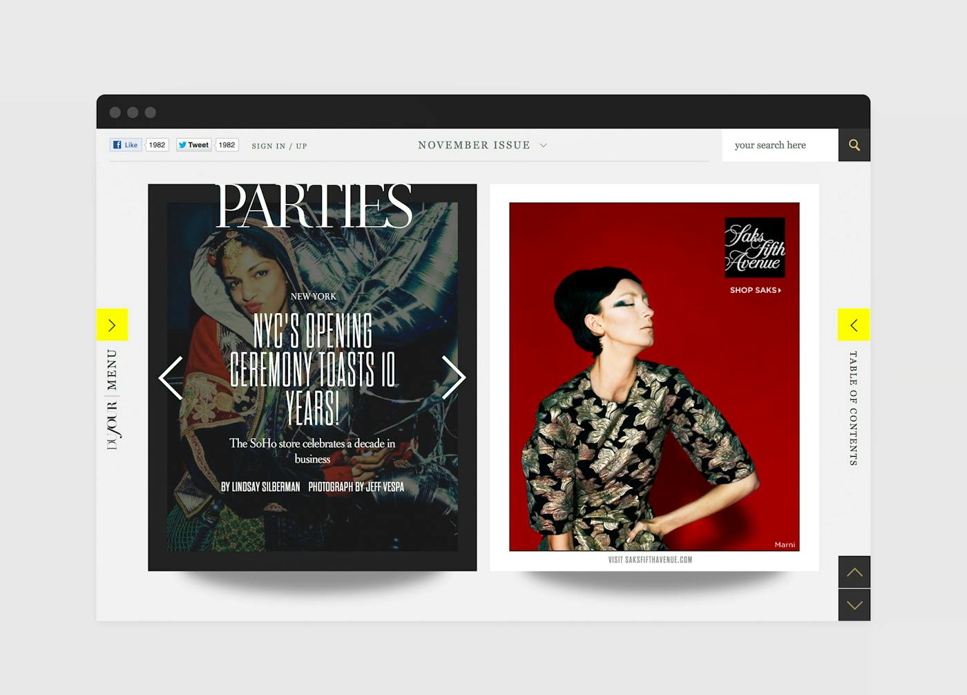
To accomplish this feat, Binn tasked Code and Theory with developing a digital experience that could function flawlessly on desktops and tablets alike, integrating ongoing editorial updates along with the full run of all current print issues. There was only one problem: the print magazine did not yet exist.
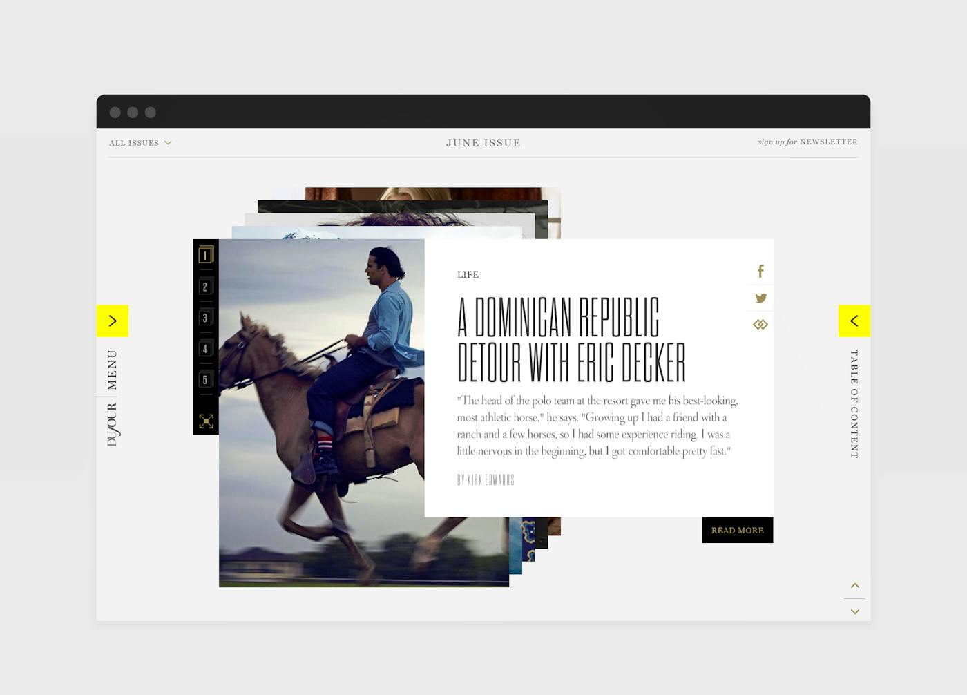
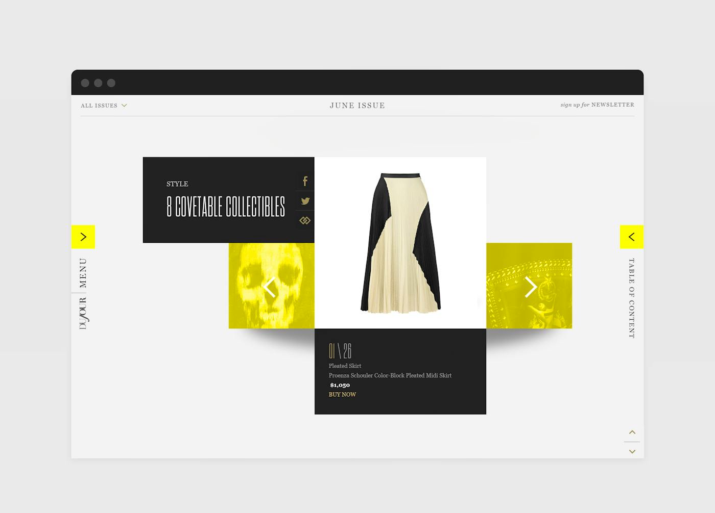
Rather than creating separate experiences for each environment and viewport, Code and Theory developed a single-view site that could comfortably house print editorial, digital-only content, and advertising– with an emphasis on the stunning visual assets DuJour was capturing. Encouraging discovery was a critical goal, and by leveraging the natural user behavior of scrolling instead of clicking, Code and Theory designed an infinite scroll format that allowed for undisrupted exploration. Users could browse through photo stories, deep dive into editorial or simply view the featured stories one after another. And to encourage sharing, each individual piece of content was shareable to social media at both the article and asset level.
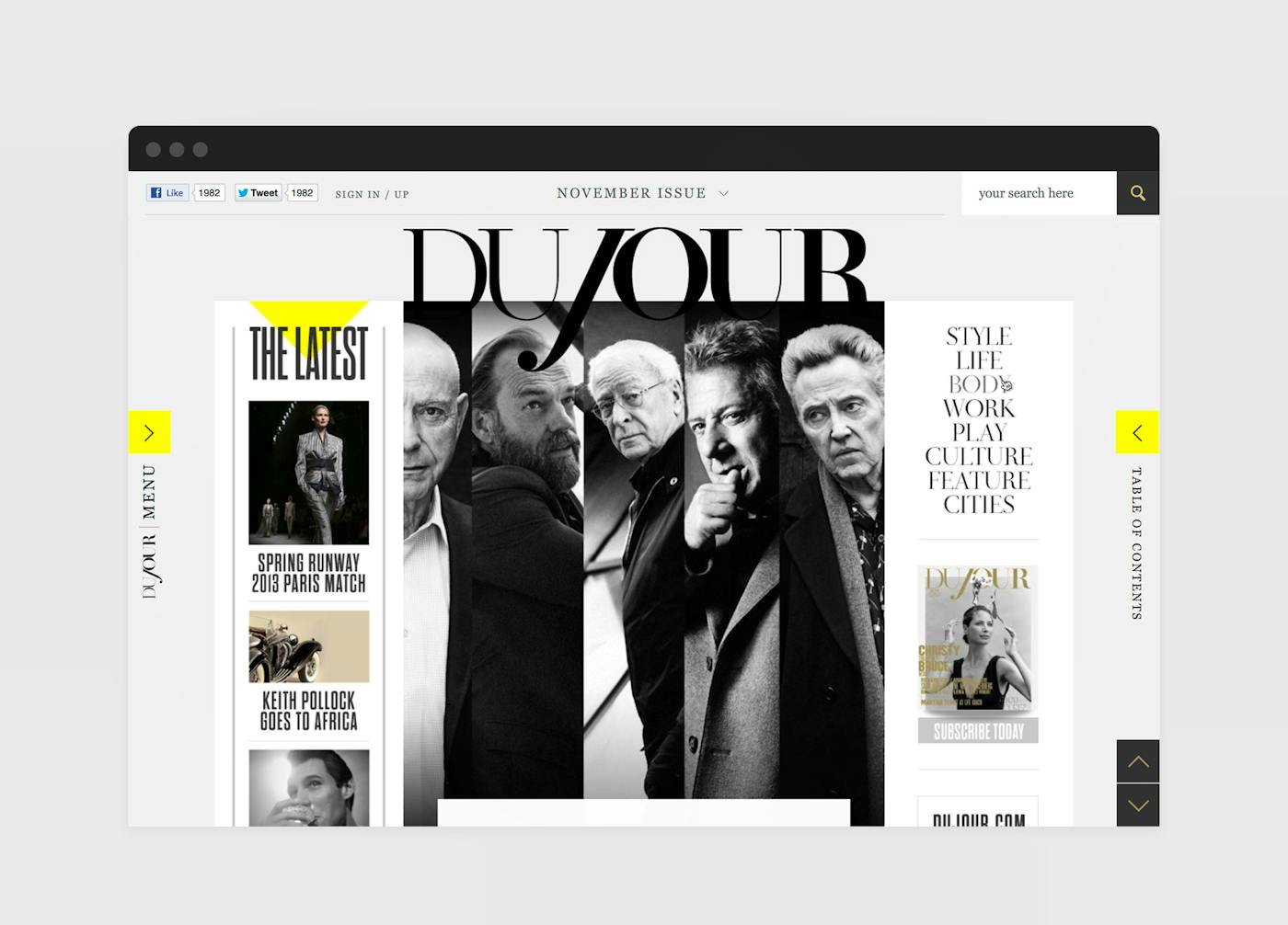
From a content strategy perspective, a major challenge was ensuring the site content remained fresh, giving users a reason to return often. Print magazine content would be augmented with online editorial both on a local and national level, leveraging analytics and geo-targeting to ensure that users got specific and relevant content. By eliminating verticals, simplifying the navigation and putting visual content at the forefront of the experience, we saw the time on site skyrocket compared to most digital publications, with users consuming article after article, spending nearly 7 minutes on the site per visit.

