Hearst Magazines
Historically, large publishing companies have had to design individual websites for each of their constituent publications. At the time, it seemed that bespoke websites were the only way to faithfully reflect each magazine’s distinct identity in digital. However, this method came with serious limitations. Namely, this decentralized model meant that pages, animations, content, ad opportunities, and galleries could not be extended and shared throughout multiple properties. Each site had its own isolated visual and editorial toolkit, meaning large editorial staff were needed to keep up with online audiences’ voracious appetite for fresh content.

1
The Business Problem
At a time of extreme change within the category, Hearst brought on Troy Young to lead the re-imagination of what their digital magazine business would become. At the center of this vision: an efficient network of sites under a single digital architecture, powered by a single CMS. At Code and Theory, we shared Young’s enthusiasm for this model. Hearst boasts some of America’s finest magazines, an exceptional and diverse range of content, vast reach, and a massive global distribution mechanism. We were energized by the opportunity to match the company’s digital experience to its physical publications.
If Hearst could build a powerful, synchronous, modular platform that united UX and editorial workflow across sites, the company could focus on creating compelling content and engaging users rather than driving forward an endless series of site redesigns and adjustments.

How can a single platform fulfill the needs of a wide range of magazines with varying degrees of content volume, editorial velocity, advertising requirements and consistency?
2
The Insight
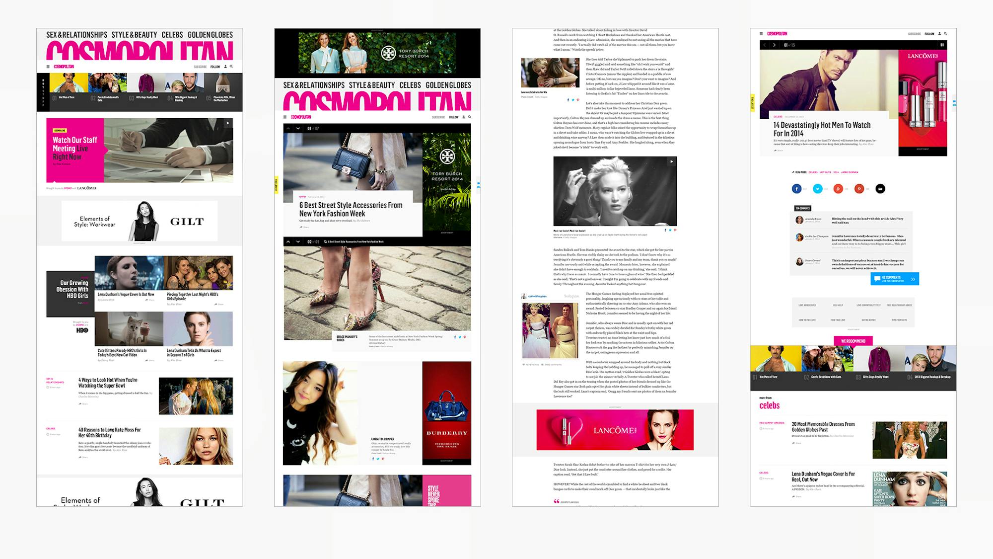
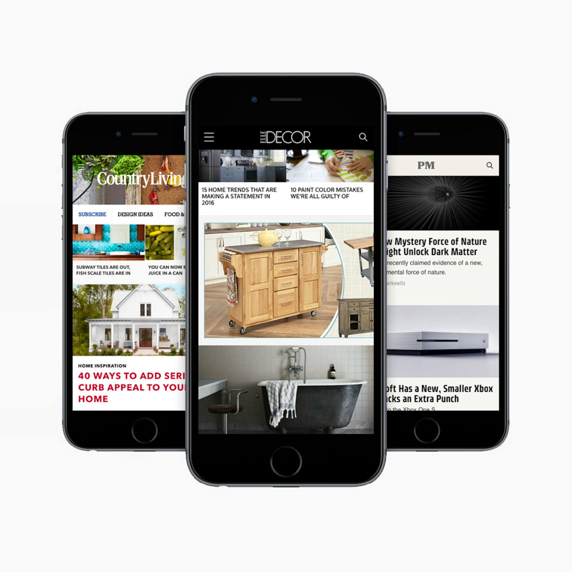
In order to understand what this new digital system would have to accomplish, our analysts and strategists set about exploring Hearst’s roster of publications. We grouped each title into one of three categories, or tiers. At the top tier were marquee publications like Cosmopolitan, Esquire, and Elle, with high content velocity and active, expansive readerships. In the middle were utility-based publications like Car and Driver and Good Housekeeping, which attracted readers with intent to do research. And at the lower tier were the slower, more specialized lifestyle publications such as Elle Decor, Veranda, and Southern Living.
After determining a general hierarchy of needs for all of these magazines in digital, the system would have to scale up for the marquee publications that churn out a high volume of content, while still offering a rich and flexible digital language for more focused publications with lower content volume.

3
The Solution
From Months to Moments
It used to take months for Hearst to get new sites up and running. Our new digital system, however, is designed for speed and efficiency. Now, new magazine sites can be pushed online in a matter of days.
Finite but Connected
Because the system was built as a unified, single system, Hearst can optimize modules across properties instantly. For example, if a gallery module worked well for Elle Decor, Cosmopolitan can adapt it easily for their identity.
True to Identity
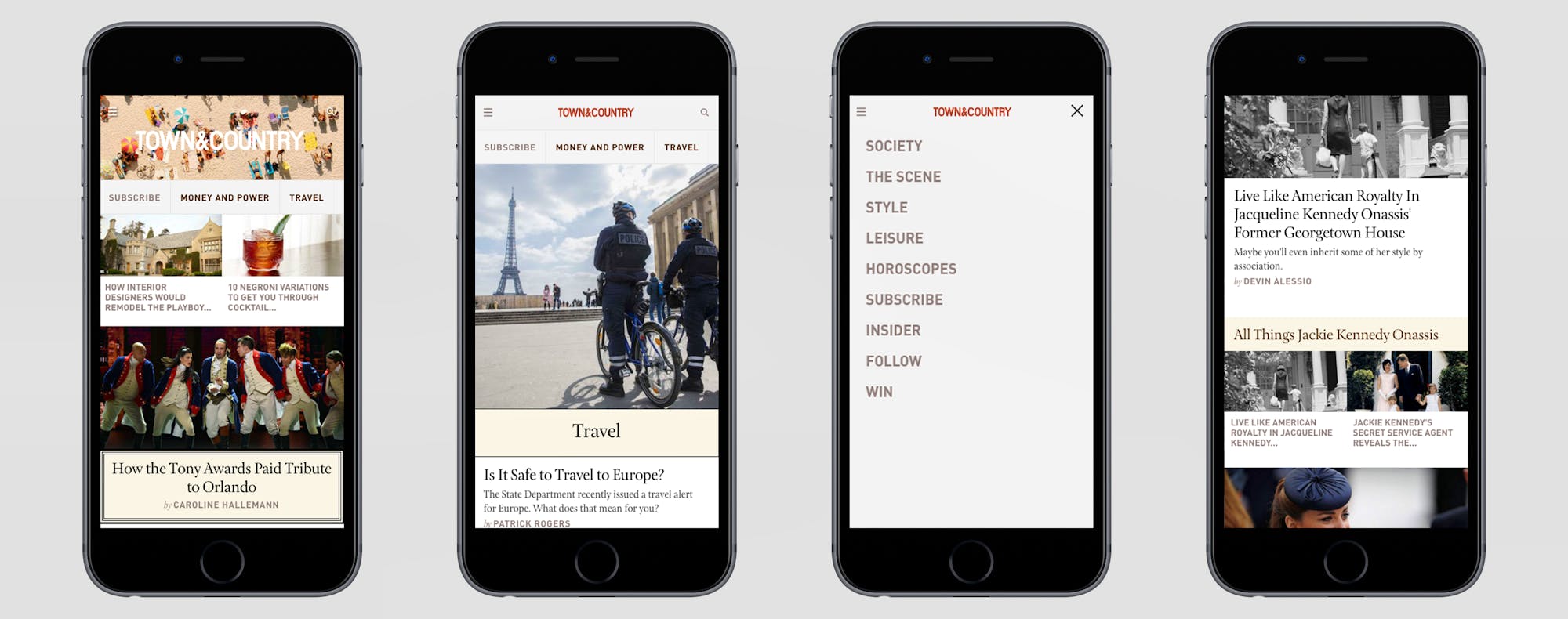
We were extremely careful to honor the brand identity of each publication. The system is standardized in terms of structures and strategies, but from a brand perspective, each site feels differentiated and unique.

Unified Ad Strategy
Since our digital system was standardized around these three tiers, an ad innovation that happens on one property can be easily and seamlessly extended across the others. From a business strategy perspective, this brought huge efficiencies to Hearst. By centralizing all ad offerings on the same ad map, the company could sell ad inventory across publications. While lots of publishers sell ads across properties, it’s much easier having everyone on the same system. The benefit for advertisers is also significant: because the system is entirely unified, they can create one custom ad architecture and know that it would work across the entire network.
In the future, Hearst will be able to be more targeted and programmatic across the platform, regardless of publication.

Bringing Efficiencies to Content
With this efficient, high-velocity content system, Hearst doesn’t have to sacrifice quality of content for speed, flexibility and personalization. Not to mention there are huge benefits to quality in relying on a single editorial library. Hearst can now be far more programmatic with its content presentation, combining and connecting interrelated content from across properties for a more immersive, multidimensional experience.
Data Is Power
The network’s unity makes it easier than ever for Hearst’s magazines to collect data on its readers across properties—meaning more personalization, and more sophisticated content strategies. Additionally, if analytics indicate the need for an optimization on one property, all magazines now have the opportunity to benefit.

4
The Results
This was the first time we tackled a challenge this systematic and extensive, and it set the bar for what was to come with future engagements like Bloomberg and The Huffington Post. The system gave Hearst the ability to optimize sites, spinoff new sites, create immersive storytelling experiences, utilize data, unify workflows, and extend ad opportunities. We like to think that this has fueled the publisher’s ambitions for a more integrated, efficient future of digital publishing.
In the long-term, we expect to see Hearst take advantage of the highly personalized and targeted content offerings that the system encourages, as well as its category-leading monetization opportunities.
