San Francisco Travel Association
Links
sftravel.comWhen the San Francisco Travel Association approached Code and Theory to design its new website, we knew we had to create a product worthy of one of the most beautiful places on earth.
The Travel Association brings together visitors and partner businesses. Our task was to create a dynamic, easy-to-use tool that would maximize the traveler's experience and give each partner—from PIER 39, to SFO International Airport, to the Monterey Bay Aquarium to Alcatraz—a beautiful showcase to educate and entice visitors to learn more.
The result is an interactive website that inspires, connects and delivers.
1
A Complete Makeover
The new sanfrancisco.travel was completely made-over from the inside out.
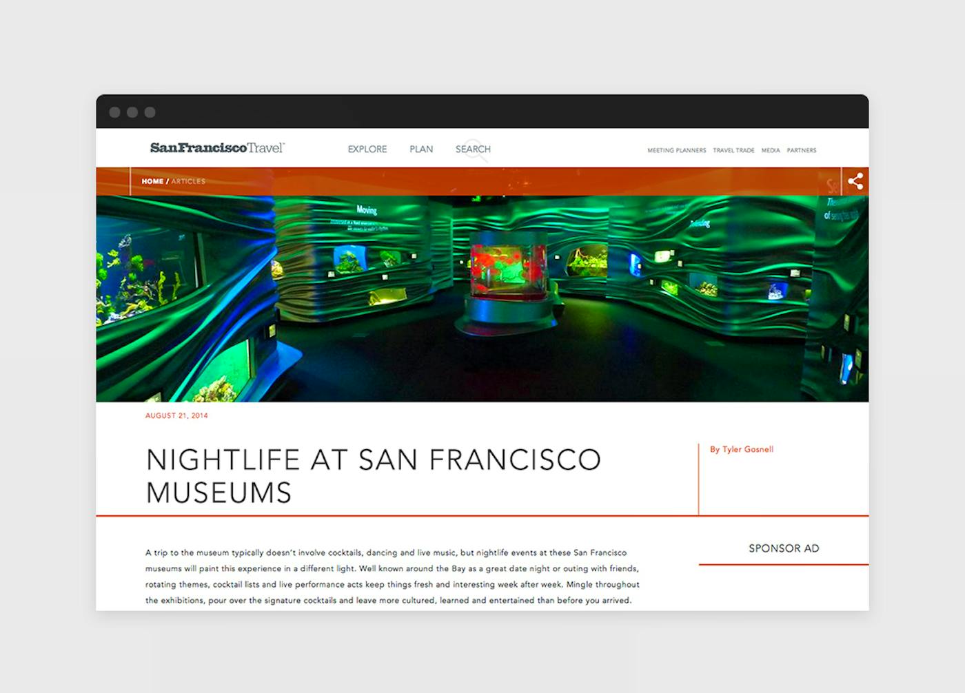
To meet our goal of simplifying and streamlining the user experience, we repackaged existing content and collapsed the navigation into just three categories—explore, plan and search. The idea was to turn the website into a travel-planning tool that could be used for individuals, group meetings and trade travel.
Some of the website’s most notable features are:
> A visual map function, which gives users greater contextual relevance as they plan their trip, and later as they enjoy San Francisco.
> A more intuitive navigation, which is intended to guide the user from one step in the travel planning process to the next. From initial research, to deciding where to stay, to choosing where to dine and where to go, we sought to inspire the consumer to discover new content throughout the platform.
> A responsive design system. Travelers today may start their travel research on a desktop, book a hotel through a tablet, and later rely on their mobile device to navigate around the city. The new sftravel.com offers the same user experience across all devices.
2
A Focus on Content
A key design challenge was how the San Francisco Travel Association would curate and organize content from its 1,500+ partners—the member businesses that pay to promote their products and services.
With the new design, which features a standardized aesthetic and clearer guidelines about articles and visuals, partners can enjoy greater visibility throughout the website. Partner editorial content and advertising are integrated into the website in a way that is not intrusive and can support the trip-planning function.
In keeping with what travelers want, the website traded long lists for interactive tools, incorporated Trip Advisor reviews, and now allows travelers to make hotel or trip reservations right on the site.
The new site is concise, relevant and responsive to the traveler's needs at every stage of planning, booking and execution.


