InStyle.com
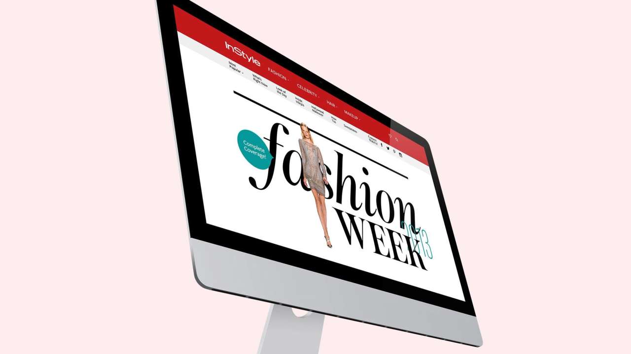
- ClientInStyle
- IndustryFashion & Beauty · Media & Publishing
- ServicesCustomer Experience
- CapabilitiesContent strategy
A new approach to online style coverage
When Code and Theory was tasked to build a new responsive InStyle.com, our challenge was to figure out the best way to showcase its up-to-the-minute content.
It had to be an elegant, flexible platform that would introduce readers to InStyle’s breadth of content.
Key Takeaways
Enhance engagement with productized content.
Implement responsive, seamless UX.
Elevate brand through visual storytelling.
Productize the Content Experience
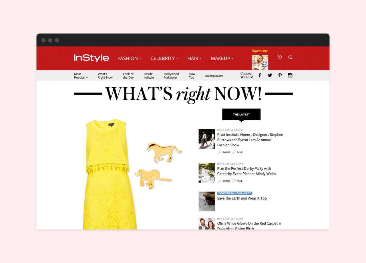
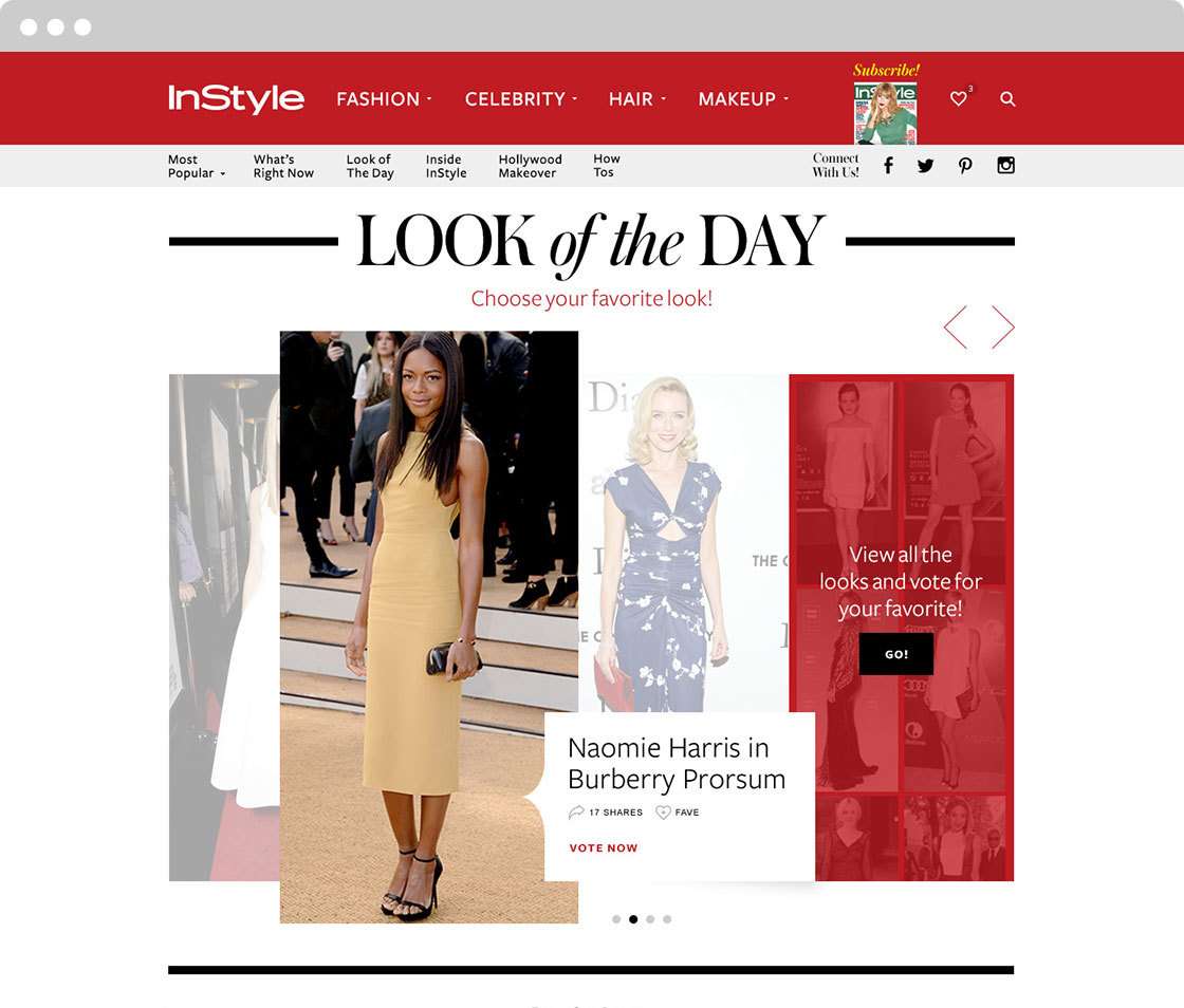
What’s Right Now is the beat and pulse of InStyle.com. It’s an up-to-the-minute stream of everything going on in the InStyle reader’s world, from fashion trends to celeb must-reads. In the same vein, Look of the Day features the editorial team’s daily picks for the hottest celeb looks and trends, and is one of the site’s top-performing sections. To maximize the value of both sections, we worked closely with the InStyle team to essentially turn these two columns into “productized” content experiences. By thinking of these content sections as “products,” it opened up a whole new world of possibilities to deliver even more value to the InStyle reader. At its core, the content productization approach does two things: It gives the user digestible, branded content features that they can come back to ritualistically, which will deliver the same type of content every time. And, it allows InStyle editors to see what posts are getting engagement, and then re-use and recirculate those pieces of content where most applicable. For instance, a handful of popular Look of the Day photos from April could easily be re-surfaced and bundled into a larger “Spring Trends” editorial content feature.
Streamlined Archival Content Browsing Experience
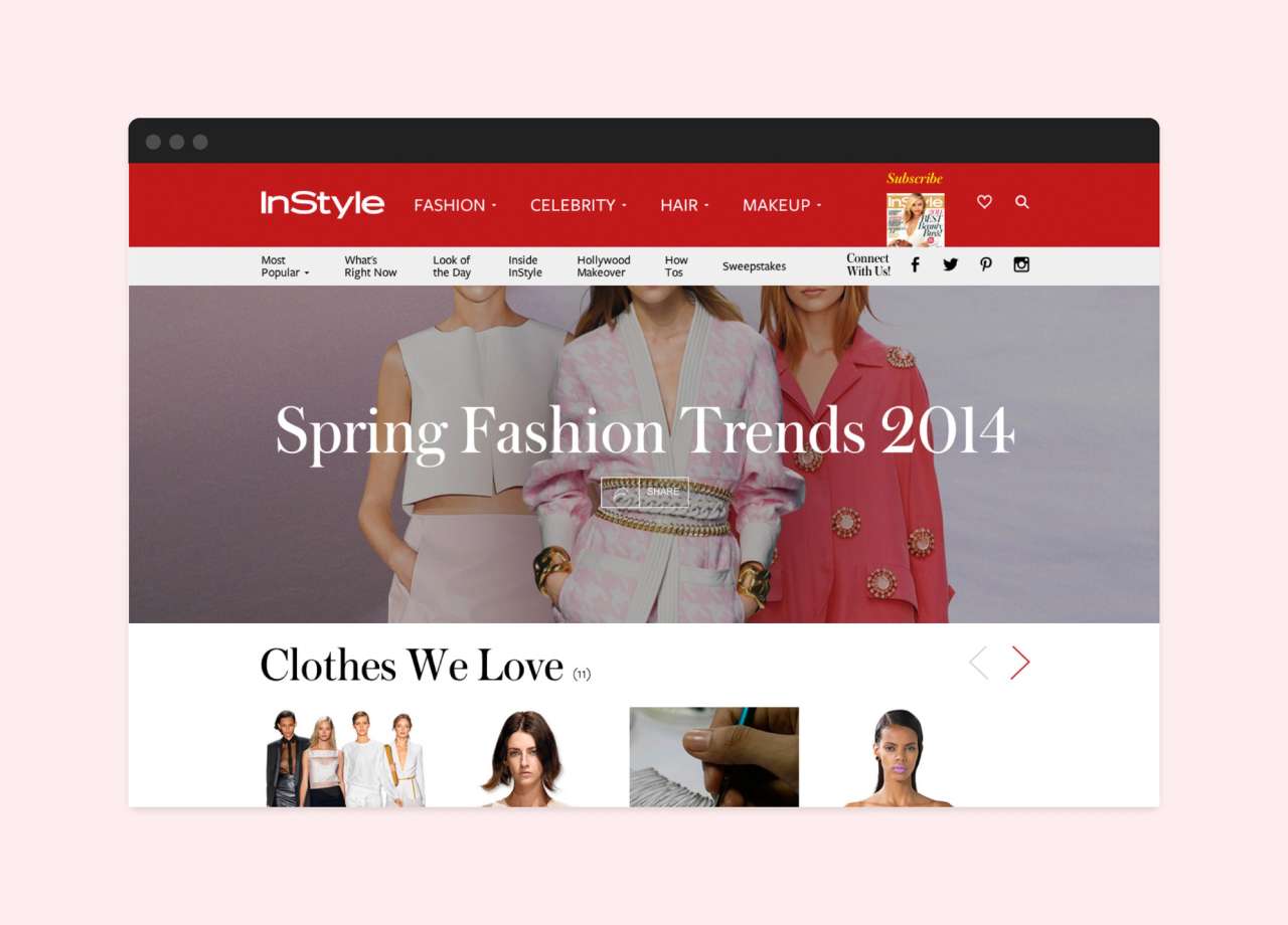
We also delivered a richer, more contextual reading and discovery experience. After all, the value of InStyle’s editorial and multimedia content isn’t only about the speed and immediacy of when it is published—the real value comes from the aggregation of content over time. Our new UX approach allows InStyle readers a much simpler archival content browsing experience—whether they’re researching recent DVF gowns spotted on the red carpet, or every Reese Witherspoon Look of the Day outfit since 2000.

Prioritizing Visual Exploration
InStyle readers are a very visual audience. In building the new responsive experience, we made sure to take cues from the print edition—opting for larger presentations of photography.In fact, every single new feature brings the focal point back to the photos, which are often the most important part of any InStyle reader’s journey. Photo galleries are bolder, cleaner, and easier to navigate, and contextual advertising placements complement the design, rather than distract from it.
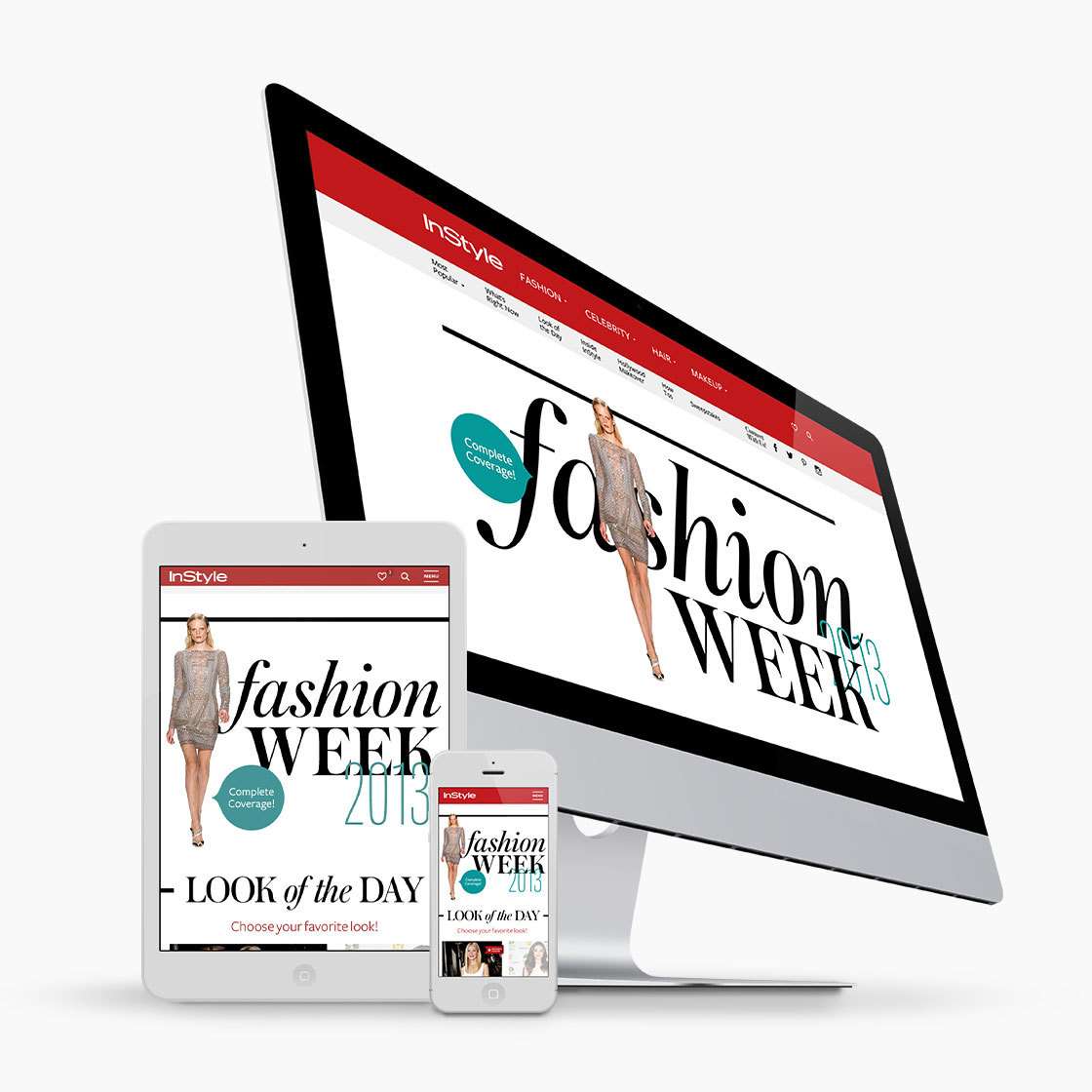
We made sure that the refreshed InStyle.com offered a consistent user experience across all touchpoints. From mobile, to tablet, to desktop, we wanted to provide readers with a rich and premium digital experience.
Consistent User Experience
In the age of social media and RSS readers, we know that users rarely type a publication’s URL into their browser anymore—which is why we treat article pages as the new homepage. Regardless of how a reader came to InStyle.com—whether it was through a link on Twitter, or a pin on Pinterest—we made sure readers were rewarded at every entry point. It’s why every part of the new design offers readers a clear, consistent path to discover new content throughout the site. There are no dead ends.
What We Did
Content
Platform
Website
Technology
Photo grid supports exactly two, three, or four photograph or video containers.
Let’s get to work. Start a conversation.
newbiz@codeandtheory.comCode and Theory is a proud member of Stagwell Group. Stagwell is the challenger network built to transform marketing. We deliver scaled creative performance for the world’s most ambitious brands, connecting culture-moving creativity with leading-edge technology to harmonize the art and science of marketing. Led by entrepreneurs, our 13,000+ specialists in 34+ countries are unified under a single purpose: to drive effectiveness and improve business results for their clients. Join us at www.stagwellglobal.com
Decode
Keep up with the culture, one newsletter at a time. Subscribe to DECODE:
Find Us
One World Trade Center,
69th Floor
New York, NY 10007