A New Customer Experience for Fitbit.com
1
Background
Having not re-designed for several years, Fitbit was well behind in e-commerce best practices. Not only that, but it wasn't tied to its initial product road-map. As a result, Fitbit tapped Code and Theory to build out a phased re-design of their site. Using a combination of existing user types, existing site analysis, and our own e-commerce expertise, we delivered a brand new design system built leveraging motion and interaction to bring to life the next generation of fitbit.com.
When creating the customer journey we considered a clear purchasing path that was defined by the storyboard developed during our weeklong workshop with the Fitbit team. The storyboard inherited the big idea themes identified during the define workshop such as easy purchase, clarity, guidance, being transparent and progressive disclosure.

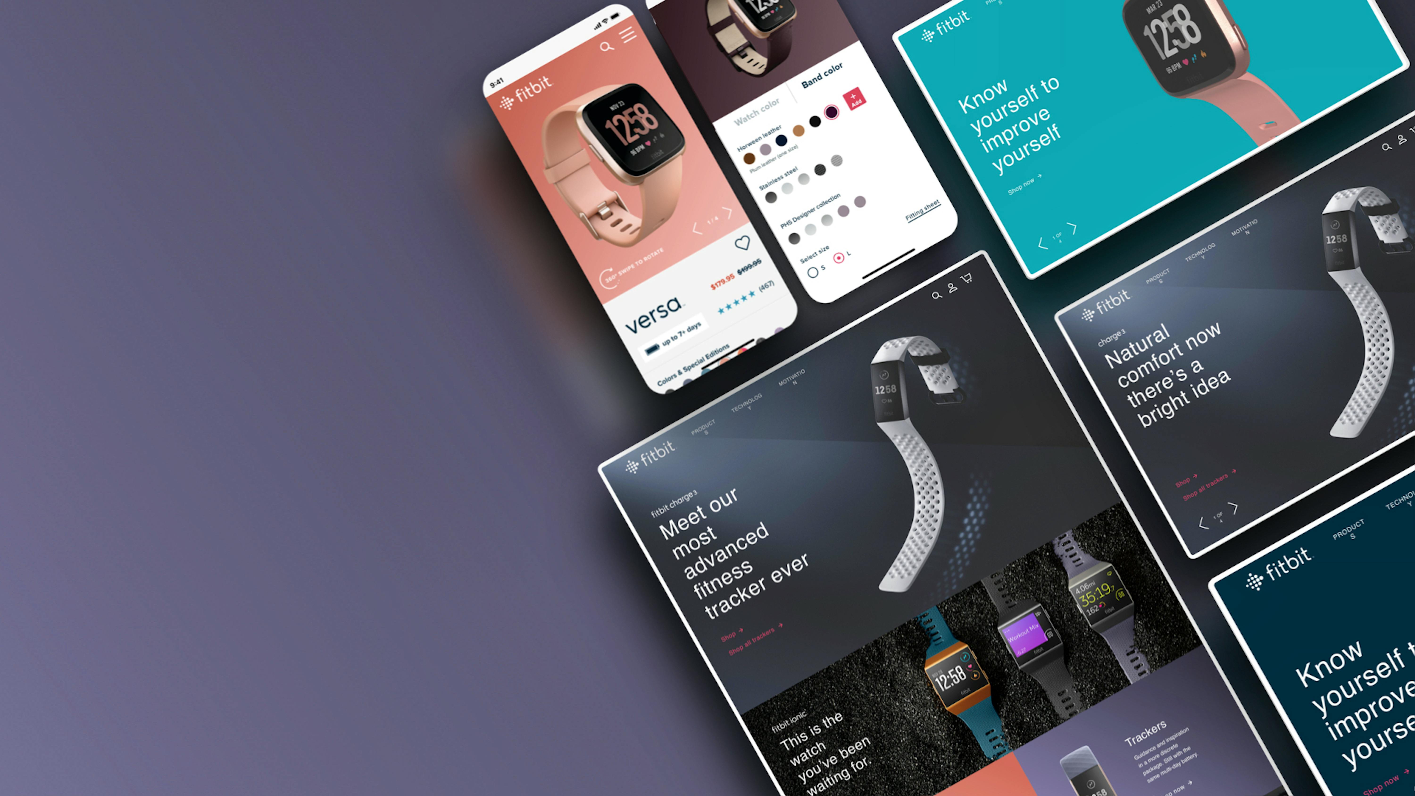
The result of our work is a personalized shopping experience that balanced inspiration and exploration with conversion while adding extra utility and personalization for existing Fitbit users and customers. We developed a rich evolution of their existing brand elements and created a bold, type driven, but playful look through the use of color blocking, and delightful interactions. An overall reduction in copy and visual clutter helped elevate their photography and focus the user on finding the right product for them.
2
A Personalized Experience
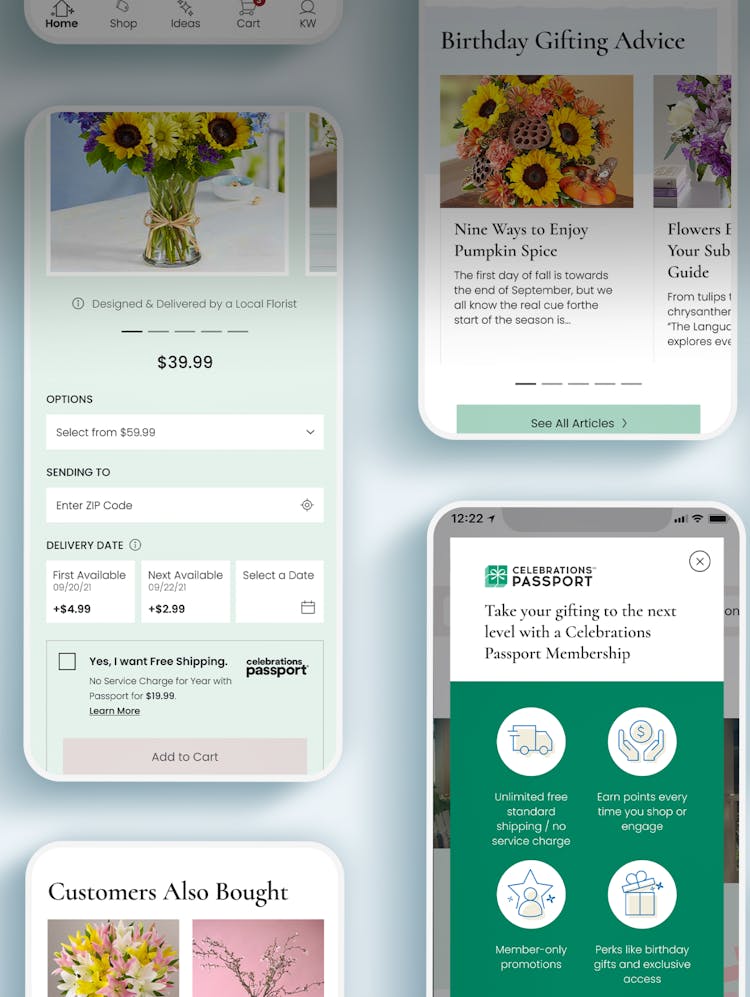
In order to help customers pick up where they left off and add extra utility for existing users, we surfaced dynamic content such as their app dashboard, quiz recommendations and recently viewed items.

3
Built for Exploration and Conversion
All features across the site were designed with the goal in mind to enable customers to identify the right product for them, customize its look and guide them through the purchase funnel.
We designed a seamless, 360° product feature, giving users the ability to customize the product look by matching different types of bezels with a variety custom band options while checking out the product at all angles.
To simplify the purchase experience, we designed a focused and guided checkout flow that balances up/cross selling of products based on the customer’s existing cart with the need to minimize friction across the three step flow.