Modernizing Harris Williams with a New Look and Future-Leaning Tech Stack
1
The Background
When we began our partnership with Harris Williams, their website was visually and technologically outdated. Its antiquated look and friction-filled experience stood in stark contrast to the realities of the firm’s bespoke, client-focused approach.
Our goal was to position Harris Williams as the leading M&A advisor through a more effective and meaningful digital experience—one that maximized conversational engagement and more accurately reflected their energetic and intelligent brand and team.
2
The Work
We started by gaining a better understanding of Harris Williams as an organization, and what truly sets it apart: a collaborative approach, deep industry expertise, and dynamic talent. These three attributes guided the design, messaging, and user experience of the new website.
Navigation: A Clearer Path
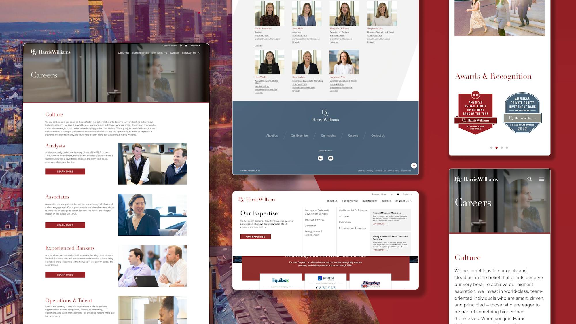
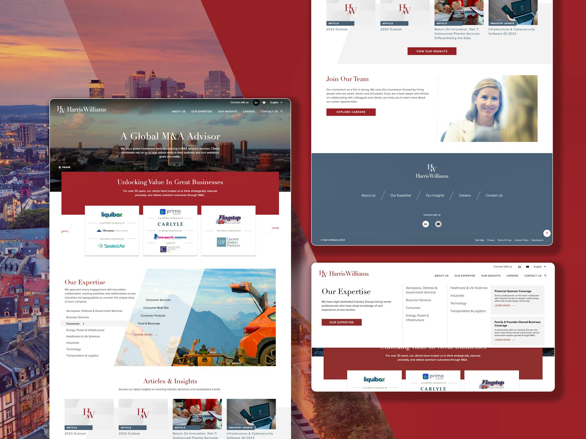
- Effortlessly navigating any website is hugely important. However, the original Harris Williams site presented challenges. Many of the pages relied on tabs below the hero images to take visitors to sub-pages within that category, making it difficult to locate specific information. We gave users a better way of finding these pages, making it easier for them to browse and engage with desirable content.
-
Visual Aesthetics: Leveraging Assets
- The site was falling flat when expressing the Harris Williams brand in the digital space. It lacked clear visual hierarchy, priorities, and contrast to lead users through the content of the website. It also lacked the dynamic energy that epitomized the HW brand. Many visual cues provided by the brand style guide were either not represented or simply misused.
-
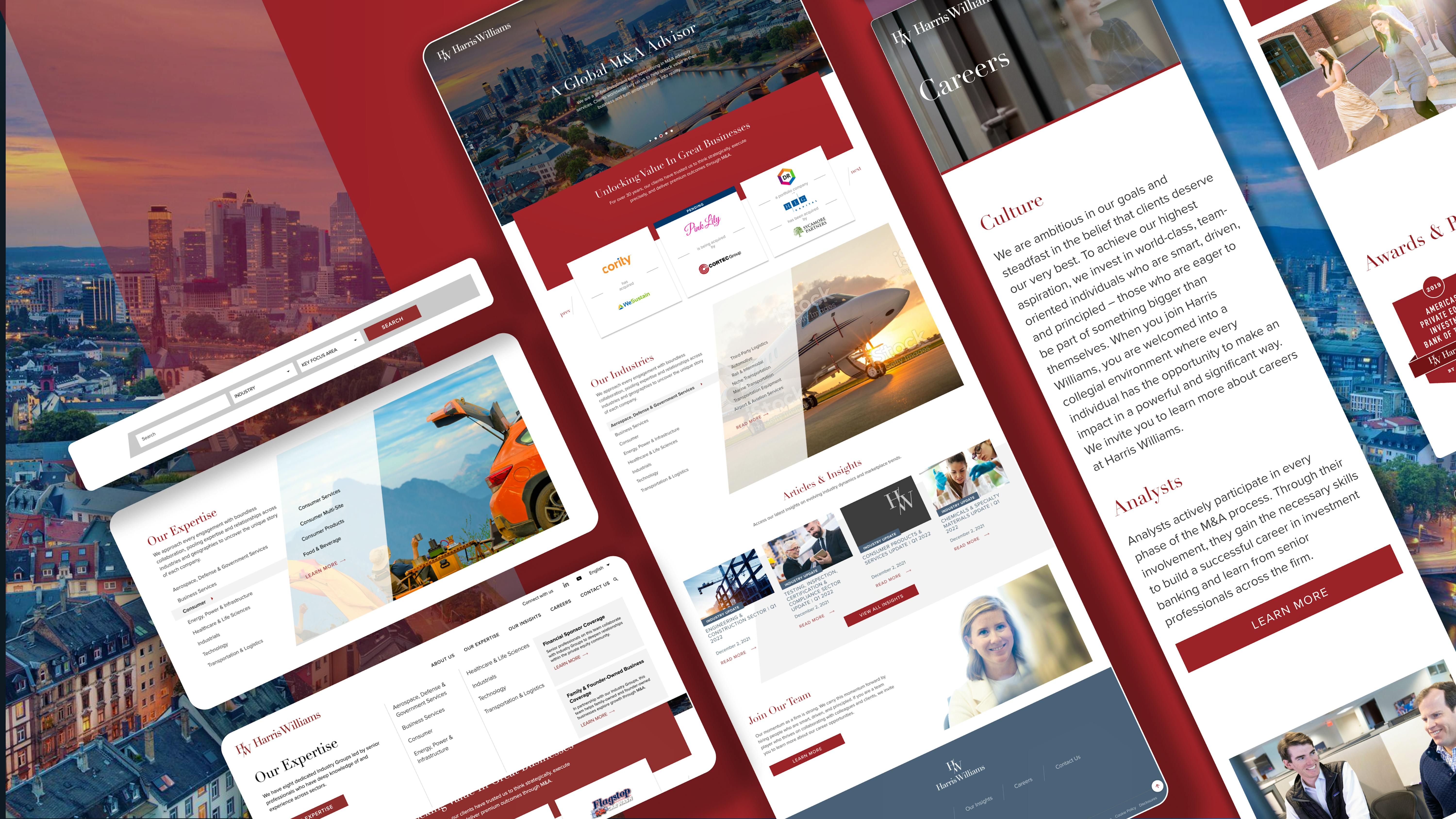
- We leveraged design elements such as the “slash” and other background treatments to keep the pages and templates interesting. We used an animated version of the logo mark (“H”, the “slash” and the “W”) for videos and other animations. We added a new slate color to extend the spectrum of the brand. Other color swatches from the secondary palette were also emphasized.

Homepage: Diving Deeper, Faster
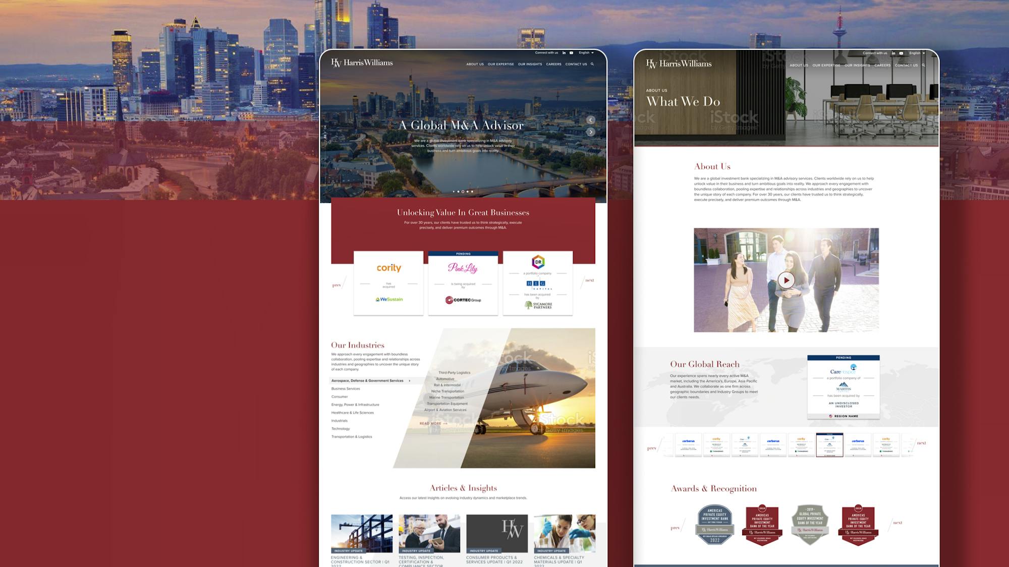
- The redesigned homepage quickly educates visitors on the key differentiators and reinforces the perception of a category-leading organization that’s powered by a team of industry experts throughout the globe. Visitors to the website can now quickly solve needs through an inviting, professional and frictionless experience that encourages intrinsic exploration, engagement, and connection to the brand and people of Harris Williams. That starts with an accessible and attractive homepage.
Transaction Display: Highlighting Success
- Transactions needed to be clearer and easier to understand, with more supporting copy that conveys what transactions are and how they help Harris Williams help their customers. Tombstones, small thumbnails that convey information about closed deals, were difficult to read. We broadened some of these tombstones to be longer and more descriptive. The elevated tombstones helped users learn more about the firm’s recent successes.
Thought Leadership: Touting Expertise
- The existing website contained valuable thought leadership content that needed to be more accessible to visitors. We expanded key pages to include more information about the firm’s focus areas and expertise, enabling Harris Willams to add additional content to many pages and helping to improve search value.

Careers: Attracting the Best
- People are the core asset of Harris Williams. Attracting and retaining talent is vitally important. The website didn’t provide enough information to potential new hires about what makes the firm unique as an employer. So we transformed the careers page into a primary tool for talent acquisition by including a new content strategy regarding inclusivity, culture, and Harris Williams’ fundamental values. We also gave DE&I—reflective of the firm’s greatest strength, its people— a more defined and prominent space within the website.
Powered with modern tech stack
- Migrating from a monolithic Drupal-based site to a modern headless architecture built on top of Contentful CMS and Next.js frontend framework. Other notable features included the hosted Meilisearch instance bringing search speed and quality to the next level; and DeepL Translator - a neural machine translation service that we integrated with Contentful via the custom-built Contentful app. These services were orchestrated in a microservices architecture pattern deployed to Platform.sh with independent CI/CD pipelines.
-
To bring our site strategy to life, we extended the progressive design elements within Harris Williams’ style guide to energize the brand expression and elevate visual aesthetics. We then launched the work by partnering with Platform.sh. We also integrated with Microsoft Dynamics for analytics.
