Modern Storytelling for Bustle Digital Group
1
Overview
Bustle Digital Group has been focused on the business of acquiring publications, and Code and Theory has been an integral partner in helping them grow their portfolio and rethink modern digital storytelling over a multi-year engagement.
Our long history of collaboration with Joshua Topolsky began before he became editor-in-chief at BDG. It all began in 2009 when we partnered to relaunch Engadget, and the relationship has extended through launching the Verge with Vox Media in 2011, reimagining Bloomberg News and launching Bloomberg Politics in 2015, and then creating and launching The Outline and its novel card system in 2016, which BDG purchased a few years later.
After these successful partnerships, Joshua tasked us with launching or redesigning seven (and counting) category-breaking digital properties.
2
The Outline
The First Modern Mutation In Digital Publishing
With the looming threat of the publishing industry dying out, Joshua Topolsky, founding editor and publisher of The Outline, saw an opportunity in this chaotic and unpredictable media landscape.
The Outline is the deliberate alternative to the conventions of digital publishing. Whereas most publications get lost in a sea of homogenized content, the Outline offers a striking contrast, knowing how its unique users work — and what they want to see. It answers the question of what Tinder would look like if it replaced profile pictures with premium headline cards.
The core idea driving the vision is simple: Quality matters more than quantity. Quality storytelling, quality design and interface, quality ads, and quality audience.
Every post on the site is given a fully art-directed digital card that offers a variety of formats. Headlines might be bullet-pointed arguments, evocative phrases, interactive visuals, data visualizations, or pull quotes. Some headlines are designed to tell a complete story; some are used to frame a long-form essay.
The Outline understands that the digital era should make it possible to tell more stories in many more ways. It also knows that the details matter. The only way to properly execute this vision is to redesign the entire platform and to start experimenting.

3
Input & Inverse
Faster, More Efficient Ways to Consume Content
These two sister sites answer some of the most important questions facing the media landscape: How can new storytelling methods cut through the clutter? How can content be more efficient and smarter for readers? What are fresh, new, visual ways to convey the same ideas to readers when everybody's brain moves at Twitter speed?
There is no traditional homepage on Input and Inverse. To make content reach users faster and more efficiently, the site's navigation structure is centered around the feed, or the stream—an infinite scroll of cards that represents a story.
Each story offers a snippet—the headline, maybe a quote, a key stat, or a GIF, along with some information. The reader can then expand that story in the feed to read more, or continue scrolling. When one story finishes, users scroll right back into the infinite stream of stories.
Input and Inverse are built on the same back-end system but with different front-end visual expressions.
Input was inspired by old-school risograph designs with vibrant and colorful paint-like vibes. We then introduced modern CSS image effects and chose big, bold typography for impactfulness. Inverse was meant to be Input’s dark, mysterious, cinematic twin. The color schemes are sharper with higher contrasts, more gradients, and shadows to give a scientific, futuristic counterpoint to Input.


4
Nylon & Bustle
Re-introducing Two Iconic Publishing Brands
As the card system continued to evolve, we began to scale it to other properties in the portfolio. Nylon and Bustle attract a predominantly female audience, focusing more on music, entertainment, beauty, and lifestyle.
New audiences and topics meant new card types and new design motifs: horoscope cards, Q&A cards, e-commerce cards. Digital Issue Hubs and long-form article pages support Nylon and Bustle’s content calendars: monthly issues, cover shoots, and sit-down interviews.
The new, unique visual identities of Nylon and Bustle reflect its audience and editorial intent.
The primary audience for Bustle is the smart, witty, intelligent woman. The design features bold and clean typography with clear hierarchy and big moments to show off original photography. The color palette is warm, clean, and mature, and circular, graphic elements and postage stamp motifs bring out the visual personality of the site.
Nylon is all about discovering the next big thing in entertainment and music. Our design system brings to life grungy textures, graphical references like a music festival posters, hand-written graphics, and bold, energetic typography. The grid and scale of elements reflects the slower publishing pace with large imagery and expressive type.


5
Romper
Content Consumption Fit for Mom
Leveraging the extensive card system we've created for the previous brands in the Bustle Digital Group portfolio, we’ve redesigned one of the most exciting yet - Romper. The go to destination for Mom.
The primary audience for Romper is the informed, stylish, on-the-go Mom, with content topics ranging from Pregnancy to Toddler. The design provides a clear path of consumption to eloquently balance the need for dense content and spatial imagery. Romper features a warm palette, making any user feel an instance sense of comfortability and reliability.
We created multi-faceted reading experiences that allowed Mom’s. with all types of schedules, to engage with content in the formats that fit their consumption habits all throughout the day…providing them quick hits of information throughout the day while giving them a relaxing space to unwind and deep dive in the evening.
Romper is about getting to the right content to her at the right time.


6
The Zoe Report
The Go-To Site for the Go-To Trends
With over a decade of publishing experience since it first launched, The Zoe Report is the approachable middle ground between lifestyle and high-fashion within the Bustle Digital Group Universe, allowing for editors and stylists to cater to their audiences every consumption need.
The site provides editors with the ability to leverage a more subtle color palette, or when appropriate, easily change it up to interject color to support the larger site narrative. Think, Spring in Bloom. From featured editorial pieces to bespoke product lists, our tried and true storytelling card system flexes to manage any and all of The Zoe Reports needs.
Leaning on our existing Product System and ensuring that it feels unique and bespoke to The Zoe Report editorial teams needs while continuing to adhere to our original strategic direction and goals established with The Bustle Digital Group more than five years ago.


7
W Magazine
A New Design with a Timeless Feel
Fresh and original, our new design revamp for W marks a new chapter for this iconic publication. Launched in 1972, W is the premier fashion and culture destination, known for celebrating diversity and discovery through stunning visuals and eloquent storytelling.
The refined design features stay true to the spirit of W while providing a clean setting that allows every element of a photograph to shine through. The design also includes a fine balance in content and spacing so the reading experience is streamlined and enjoyable, never overwhelming.
Our bold design system allows readers to peruse inventive photography, thought-provoking features, and immersive editorials at their leisure, offering a chic, unique, and intelligent alternative to mainstream fashion titles. The card story format allows W o showcase its extensive collection of stunning photography and its breadth of fashion portfolios in an immersive experience that is reminiscent of the original printed magazine. It also adds interesting movement and visuals that enhance the storytelling of its editorial pieces.


8
Elite Daily
Bold, bright, and bursting with personality
Elite Daily is dedicated to keeping readers in the loop, so our all-new design system guarantees they won’t miss a beat. Joyful and bold, this new look connotes the publication’s emphasis on wanderlust and optimism.
As a hub for all things lifestyle, relationships, and entertainment, Elite Daily covers relevant topics and promotes inclusion. They connect with their young audience through a bold personality and bright look.
With dayglow-inspired styles and bold typography, the design system captures that luster. The lively texture against the poppy, neon color palette creates a modern feel—it illuminates Elite Daily’s exuberance.


9
Gawker
Don’t Call It a Comeback
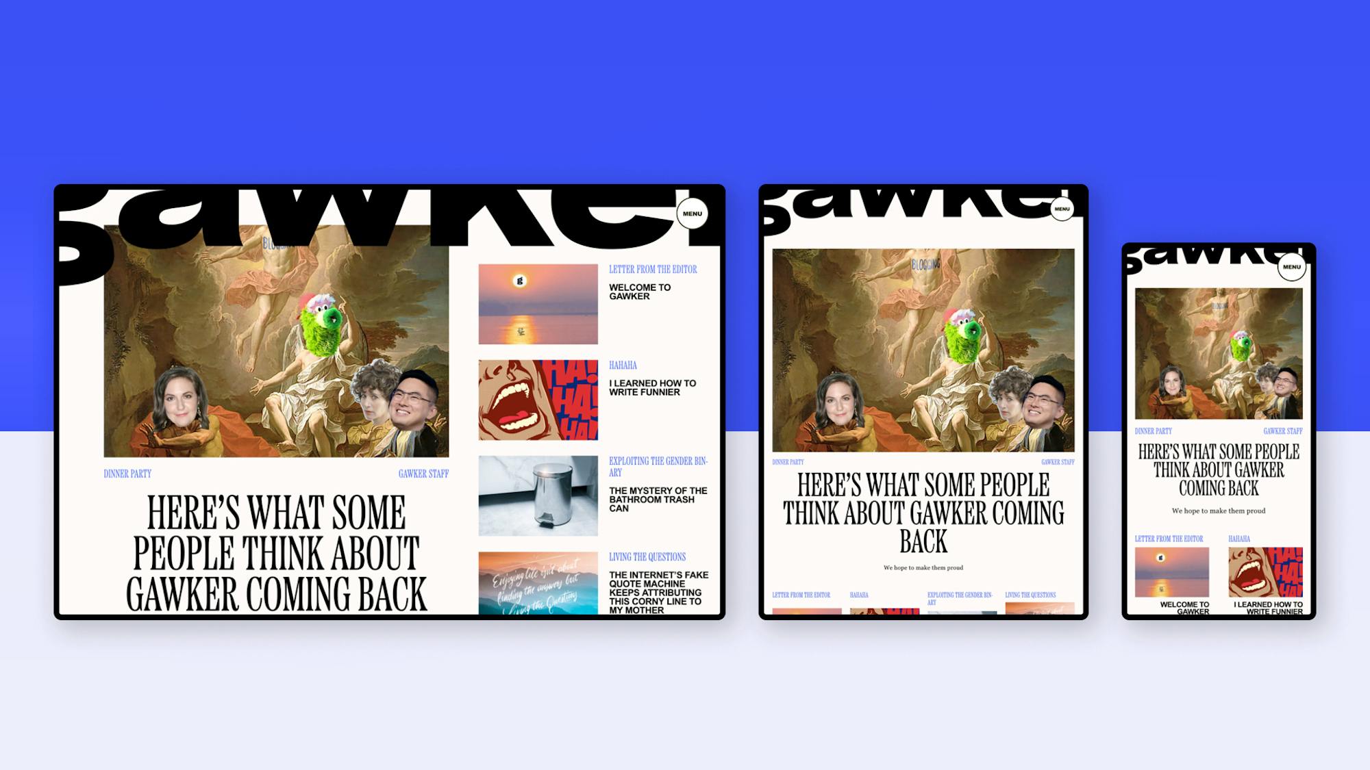
Instead, think: revamp. Dedicated to providing readers with brow-raising gossip and animated opinion pieces, Gawker is ready to be bold and turn heads. The publication’s tongue-in-cheek humor and unapologetic tone is solace for an audience looking to indulge in thoughts they may be too scared to say out loud.
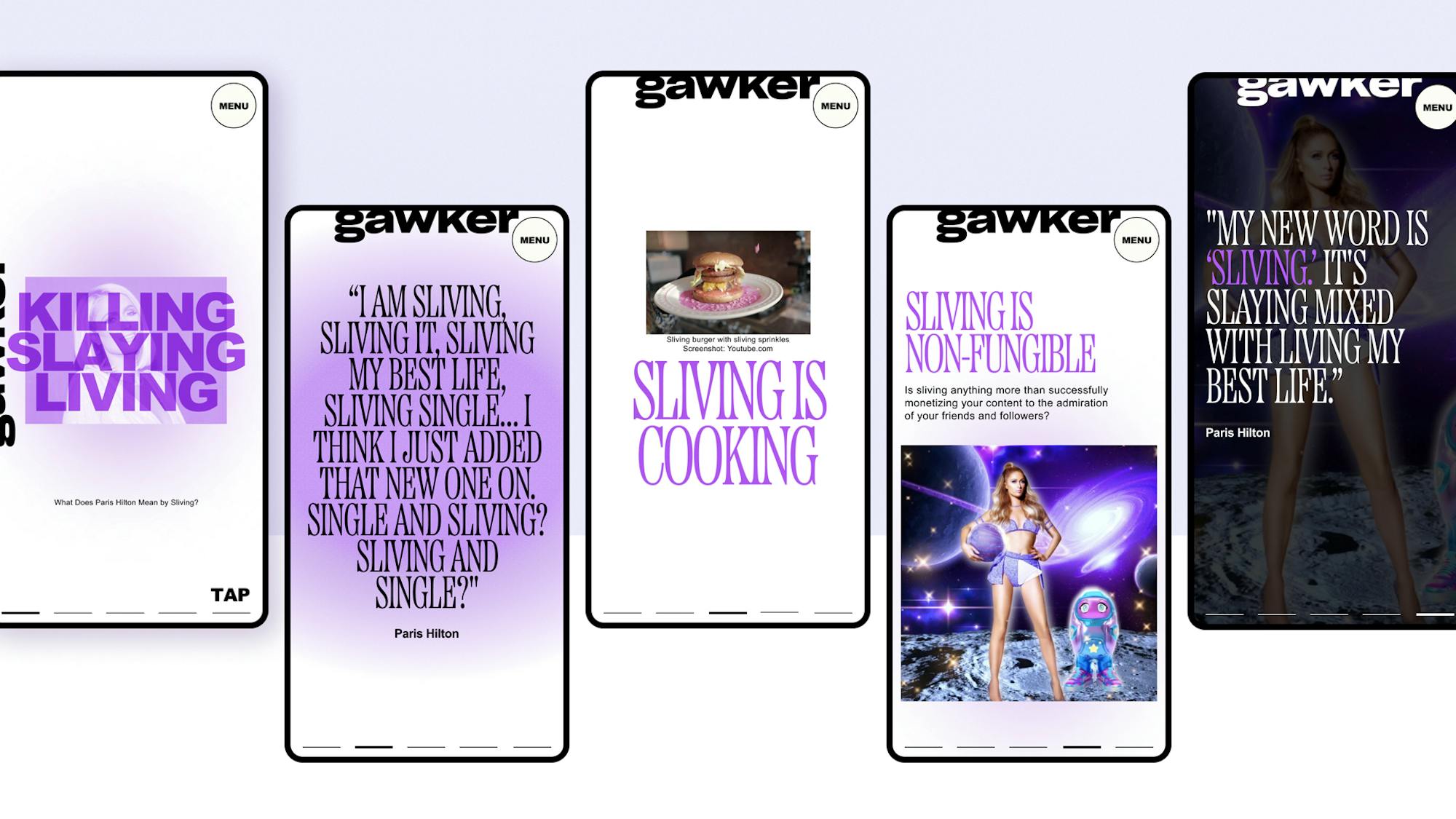
The new era of this publication is lively and breaths fresh air into the name. This concept is mimicked in the design system with uniquely laid out compositions, bold colors, and lively typography. It facilitates an entertaining and engaging experience, all the while still bringing a touch of class and sophistication.
Gawker’s new design system was made with the audiences’ attention in mind. Lively typography paired with the new bold primary color scheme lets readers know this is information they don’t want to skip. Card stories are a quick and efficient way for readers to access a curation of Gawker published content such as celebrity news and amusing opinion pieces instantly.


