Redefining Luxury in the Las Vegas Casino Landscape
1
The Overview
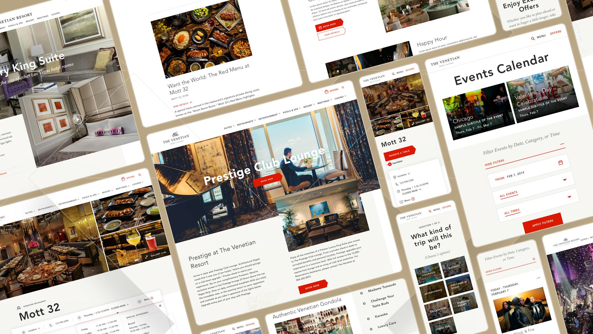
How do you tell a truly original story in the digital space? It starts with creating a brand new website with a multitude of thoughtful attributes that range from optimizing user navigation to creating inspiring new photography.
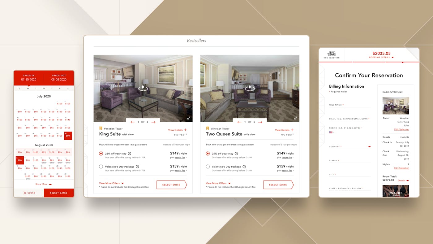
Beyond the digital rebrand, Code and Theory also designed and built a luxury experience that enhances conversion with the creation of a bespoke, best-in-class booking flow. From branding to conversion, Code and Theory has accompanied the Venetian Resort for years through an iterative process based on prototyping and testing. This allows us to discover and validate strategic opportunities to optimize our design solutions before developing and deploying to Adobe AEM.
2
Redefining Luxury
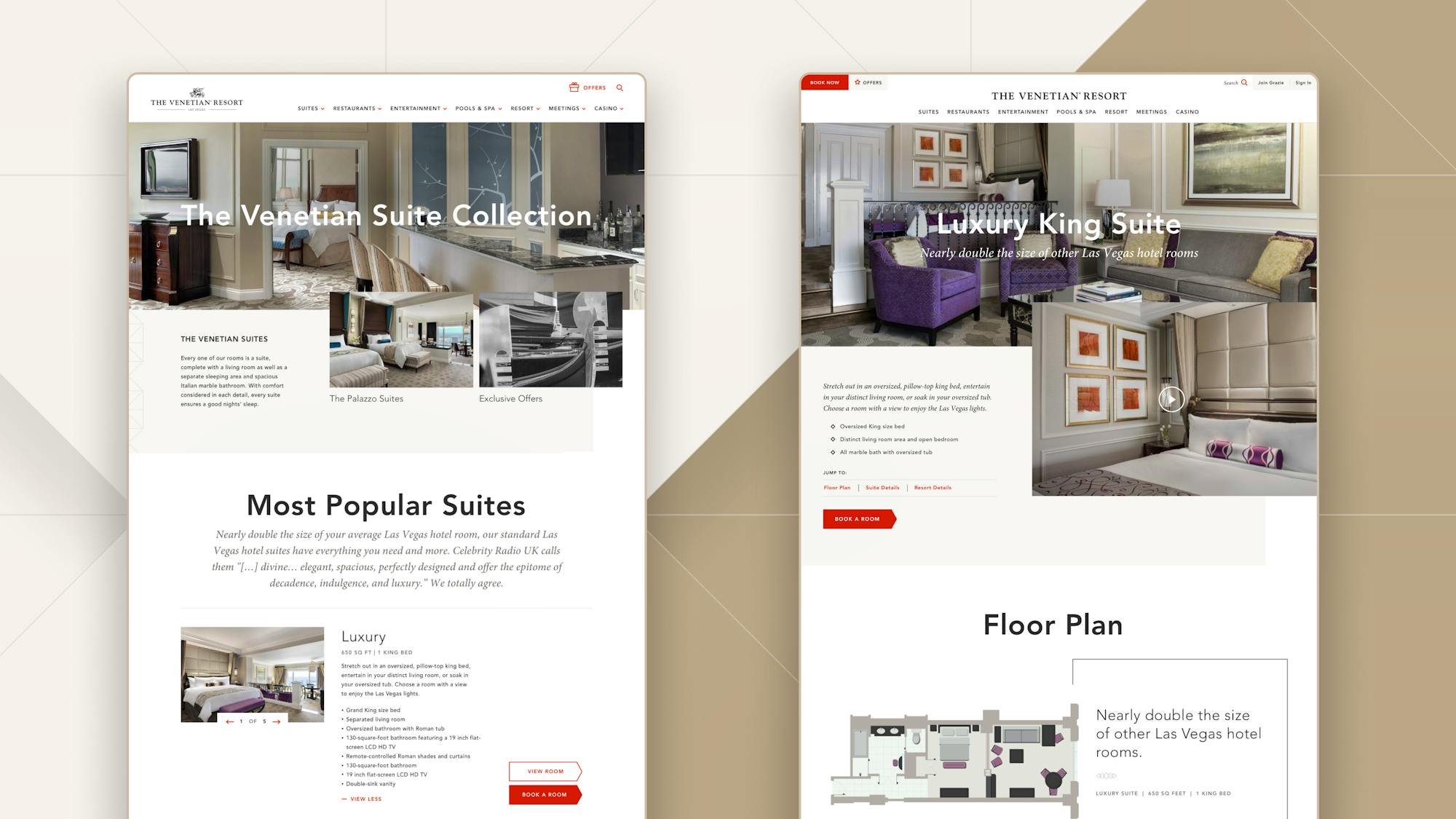
A deep redesign of the user experience and cutting-edge visuals would not have been enough with the site’s existing content, which did not correspond to the type of luxury the Venetian Resort wanted to showcase.
To inspire users to become guests, Code and Theory started a number of initiatives to create more compelling content through the use of photography, videography, cinemagraphs, and copy direction.
Instead of a heavily retouched, overly saturated version of luxury, the suites were photographed with natural light for a result that is fresher and more contemporary.
3
The Details
Tailored Room Booking Funnel
We designed a custom booking experience from scratch by integrating it with the brand site to help increase confidence for conversion
Single-Page Application
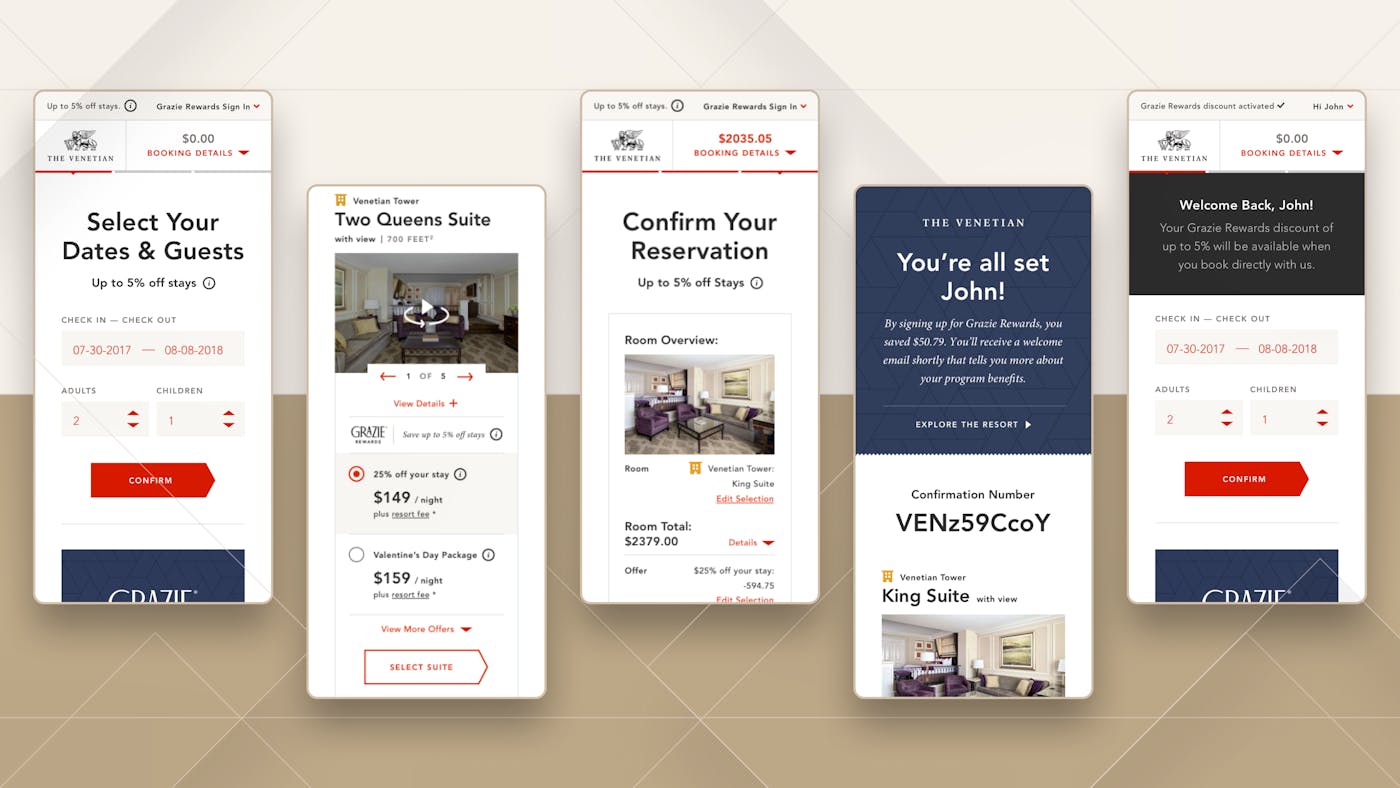
To offer a smooth and delightful experience designed for optimum reactivity we designed a PWA unlike other sites that force users to download a separate app to book.
Obvious Progression
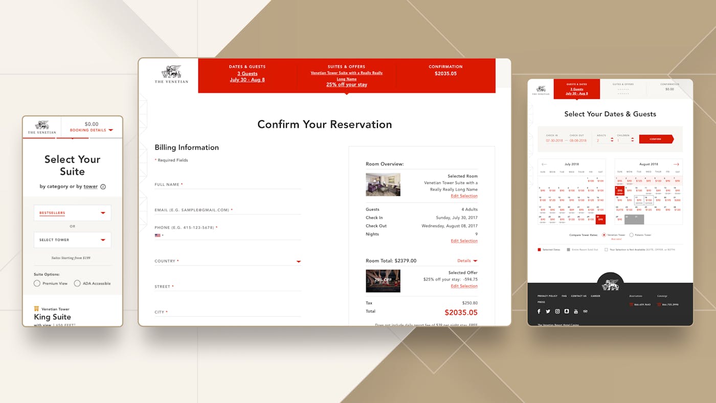
A navigation and progress bar allows the user to know exactly what is expected from them; to verify or to go back and modify their previous selections. This reassurance and convenience increase user confidence and optimizes conversion.
One Step at a Time
The best experience is not about cramming several inputs on the same page. Each step is a single action or choice to help users focus on their booking task without potential distractions.
Accessible and Optimized
We spent a tremendous amount of effort to validate this experience on various devices and breakpoints by testing it separately.
UI variants were integrated to show step-by-step progression along with easy editing. Accessibility was incorporated by careful consideration of colors and font choices. Business changes were adapted when offers evolved.
Ultimately, we believe we’ve found the balance of function and utility while maintaining the overall elegance of the Venetian Resort’s brand.
