Rebuilding a 100-Year-Old Foundation For The Next Century
1
The Brief
We received a brief to future-proof a 100 year old foundation.
The Commonwealth Fund came to Code and Theory with a specific need: they had a century-old archive of research content that needed to be architected for modern search engines and the next 100 years.
This assignment included an opportunity to redesign the site for the 21st century so we could help solidify the Fund's position at the forefront of the healthcare policy debate.
Together, we set out to modernize, optimize and streamline the Commonwealth Fund's gigantic information-architecture, and amplify the mission that drives the foundation: We are a foundation dedicated to affordable, quality, healthcare. For everyone.
2
The Approach
The Fund's mission is dedicated to supporting independent research promoting a better and more equitable healthcare system–particularly for society's most vulnerable, including people of color, people with low income, and those who are uninsured.
As the COVID-19 pandemic demonstrated, healthcare in the United States is rife with inequities and serious shortcomings as millions of people cannot get and afford the healthcare they need.
Through research we discovered that the Fund’s data was organized in a sprawling taxonomic framework that was inhibiting connections and order.
As a prominent resource in the healthcare industry, we needed to standardize and consolidate the Fund’s pre-existing taxonomy. We did this by establishing an intelligent site-search algorithm, designed around industry semantics to produce meaningful relevancy.
Using a data driven approach, we were able to find solutions to create an easier structure and hierarchy for the Fund’s key audiences (policy makers, legislators, researchers, media and the educated public) to navigate and provide us with the healthcare we need.
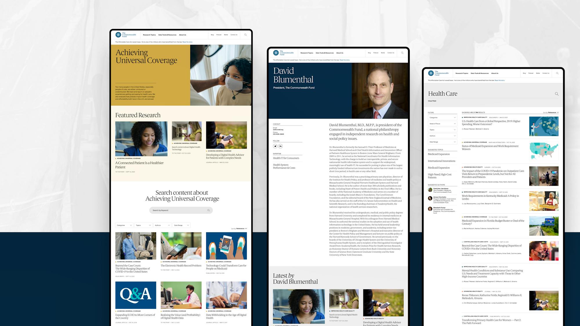
We used technology as a tool to improve communication, developed a new information-architecture to deliver accurate search results and relevant recommendations, and created a beautiful new design system and color scheme to leverage the Fund’s mission.
3
The Outcome
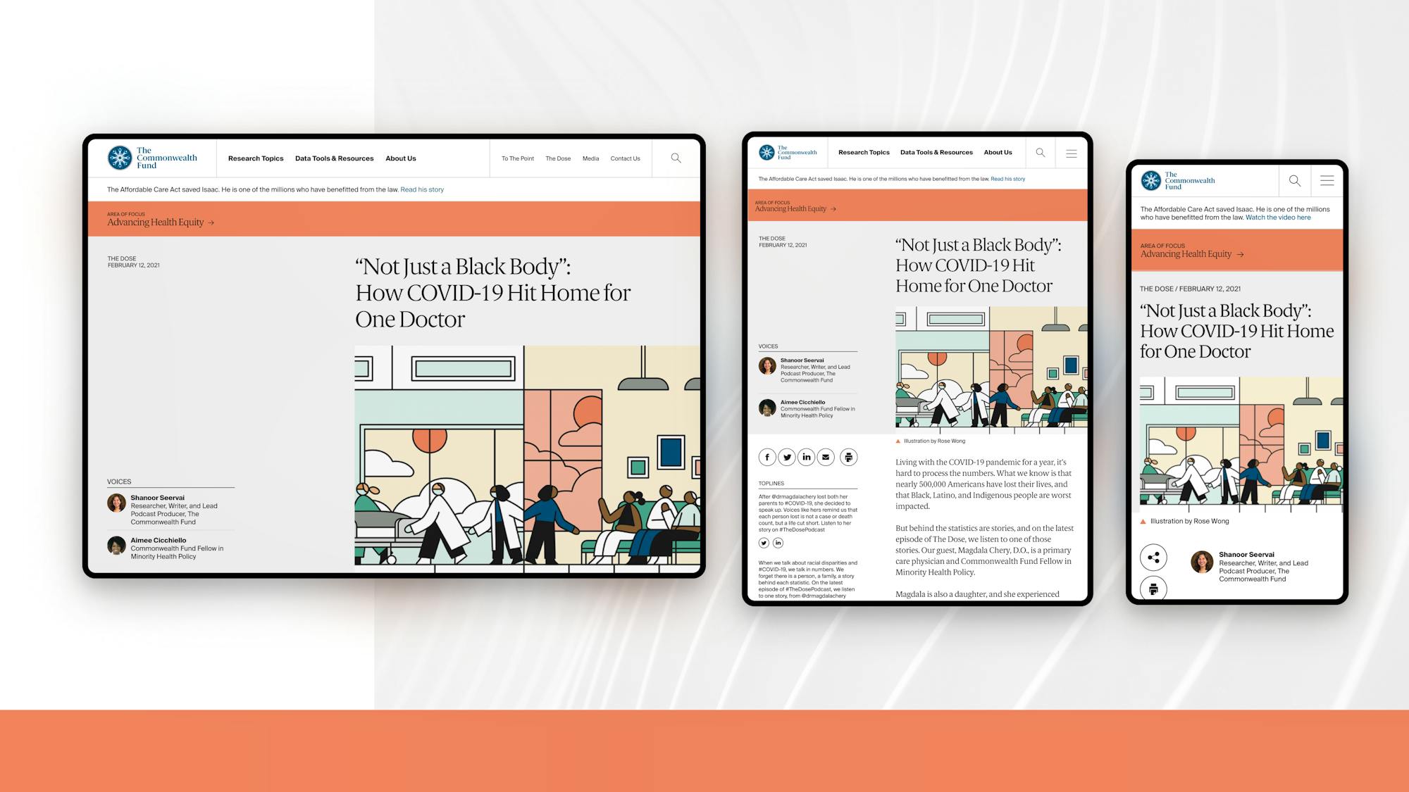
Publishing to reinforce the mission – The new information architecture and site design emphasizes the fund’s mission. Every piece of research is published beneath a visual banner that communicates its intention while linking to a focused browse experience.
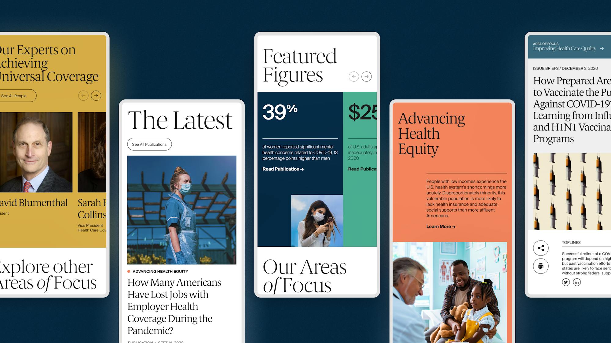
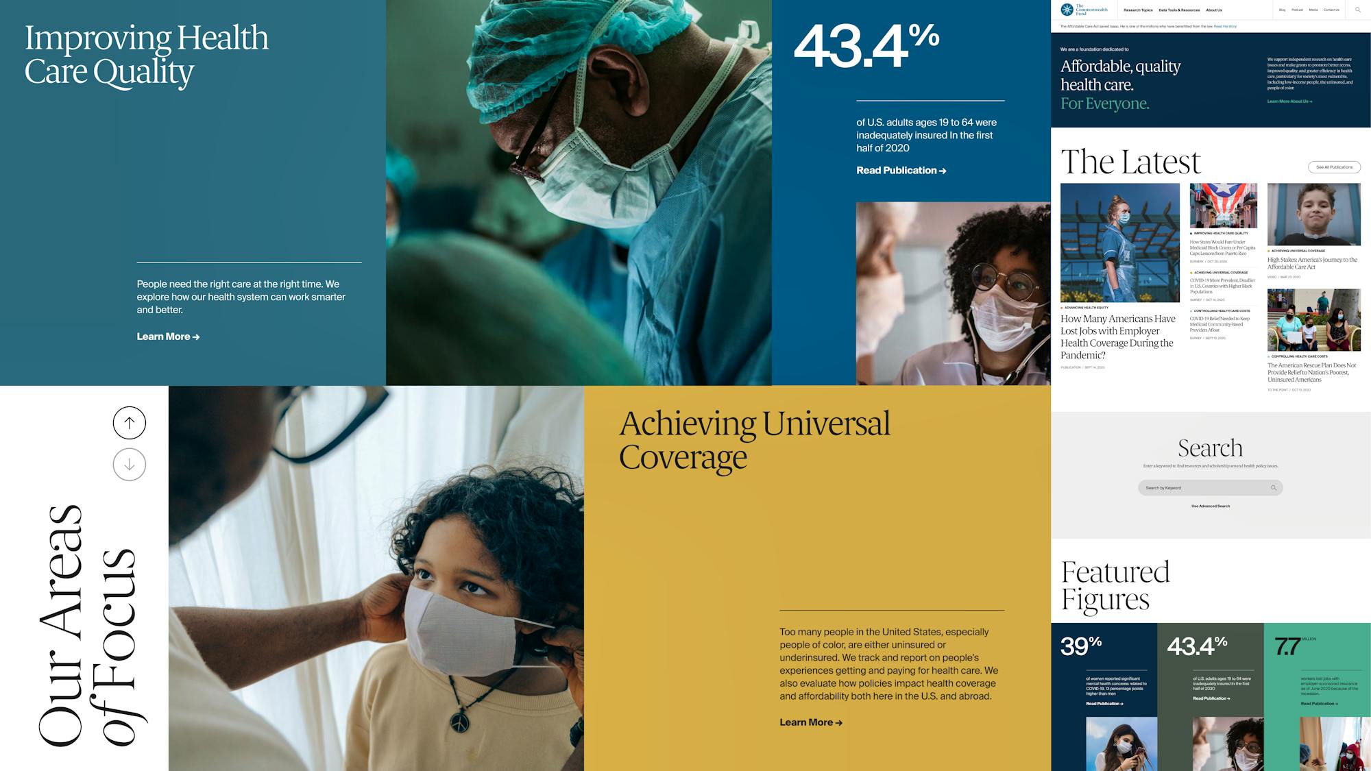
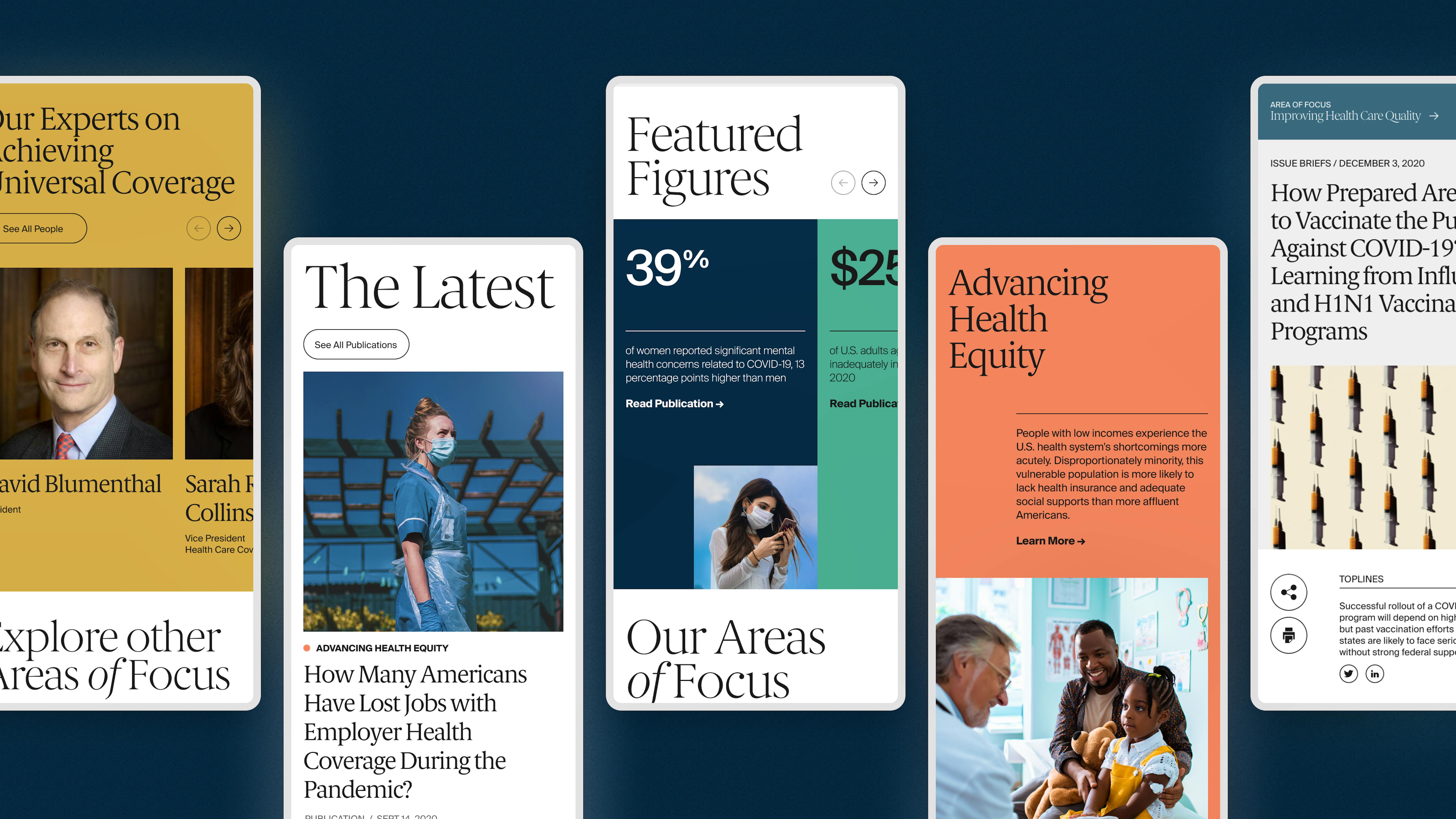
A new visual tone – The new design introduces new brand colors, content franchises, and a mobile-optimized framework that delivers value on the go.
With the new site prioritization– Everything the Fund does is clearly connected to their mission and ensures it’s findable and scalable for the next 100+ years.
