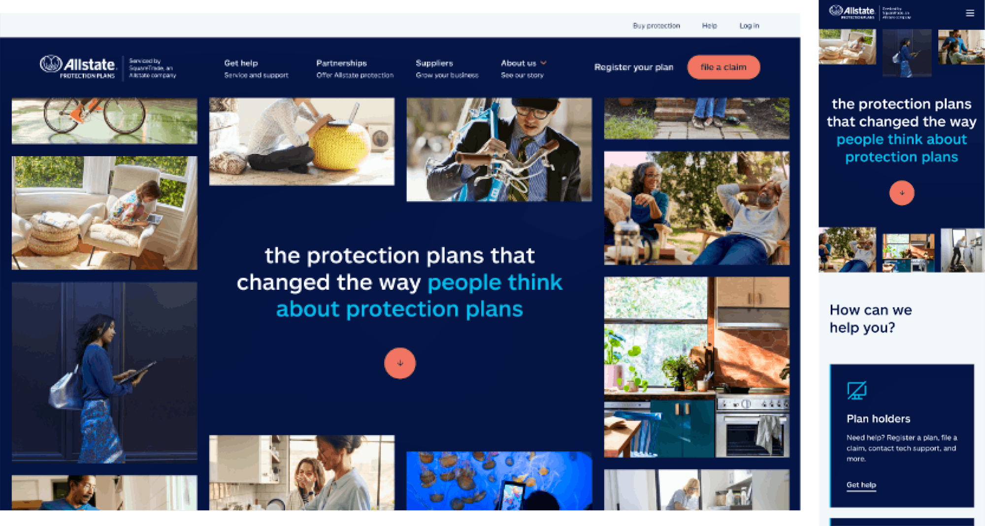
Bringing SquareTrade Into The Allstate Family
1
The Background
After being acquired by Allstate, SquareTrade, an extended warranty service provider for consumer electronics and appliances, changed its branding and core offering from direct-to-consumer to business-to-business partnerships. To reflect these changes within the business, the site experience needed to shift the focus away from selling warranty plans direct to consumers (while still offering support for current customers) and move toward developing B2B partnerships; all while updating the look and feel to match the new brand.

2
The Strategy
The first significant milestone was developing the new visual identity of SquareTrade, soon to be known as Allstate Protection Plans, that leveraged the existing Allstate brand guidelines but was also unique to SquareTrade as “the cooler sibling who works in tech.” To accomplish this, we developed a new approach to imagery and animation that shifted the focus away from products and toward the people, services, and lifestyle in which the products are used in. We also created a number of graphical elements that built on the Allstate brand and enabled SquareTrade to stand out and express itself in various ways across the site.
For the site redesign, we started with the navigation and information architecture. The current state focused on pathing users to their 25+ detail pages which overwhelmed users and was now obsolete with the changes to the business. To overcome this, we reorganized the IA and navigation to better reflect the new areas SquareTrade operates in and who they serve while providing all types of users with a clear and straightforward path to action.

3
The Outcome
The site was brought to life by our internal development team who customized the Drupal CMS experience to better empower the SquareTrade editorial and content teams. Initially, the SquareTrade team was heavily reliant on their previous development partners to make even small changes on the site. To overcome this, we overhauled the Drupal interface and implemented a flexible drag-and-drop tool to enable quicker page creation and allow for more standardized page layouts. Overall, the team was able to reduce process complexities and enhance the responsiveness of the site to work across more varied device sizes.
Ultimately the design, strategy, and development work led to organic growth and additional work to design and develop the European versions of the site.