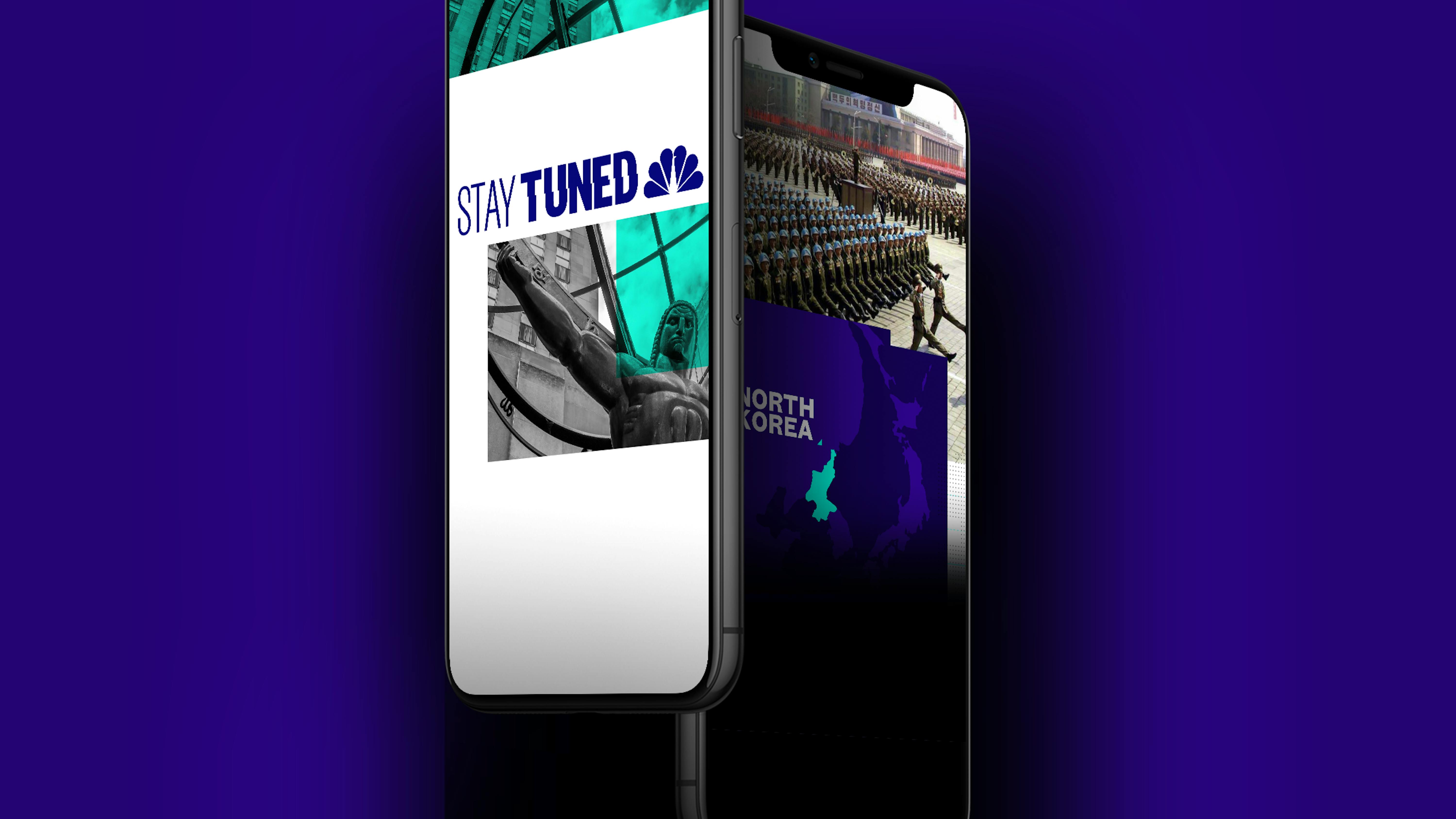
NBC News Stay Tuned
1
The Background
With a focus on engaging younger audiences, NBC News has turned toward Snapchat as one of the key components of its future thinking strategic toolkit.
Enter “Stay Tuned,” Snapchat’s first daily-news program, featuring two episodes a day during the week, and one each day on the weekend. With more news sites meeting NBC News on the Snapchat playing field, a redesign became necessary to stay ahead of the competition.
NBC News came to Code and Theory with a fresh challenge – turn around a completely original motion graphics theme for “Stay Tuned,” with a brand new design system for NBC News’ production team to riff off of, in the course of a week.
2
The Challenge
Like any great design, the sophistication is in the details.
In order to find success with a short turnaround, Code and Theory’s designers embedded themselves at the NBC News offices full-time for one week, working a shoulder tap away from the Lead Video Editor on “Stay Tuned” throughout the duration of their stay. This highly collaborative process, echoing the colocation model the two teams created during their work launching NBC News' new verticals, allowed for quick turnaround. Daily meetings with Snapchat’s in house design team enabled a consistent stream of feedback to ensure that the team continued its push in the right direction.
One of the larger challenges we faced was how to retain users’ attention on such a fleeting medium. With so many bite-size options available, how could we keep the notoriously skittish, under-25 Snap audience locked into a news show? These were the big questions driving our design philosophy.
3
The Solution
The refresh was as fast and furious as Snapchat itself.
According to a NewsCred survey, Snapchat users are a loyal bunch, with 54% of them using the app daily, with a median age of 18. Capitalizing on this market dovetails with NBC News' overarching goal to create a loyal user base who will ideally grow with the brand.
The original Stay Tuned concept needed an injection of modernity to reflect the quality of journalism that the show provides. We wanted Stay Tuned to be more than just a television news show on your phone. With Snapchat’s framework in mind the visual tone needed to be fast, to-the-point, and unlike any news show out there.
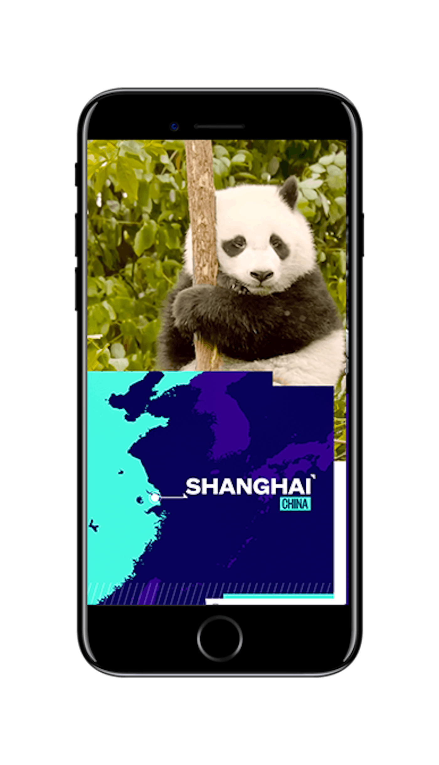
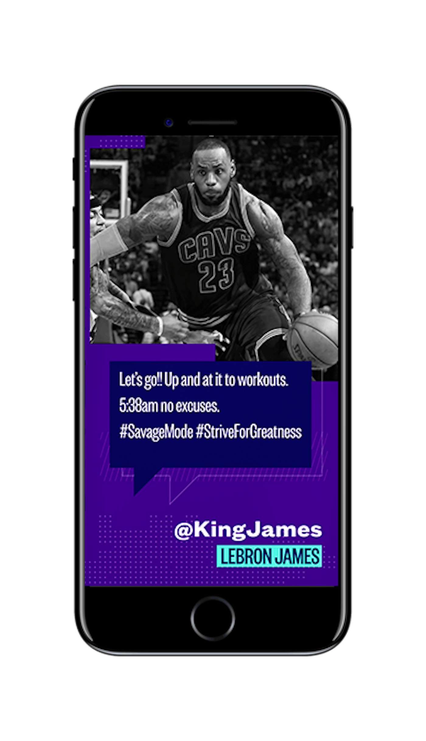
The final designs are a modernized take on a “glitch” effect. The name Stay Tuned suggests imagery of an old TV set or a family huddled around a radio, and we wanted to bring that sentiment into the 21st century. The accent colors are inspired by the classic red and blue of a distorted LED screen and kept in check by a sturdy purple as the primary color. The entire color palette can switch on a dime, just like the news cycle, when a breaking story hits. In this case, the staid purple takes a backseat to an urgent red. We knew the show would have to move fast, so we created a stacked color block effect to highlight and give life to effects that are only in motion for less than a second. To account for the ephemeral nature of the Snapchat medium, we replaced the boxy full-bleed transition graphics that were used in the old system with a quick left-to-right glitch transition between clips, maximizing the time that interesting content appears on the screen, and thus keeping the user engaged through the end of the clip.

4
The Conclusion
On August 18th, Stay Tuned's new design went live and reached 29 million unique viewers in the first month. We have left the NBC News Stay Tuned team with a fully detailed style guide for future use, and to continue to iterate on as they see fit.


