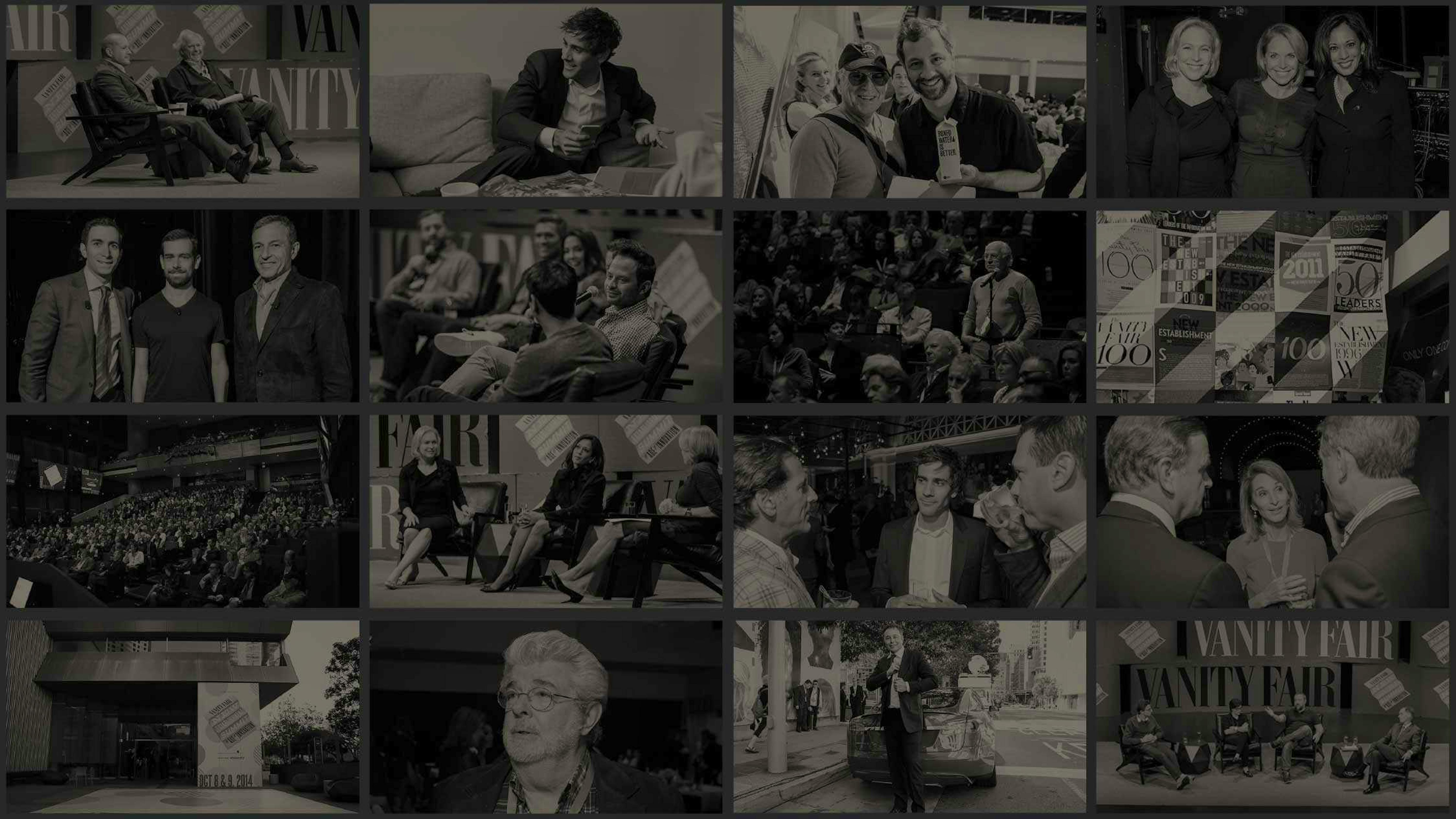
An Event Site Fit for Vanity Fair
Most websites dedicated to events are fairly static. They’re designed to be updated a few times at most and primarily serve as online billboards.
Vanity Fair—the iconic Condé Nast-owned magazine—wanted to take a different approach.
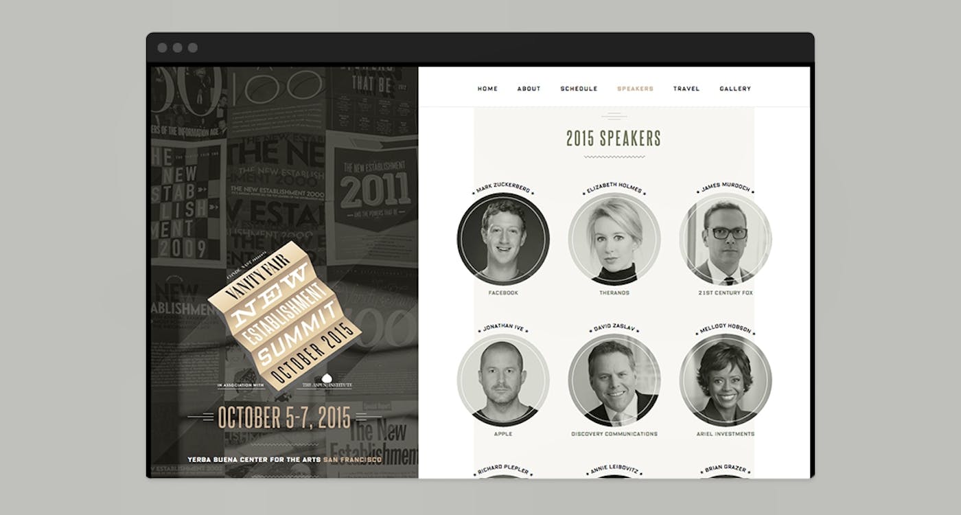
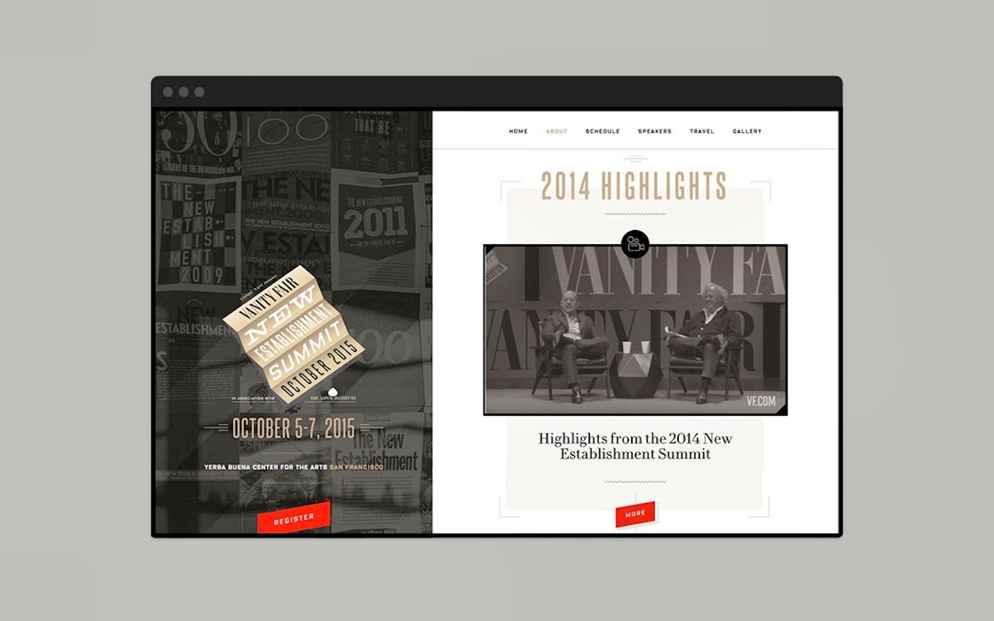
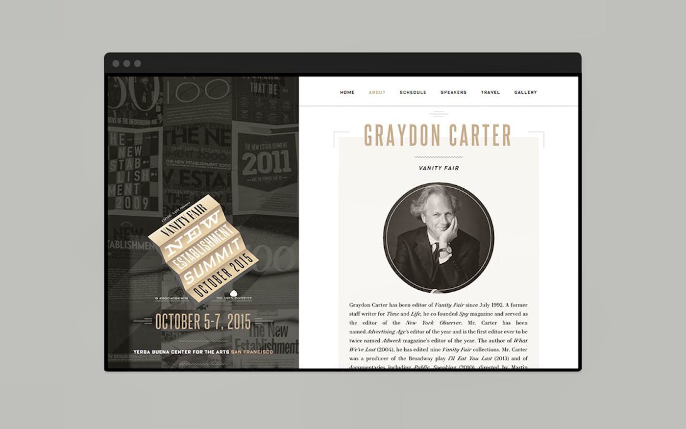
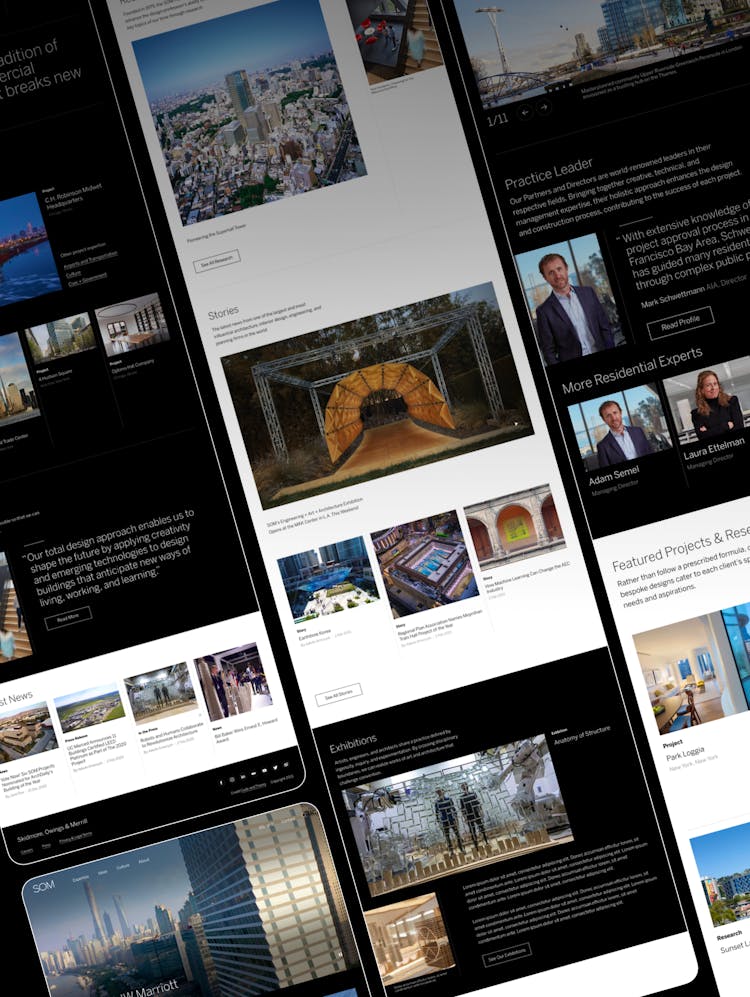
In advance of its second annual New Establishment Summit, Code and Theory collaborated with Vanity Fair to transform its Summit site into a more responsive and flexible destination.
It's an elegant design that mirrors the prestige and power of what the New Establishment Summit stands for.
1
Taking a Different Approach
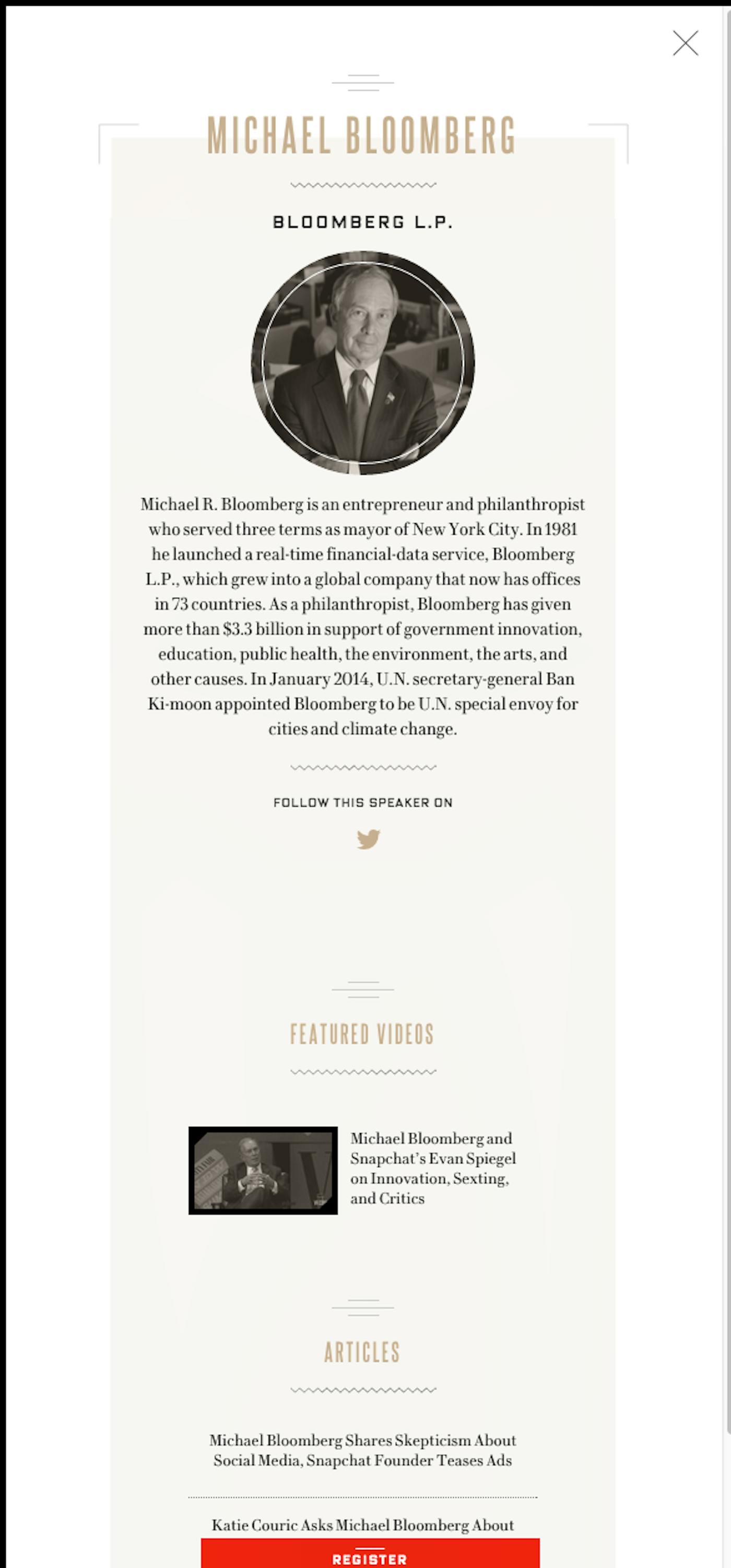
The New Establishment Summit is the physical embodiment of Vanity Fair’s annual list of society’s tastemakers who are “shifting and shaping the global conversation” in the intersecting worlds of technology, media, entertainment, politics, and beyond.
In 2014, speakers included Apple design chief Jony Ive, Tesla Motors CEO and SpaceX CEO and CTO Elon Musk, Snapchat founder Evan Spiegel, and Spotify CEO Daniel Ek.

Since this event generates so much news, Vanity Fair needed more than just a beautiful website. They needed a content management system that could flex and adapt to various moments in the event cycle, providing the magazine with a powerful multimedia and editorial platform that could easily cover the 2015 event, as well as future events.
2
Room for Improvement
Interviews with stakeholders revealed that there was room for improvement from the previous Summit website.
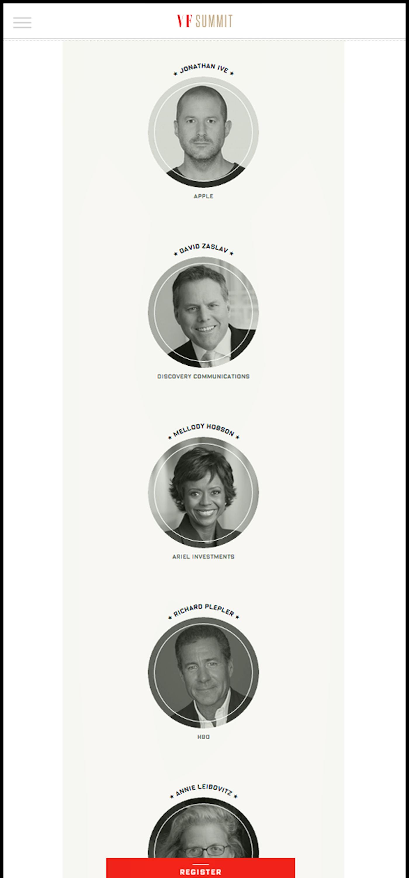
For one, the process of buying tickets needed to be simplified, and additional features—like allowing paid attendees the option to transfer their tickets to another person—needed to be integrated. Enabling attendees to share content on social, and to more quickly access and browse the schedule and additional content on mobile, was also a major focus of the redesign.
The biggest tweak, though, concerned the process of adding and updating content. Because of the nature of a live event, Summit organizers needed a simple tool that would allow them to update content on the fly, and easily leverage Vanity Fair’s editorial event coverage without having to re-create it for the site.
We decided on an easy-to-use, flexible, modular-based CMS that can continue to grow with the event in subsequent years.
Part of our strategy centered around how to help site editors leverage all the great content leading up to, during, and following the event. And of course, surface it at the right time for visitors.
3
Covering Key Moments
The overarching strategy was to find ways to transform the Summit site into more of an editorial entity than just a traditional events site.
In addition to the editorial goals, The New Establishment Summit site needed to accommodate five key moments or “chapters” in the events cycle, including:
(1) The initial call for attendees
(2) The announcement of the speaker lineup
(3) The unveiling of the final speaker list and agenda
(4) Key moments during event
(5) Event recaps, photos, and videos following the event
The new site enables editors to create and curate information relevant to each chapter, and highlight it at different points in time. Thanks to the flexible, modular design, most pages on the site have the ability to be modified and customized.
4
Elegant and Powerful
The new site, which was unveiled in June 2015, complemented the elegant look and feel of the Vanity Fair brand, and provided all Summit stakeholders a more powerful tool to promote and cover the October 2015 event and beyond.
And with a 2015 speaker lineup that included Facebook C.E.O. Mark Zuckerberg, co-C.O.O. of 21st Century Fox James Murdoch, and Vanity Fair contributing photographer Annie Leibovitz, there was major buzz leading up to, during, and following the Summit.

