A Smarter, Faster Bloomberg.com
“The site is a reinvention of how we bring our stories to the world. It's faster, smarter, and bigger than anything we've ever done...”
In his editor's note to announce the new Bloomberg.com to the world, Bloomberg's Digital Editor Josh Topolsky underscored the magnitude of the launch, and what it meant for the Bloomberg brand.
After all, the new site, dubbed Bloomberg Business, was the first-ever flagship destination for everything within the Bloomberg media universe—Bloomberg News, Bloomberg Businessweek, Bloomberg TV, Bloomberg Video, and content from entirely new channels like Bloomberg Politics.
Going into the project, the team was aligned on two goals: The new Bloomberg.com had to be smarter and faster than ever before.
Here’s how Bloomberg and Code and Theory brought that vision to life.
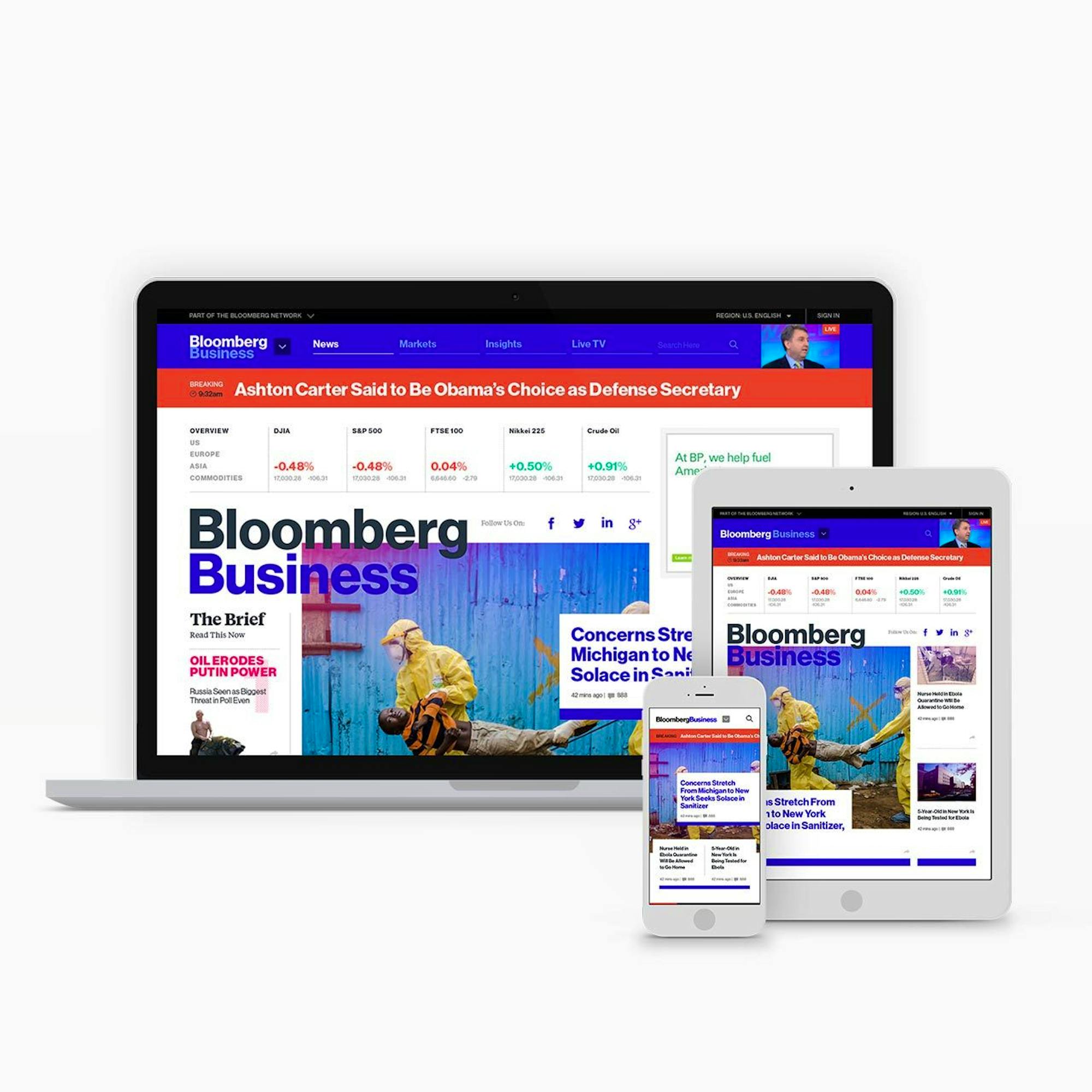
Bloomberg has always been very avant-garde and bold in pushing the limits of how to tell a story. The site is a reflection of that.
1
THE CHALLENGE
The challenge of bringing order and hierarchy to everything in the Bloomberg ecosystem started with a question: Who are we trying to reach?
As outlined in March 2014 by Bloomberg Media CEO Justin B. Smith, the goal was to broaden Bloomberg’s core audience beyond its traditional finance roots, towards global business.
Bloomberg Business was to be the centerpiece of that strategy.
The challenge, then, was how to accommodate both active and passive readers: from the hardcore business news junkie who needs fast, accurate, dynamic information about the markets, to the more casual topic-focused reader looking for Bloomberg’s take on the latest in technology or politics.
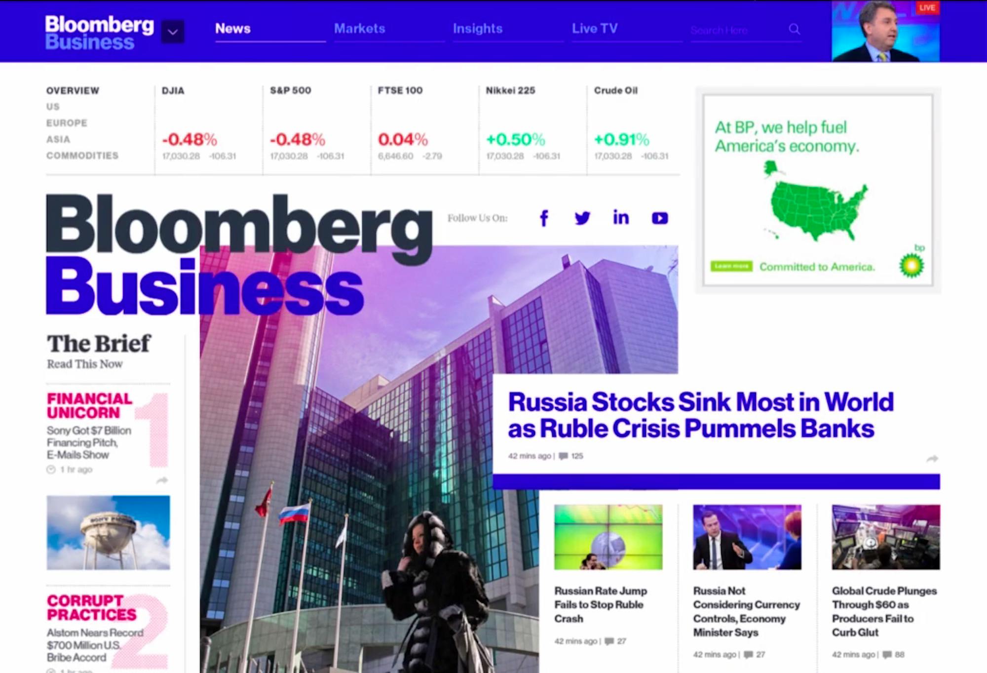
The solution was a flexible, modular design system that highlighted Bloomberg’s breadth of news coverage while encouraging deeper engagement into each vertical.
2
Design, Functionality and Purpose
The visual language of Bloomberg.com is a combination of aesthetics and function. From the bold colors, to the use of motion, to visual cues like breaker modules and pull-quotes—everything was purposefully designed to help move a user down the page.
The article page was a major focus of the redesign, as it’s often where users land first. It’s why we made sure visitors were presented with a variety of visual cues—or pathing options—to encourage a continuous, uninterrupted reading experience. For example:

— 01
A Progress Marker
A line at the top of the page tells readers how far along they are in the story.
— 02
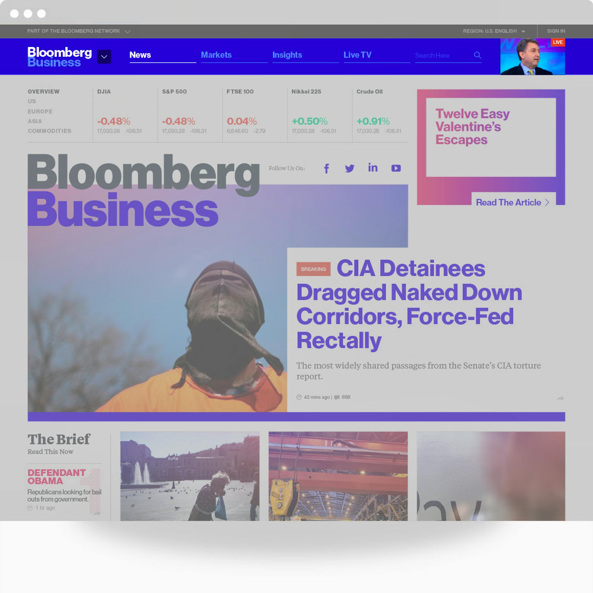
A Persistent Bloomberg TV Video Player
The player is always visible in the top navigation bar and allows for both active and passive video consumption.
— 03
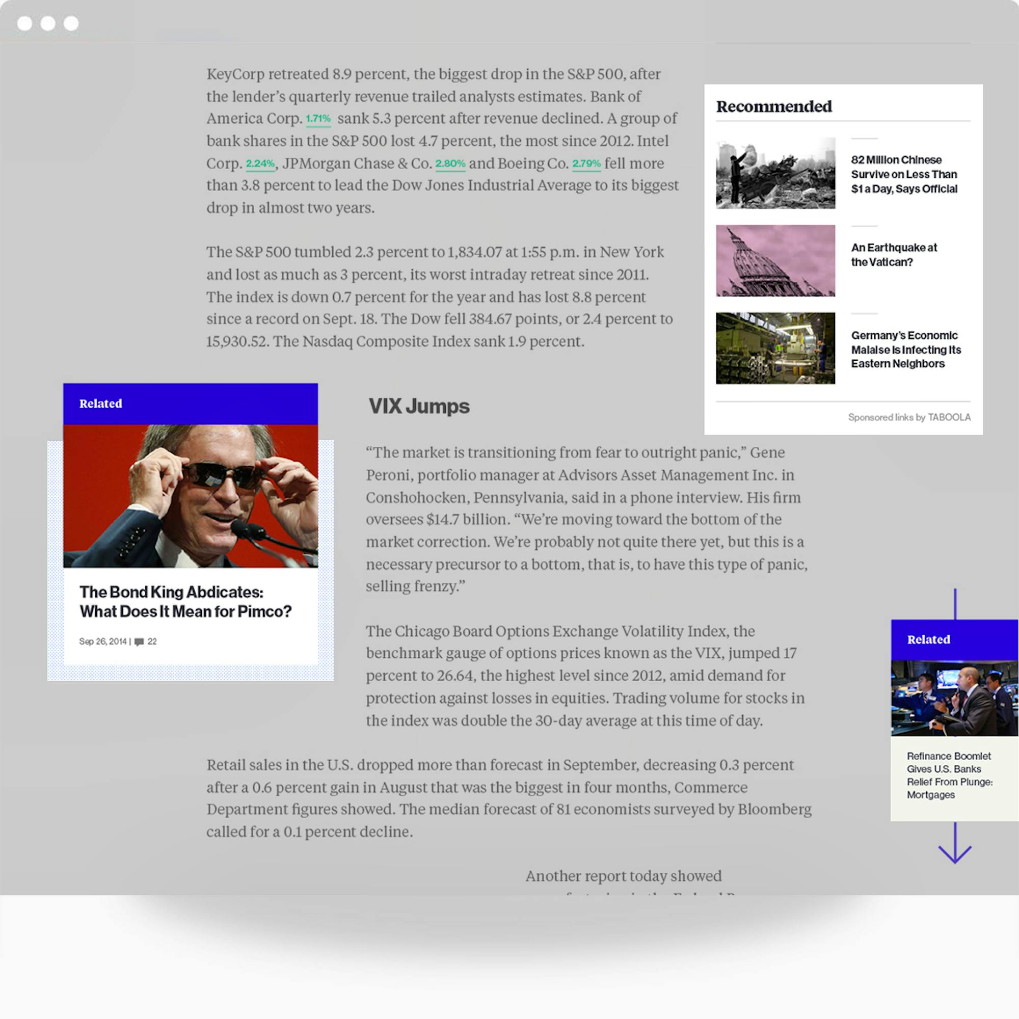
Relevant Shoulder Content
Adjacent to every story package is a grouping of relevant content to entice readers to discover more.

— 04
More Beautiful Ad Experiences
Building off of the custom ad strategy established in the design of Bloomberg Politics, Bloomberg Business takes things one step further. Our system of custom ad tools allowed Bloomberg’s ad partners to tell its unique story through a variety of units that connect a user’s scrolling behavior to the motion animation within the advertisement.
3
Story Development
To ensure that the visual treatment of every story matches its editorial importance in the news hierarchy, each content module—like live video feeds, image galleries, text, or pull-quotes—can be snapped together in near infinite ways.
Bloomberg.com can bend and flex with the news flow, and express editorial purposefulness. Consider this example:
Breaking the News
In late September, Bloomberg broke a major story about the sudden ousting of the founder of PIMCO, one of the world's most powerful bond funds. A bold, red headline is published at the top of the page.
Developing the Story
Several hours later, the story develops into a full-fledged feature story and is promoted at the top of the homepage.
Giving Context
Ten days later, editors gather supporting stories and related material to help contextualize the story arc and give readers a better sense of the history of unrest at PIMCO. The story becomes a multi-layer feature package.
Defining the Conversation
As the conversation gains momentum in the financial world, Bloomberg publishes a bold cover story—The Fall of the Bond King—and promotes it on the homepage and throughout Bloomberg.com.

4
The Response
Since its debut at the end of January, the bold, new Bloomberg.com has been the subject of heated debates in media and design circles.
Wired.com wrote that its “kaleidoscopic, modular design” heralded the “future of web news,” Venturebeat called it “seriously great,” and Nieman Journalism Lab wrote that the site aims to have the “visual and rhetorical oomph” to reach a broader audience for business news.
But the project didn't end there. Bloomberg and Code and Theory continued to explore how users interact with the site, with the goal of refining and optimizing the site functionality and features to accommodate visitor needs and changes in user behavior.


