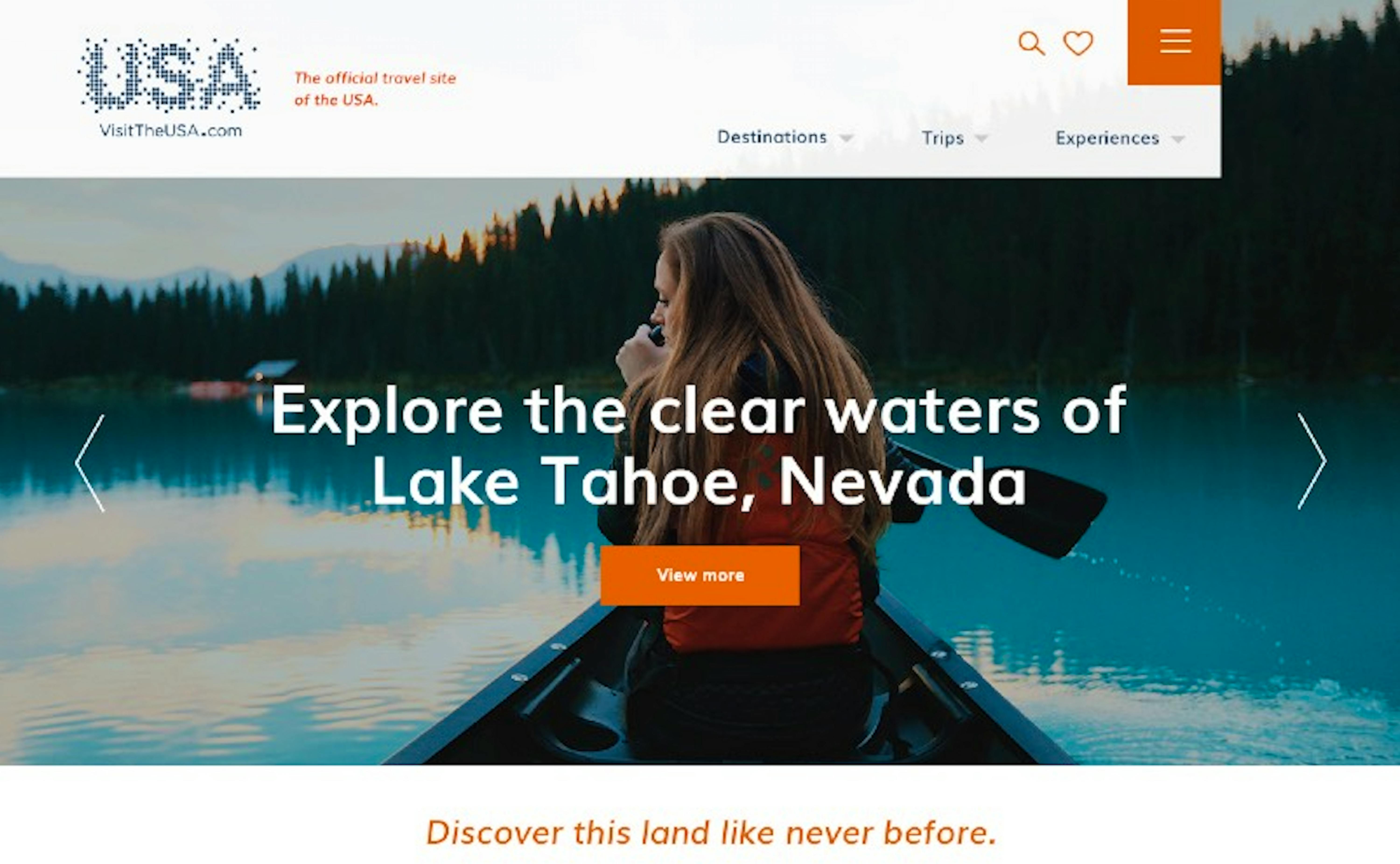
Amplifying the USA as an International Travel Destination
1
The Background
With 50 states, 180 national parks, 160+ cities and more than 1,000 experiences at reach, VisitTheUSA.com had no shortage of content to offer to its visitors. The website was also available in 8 languages and regional content supporting 14 countries.
In 2015, Brand USA asked Code and Theory to completely rethink how the USA should present itself to both inspire all world travelers and increase a declining number of visitors.
2
The Challenge
The USA has so much to offer visitors. How do we inspire travelers from 14 different countries by presenting content that best matches their individual interests?
3
The Solution
The website’s main role is to spark inspiration and drive users down the funnel to their partnering state and city DMO (destination marketing organization) websites, which support direct booking of attractions and hotels.
When it comes to what travelers look for in a destination, there are cultural delineations between countries—and in turn, each traveler’s interests are different.
From Surfing California to Shopping in New York
Presenting the exhaustive options of what it means to visit the USA can be overwhelming for the user. Showing family experiences to a single traveler, or adventure sports to someone who only wants to relax, is neither relevant nor able to transform digital users into potential visitors.
Our research, alongside the client’s data, showed early in the project that personalization should become a major focus.
Beyond defining the clearest navigation possible, offering appealing contextual circulation options, giving access to filters and an optimal predictive search tool—we worked to adapt the user experience as much as possible, in order to showcase user-relevant content.
Using a personalization engine (Acquia Lift for Drupal) and a consistent global taxonomy, we were able to design flexible and modular pages that rearrange content dynamically. Content would adapt depending on the user’s interests and behaviors, being informed by every browsing session and personalizing over time.
4
The Results
A Clear Interface that Hides the Massive Quantity of Content to Show only User-Relevant Highlights
The website allows users to intuitively navigate 15,000 pages of content in 14 countries and gives Brand USA the ability to update and adapt the content dynamically for each market in an efficient manner.
The website’s most notable features include:
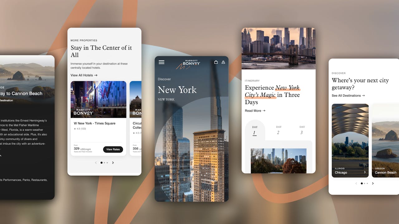
An omnipresent map widget — Accessible everywhere and adapted to the context, the map gives the user a sense of place by showing the points of interest mentioned in the articles as well as trip itineraries. Users can bookmark favorite spots for later.
Trip ideas — Describing experiences that could be done in one hour or one day is not enough to inspire travelers (and has been done before by state & city travel websites). The mission of the website is to foster the discovery of trips that span several states and cities. Trips are a curated sequence of destinations and things to do—showcased in a specific interface with inspiring media plus useful information embedded in a multi-steps itinerary.
Choose your adventure — Big-city glamour or small-town charm? High-octane adventure or supreme relaxation? A playful quiz lets the users express their interests by choosing between a series of 2 suggested activities, then delivers matching suggestions.
