H&R Block Tax Calculator Services
H&R Block locations across the United States are dedicated to offering a helpful and effective way for customers to complete the stressful task of preparing their taxes. However, their online tools lagged behind the in-store experience and often left users confused.
In July 2014, H&R Block hired Code and Theory to evaluate their existing online tax calculator and find a way not only to improve the user experience but to make it a valuable resource in educating and converting new customers.

The H&R Block Tax Calculator was intended to serve as a tool that enabled users to learn about their tax return and calculate their projected refund in an easy, convenient and manageable way. We immediately saw that the lack of information architecture, system bugs (periods and commas could not be entered into the form), and slow load times meant users could not accurately complete the forms. Further, their tool often caused more stress with a cluttered and confusing interface that compounded information input problems and resulted in wildly inaccurate refund predictions.
How can H&R Block deliver an elegant and accurate tax calculation tool that genuinely helps customers and drives sales?
1
The Experience Insight
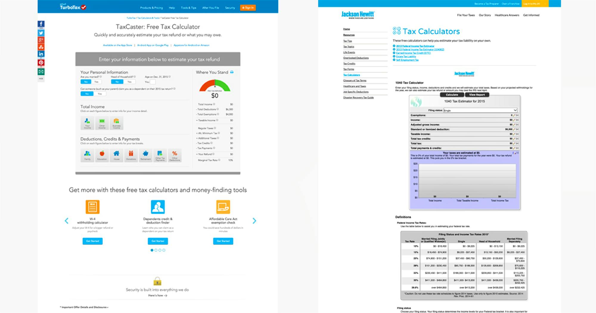
After auditing competitor systems, we were faced with two prevalent design philosophies for online tax forms: an endless stream of “yes-no” questions (i.e. TurboTax), and a model that focused on more narrative and contextual questions to gather information (i.e. Jackson Hewitt).
In order to validate the effectiveness of these two concepts, we conducted intensive in-person user testing and research. We asked 32 participants from two distinct parts of the country—Austin, Texas and Chicago, Illinois—to take part in our user testing experiment. Each participant was assigned a “role,” given time to delve into character, and asked to interact with the system in every possible user scenario the system could encounter.
Our team tested the two prevalent concepts against the existing H&R Block calculator. None of them worked.
Our research revealed major limitations to both design approaches, forcing us to invent an entirely original approach.
2
The Solution
Reaching a Middle Ground
H&R Block’s new tax calculator was created as a hybrid of the two models. The hybrid model incorporated the clarity and simplicity of the question model and the thoroughness and accuracy of the contextual model while eliminating the tediousness of both. To improve the speed of the process, the hybrid model grouped together specific questions regarding personal information, sources of income, and sources of expenses, as opposed to asking for this information one question at a time. More detailed form fields were then delivered to the user based on the specific answers they chose. Each form was presented sequentially to avoid overwhelming users and to ensure accuracy.
Lending a Helping Hand
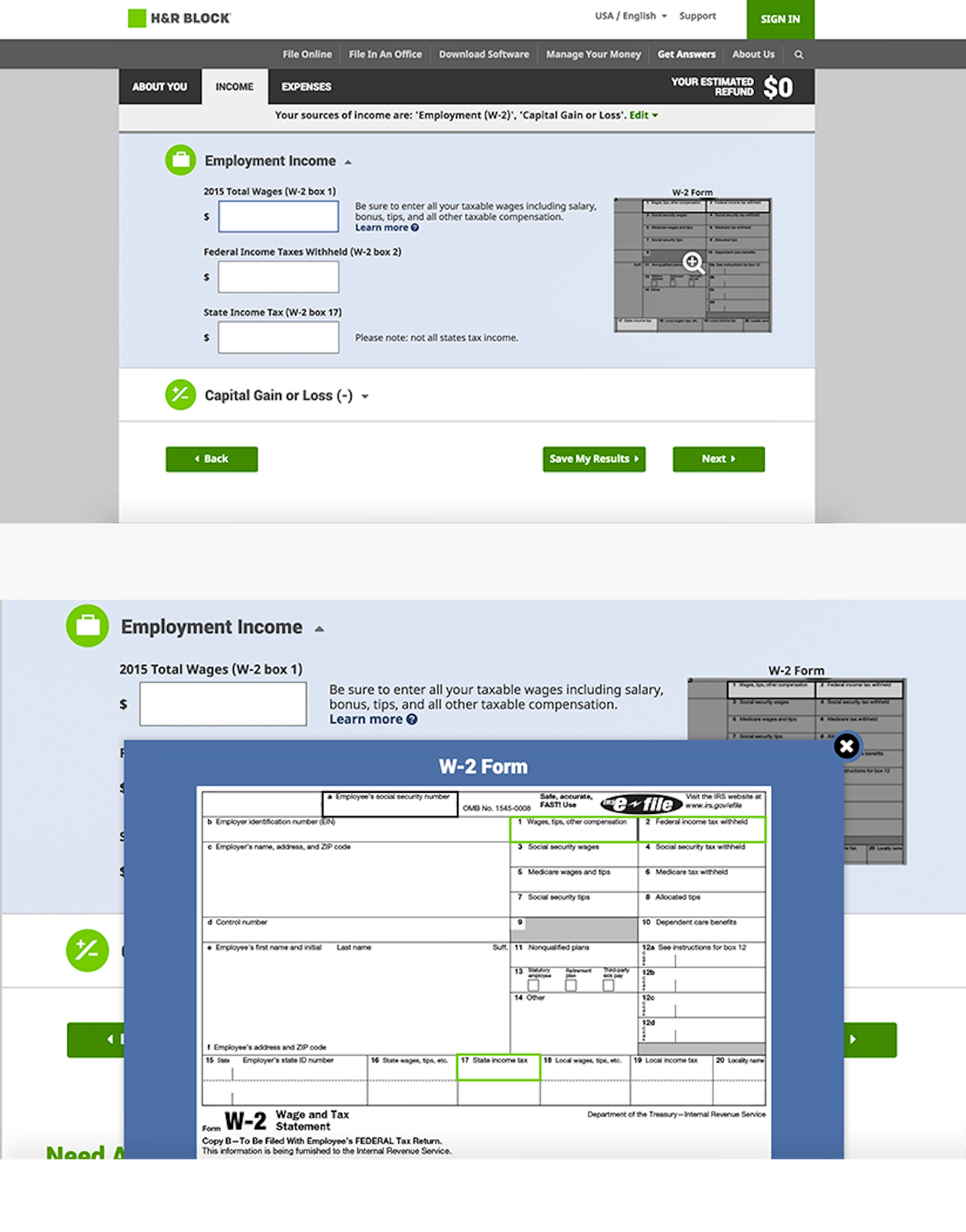
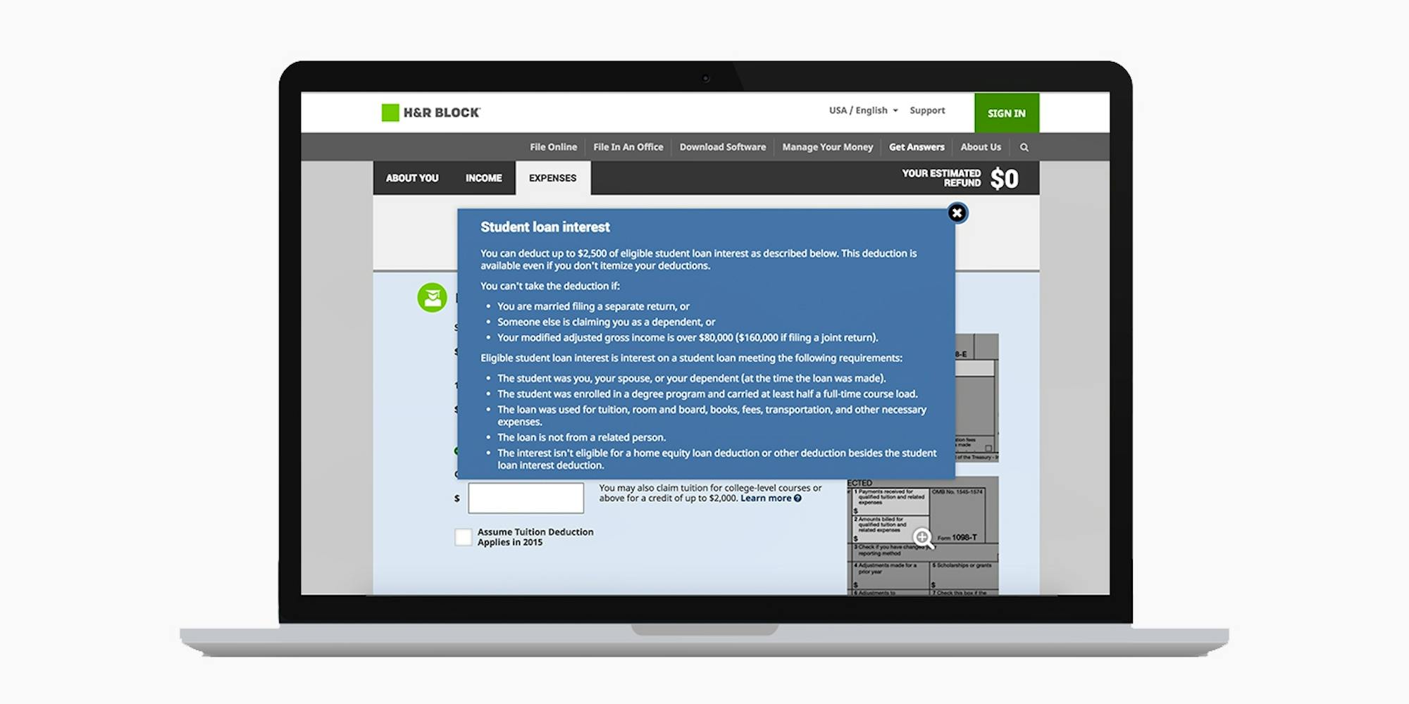
To prevent confusion and drop-off, detailed information and definitions were provided for familiar and unfamiliar concepts and terms. By simply clicking on a question mark, users receive a pop-up that presents the term in the context of the relevant tax form with specific definitions and explanations. Additionally, an easily-digestible image displayed the relevant print version of the form section alongside the online form, allowing the user to follow along with printed forms delivered by banks and employers.
Bringing the Tool to the Customer
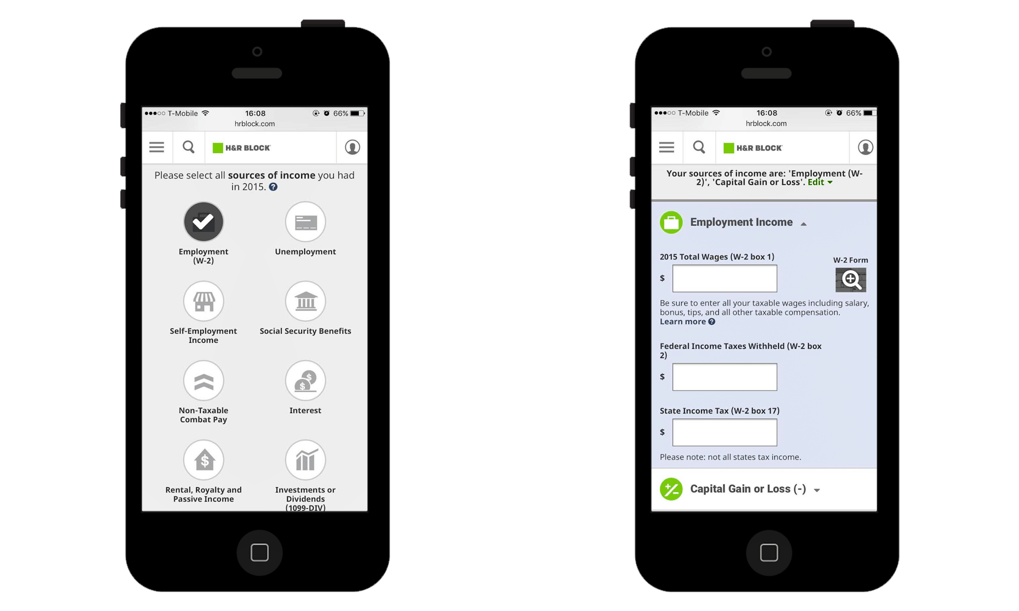
To improve reach, we helped H&R Block use elements of their calculator tool in a rich media advertisement that could be recirculated on other sites, capturing customers outside of H&R’s direct orbit.
To simplify the process further, information added by a user in the ad was captured, saved, and moved into the full H&R Block site experience after clicking.
3
The Results
Since launch, the H&R Block tax calculator, designed by Code and Theory, has more than doubled the speed of completion compared to the previous tax calculator—and compared to the competition. Gone are the days of missing commas and zero returns, with users completing the tool with nearly 100% accuracy.

