NBCUniversal.com
Links
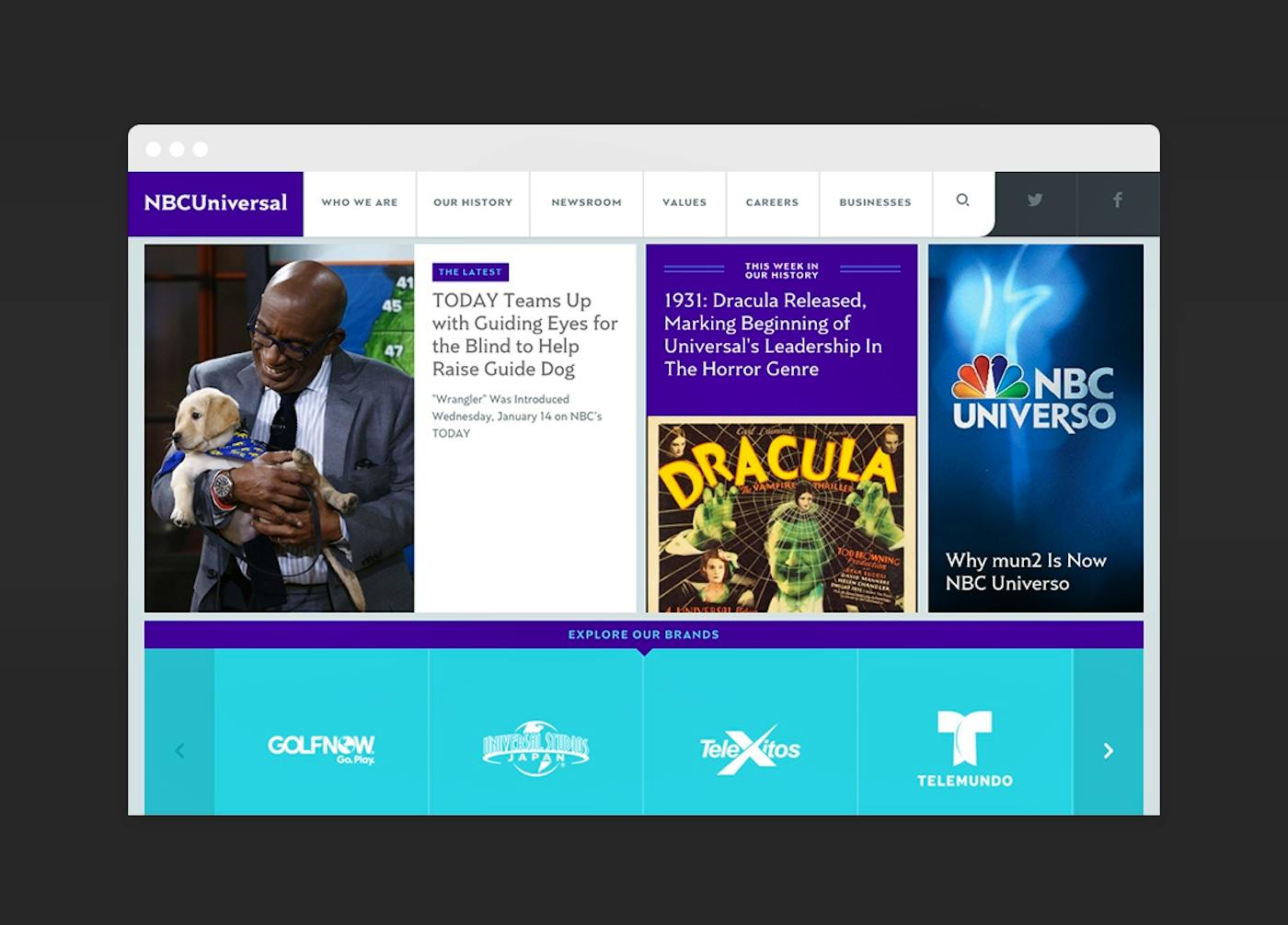
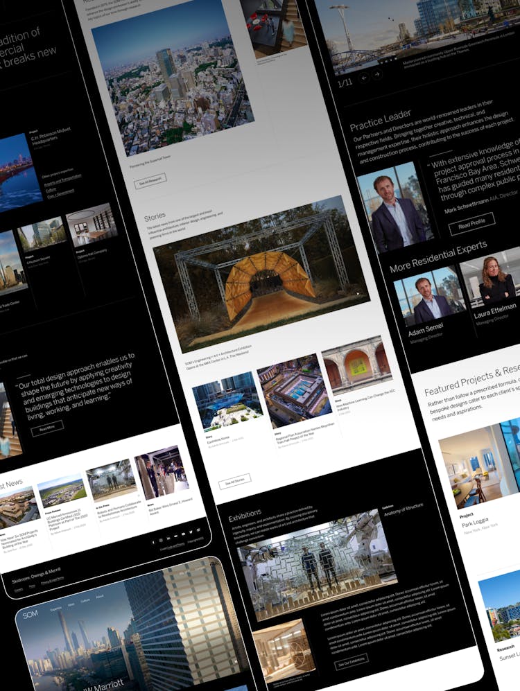
NBCUniversal.comNBC Universal, one of the world’s premier media and entertainment companies, came to us with a singular goal: Make NBCUniversal.com a better digital showcase for the company’s thought leadership, innovation and news.
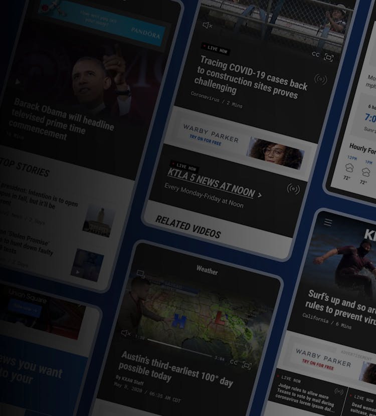
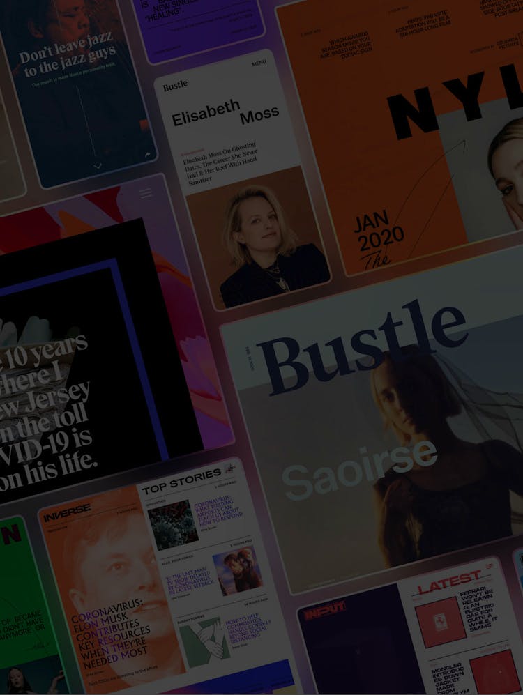
With more than 100 brands spanning TV networks, theme parks, internet-based businesses and more, our challenge was to create a flexible, scalable site that unified the NBC Universal voice across all properties and better highlight its robust, engaging content.
1
Simplicity Is Key
Visitors to NBCUniversal.com range from job hunters, to the press, to industry peers, consumers and investors.
While each person has a different vantage point and motive for visiting, no one should have to do much work to find what they’re looking for. So, we took a hard look at the current site and assessed everything from the architecture to the overall tone. Collaborating with the NBCUniversal team, we focused on two key changes that would lay the foundation for the new design:
A Clearer Taxonomy
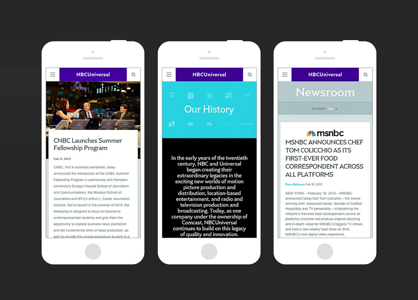
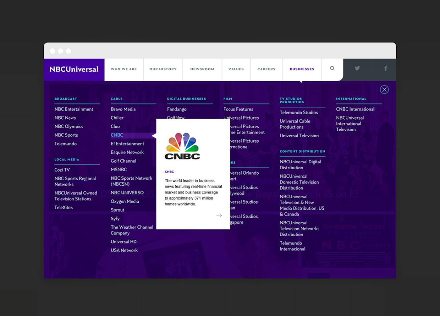
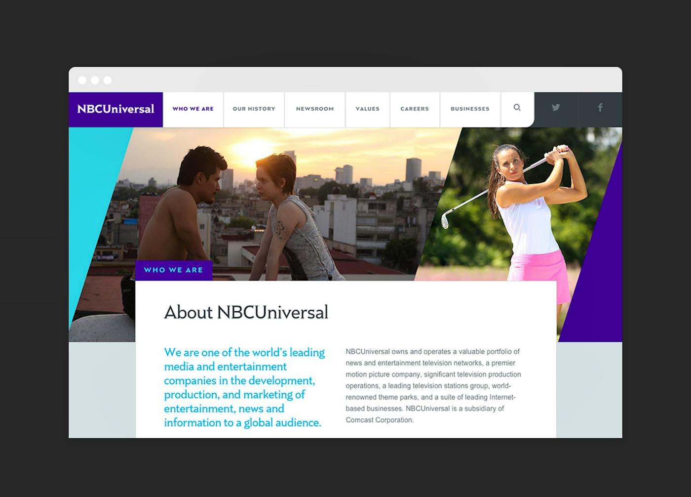
On the old website, the pages that told the strongest brand narrative were buried within the “Corporate” tab. In rethinking the taxonomy of the new site, we chose a structure that was more familiar to web users and surfaced the most important content. For example, the navigation bar focuses more on the company narrative (e.g., About Us, Our History), and the “Businesses” tab offers a more simplified way for users to learn more about NBC Universal businesses. Simply hover over each division, and a business card pops up with a quick summary.
A Simpler System
We implemented a modular system to make changing the content layout and hierarchy quick and simple. The new NBCUniversal.com is built on a scalable structure that can easily grow with the site into the future as content and technologies evolve.
2
Maximizing Resources
A new website design should never increase the editorial burden on the employees responsible for keeping site content fresh and up to date.
So, in designing the new NBCUniversal.com, the idea was to maximize every resource available to us.
We knew the breadth and depth of NBC Universal’s content offerings across all properties was huge—from press releases and whitepapers to videos, photos, articles and innovation profiles. There would never be a shortage of great content.
Our strategy? Make it easier than ever for NBCU employees to get that content onto the site.
For example:
Sourced Content
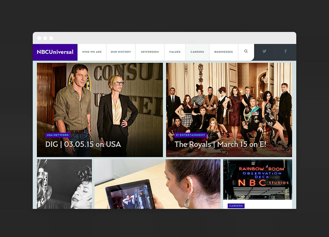
– We pulled in visual and multimedia content from multiple sources to make the site feel timely and exciting.
Automation
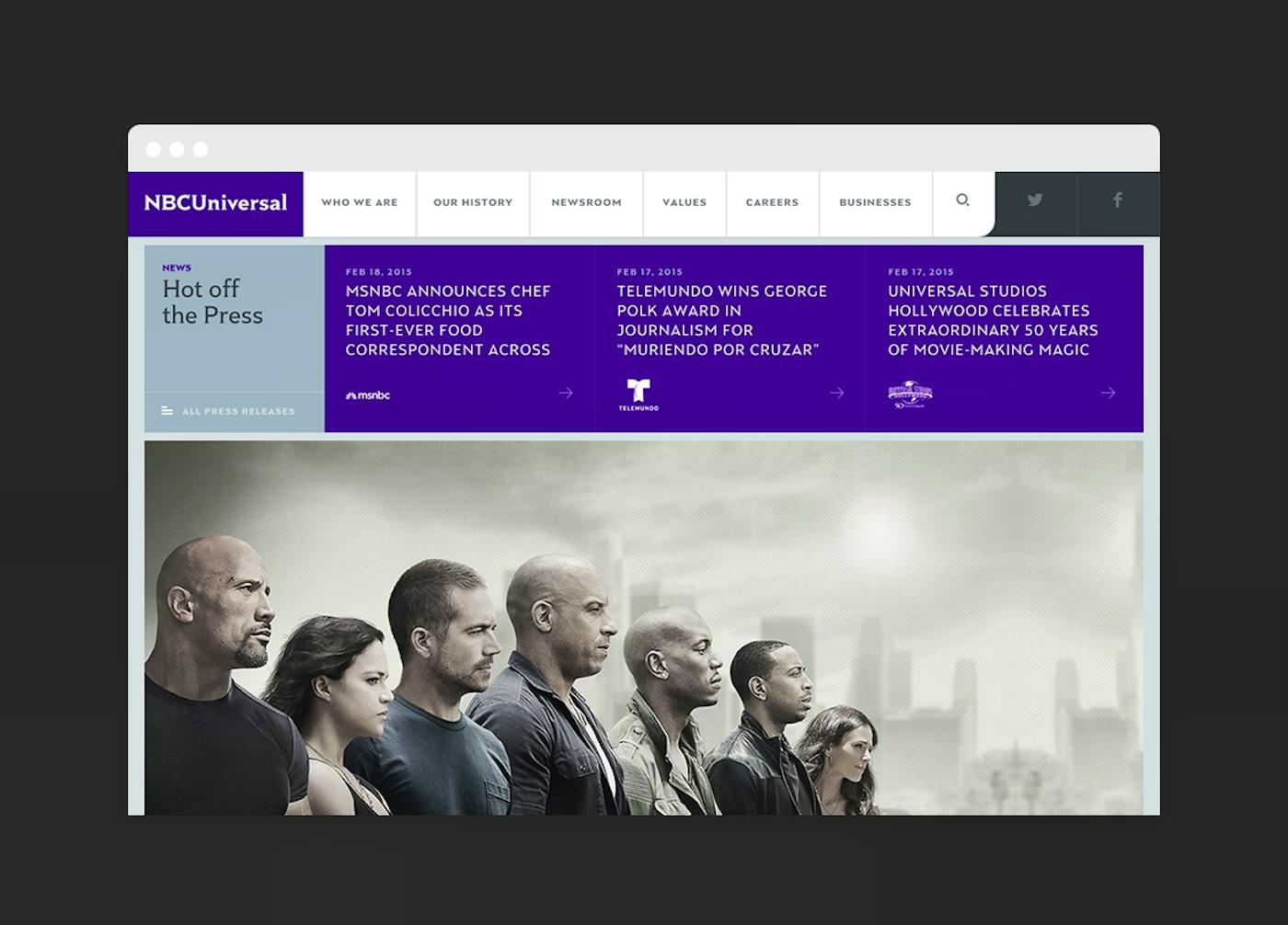
– We leveraged automation and feeds to publish more content without putting additional pressure on staff to have to produce content from scratch, or re-format content to fit within the site’s content management system
RSS and APIs
– We tapped into RSS news feeds and social media APIs to generate rich, dynamic content with little manual effort.
3
A Storytelling Showcase
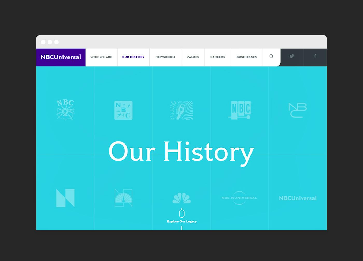
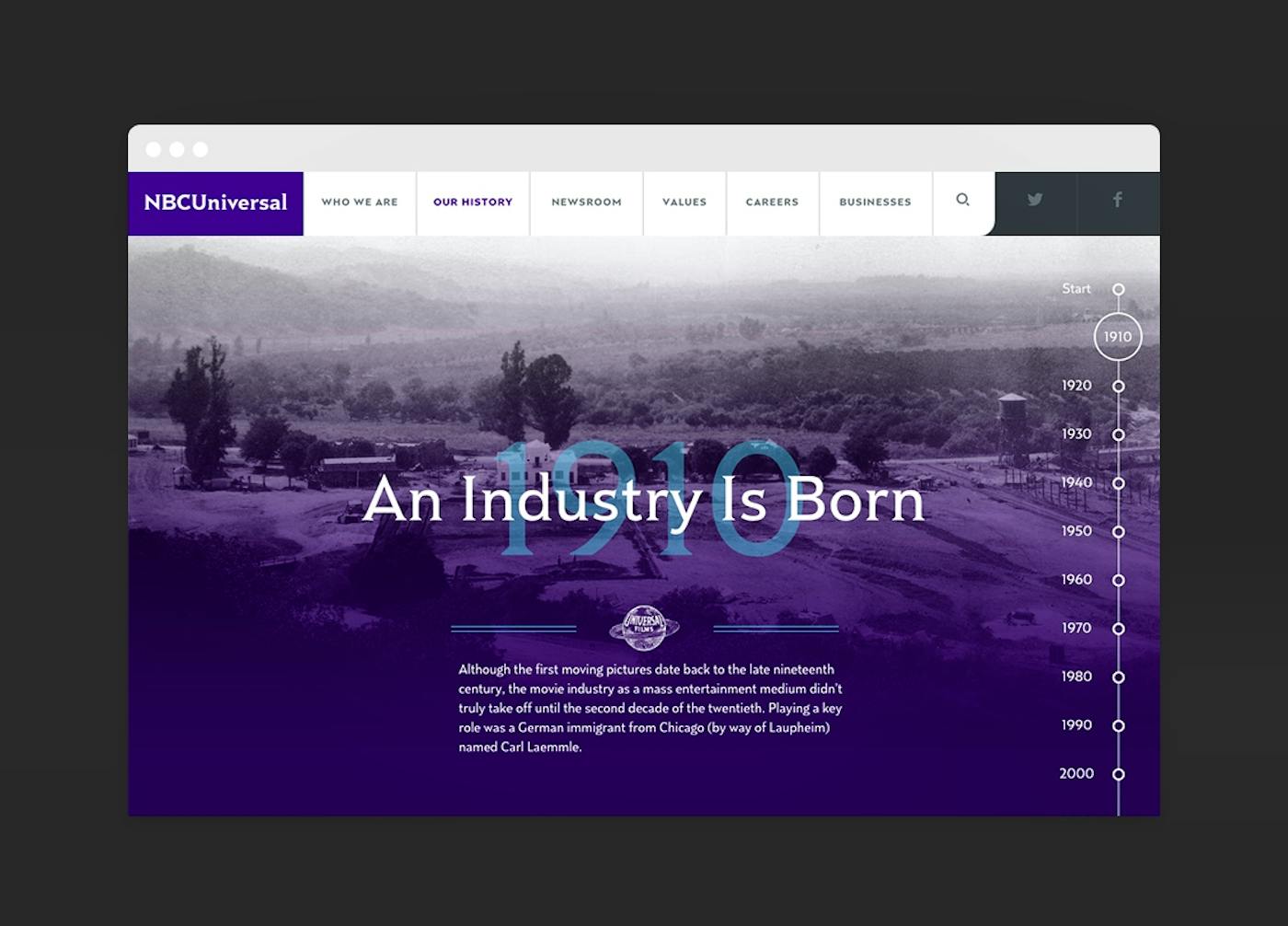
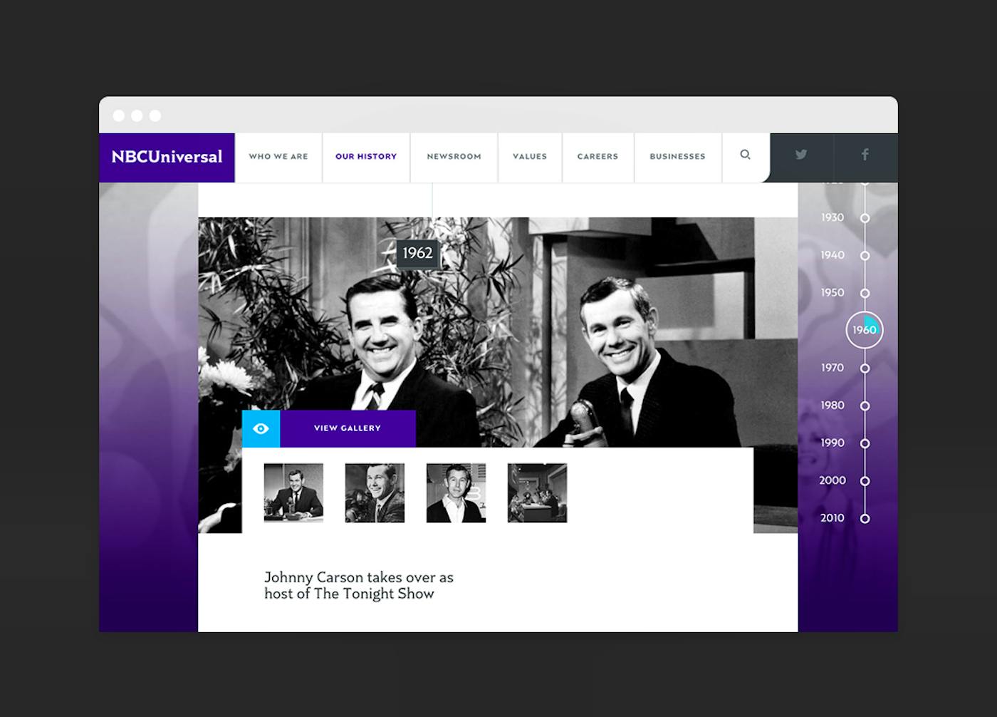
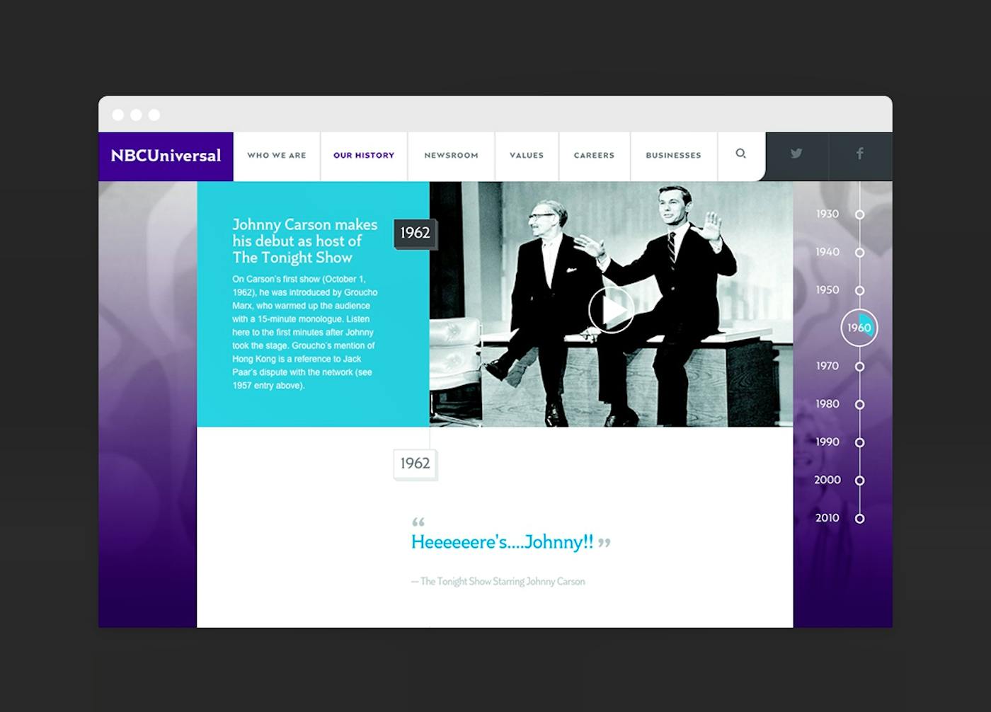
A company timeline is a simple, beautiful way to tell a brand’s story.
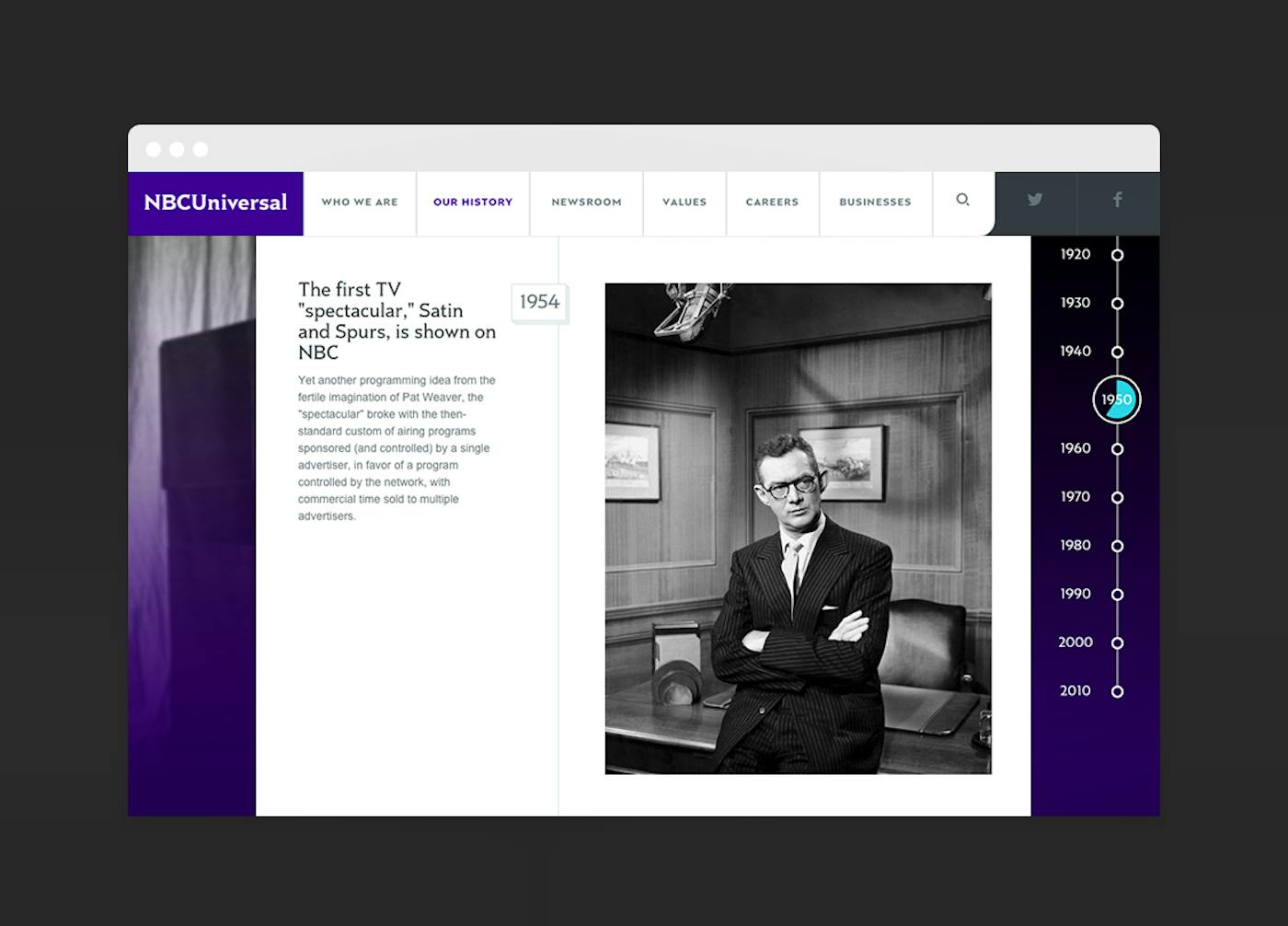
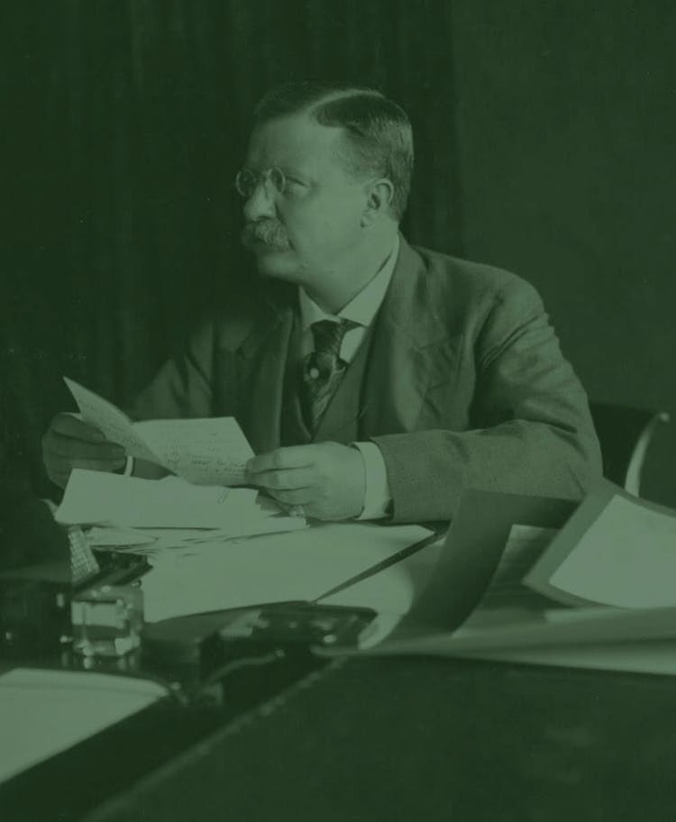
It’s why we totally overhauled NBC Universal’s previous company timeline, making it an immersive, interactive page with decade jump points and multimedia content. We worked with NBCU to surface major milestones, and ensured that the new timeline could easily be updated by staff.
At launch, the new NBCUniversal.com became a powerful tool that allowed NBC Universal a better way to communicate its incredible history, and tell its evolving story at every moment it unfolds.
