Rockwell Group
What if a company’s website could completely immerse you in its stories? What if its stories were the stage?
That was the guiding principle behind the new responsive website for Rockwell Group, one of the most influential architectural design groups in the world.
More than just a new digital platform to showcase its work, the new rockwellgroup.com invites users to explore the firm’s 30-year history in design, and allows its employees more flexibility than ever to share its creative process—from ideation to execution.
Code and Theory was an ideal collaborator to help us develop a framework for an editorially-driven, content-rich digital experience.
1
Encouraging Serendipitous Discovery
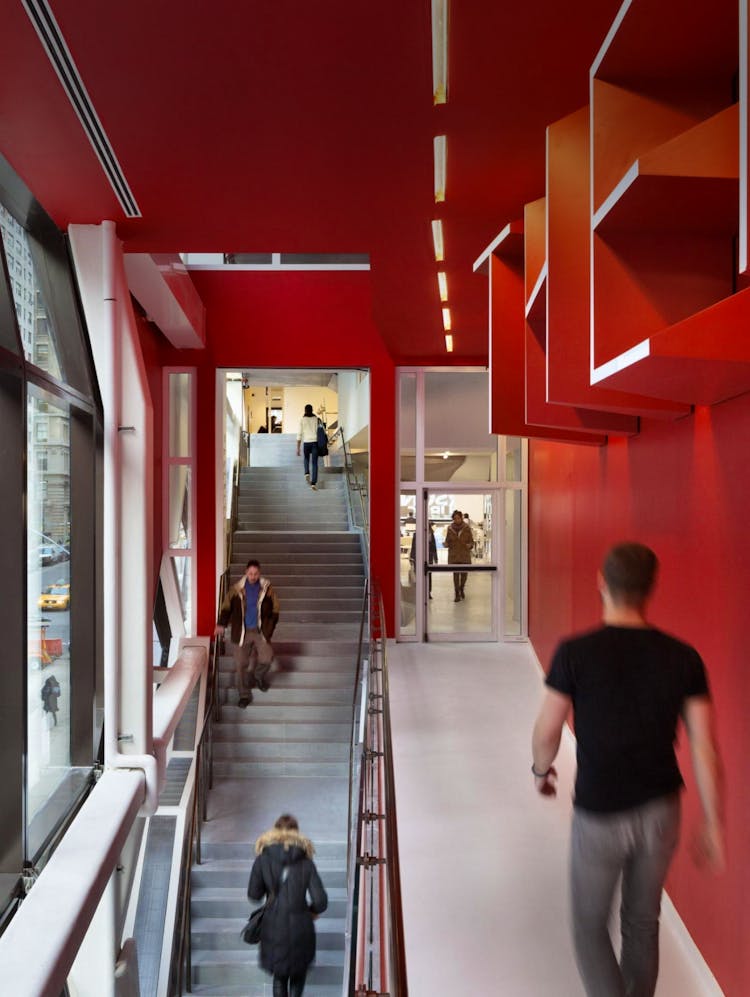
Rockwell Group has designed everything from restaurants, to hotels, to playgrounds, to theaters, to grills.
At the very start of the engagement, Rockwell Group and our Code and Theory team recognized that the firm’s diverse offerings did not fit neatly into defined categories. It didn’t make sense to limit them to a traditional navigation and content structure.
We set out to build a site that encouraged endless discovery.
— 01
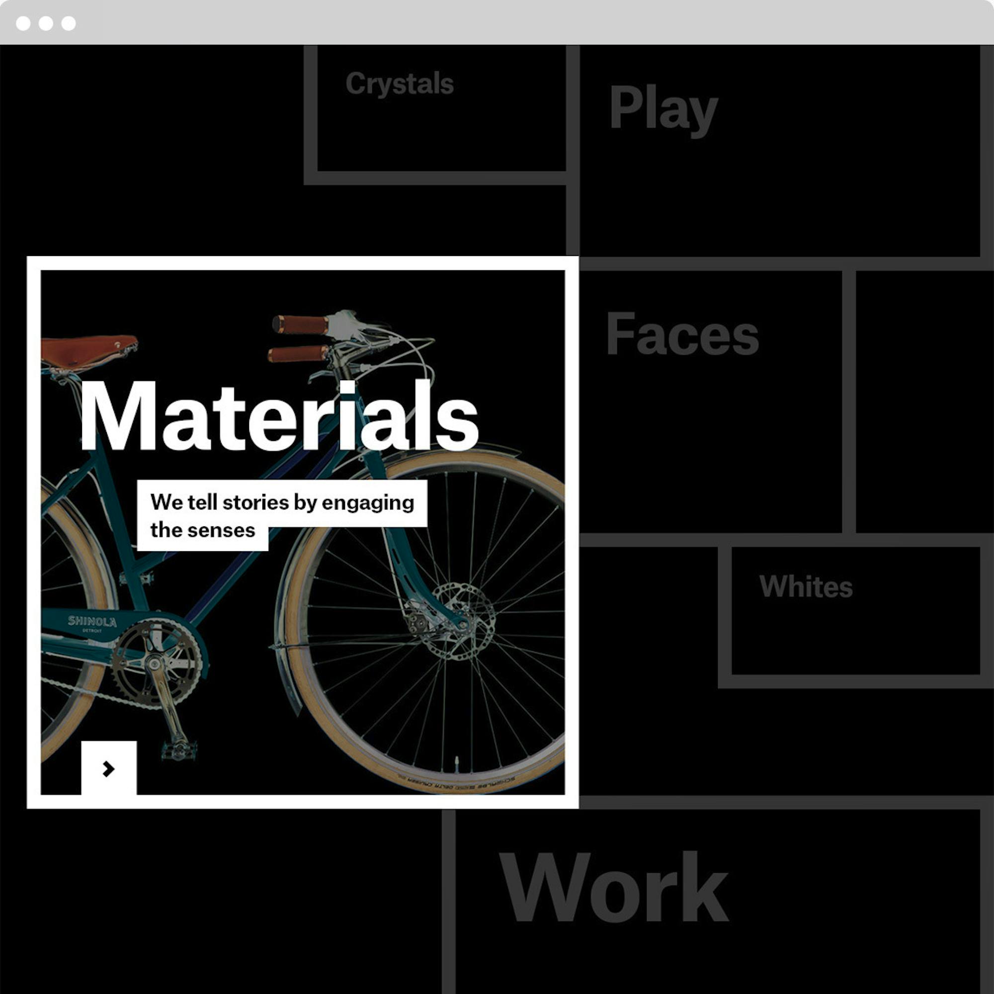
A Cabinet of Curiosities
This special section allows Rockwell Group endless flexibility to showcase its breadth of services and insights in a non-linear way. It acts as a playground of sorts, where Rockwell Group can explore different themes around their core beliefs, thought starters, or points of interest.
— 02
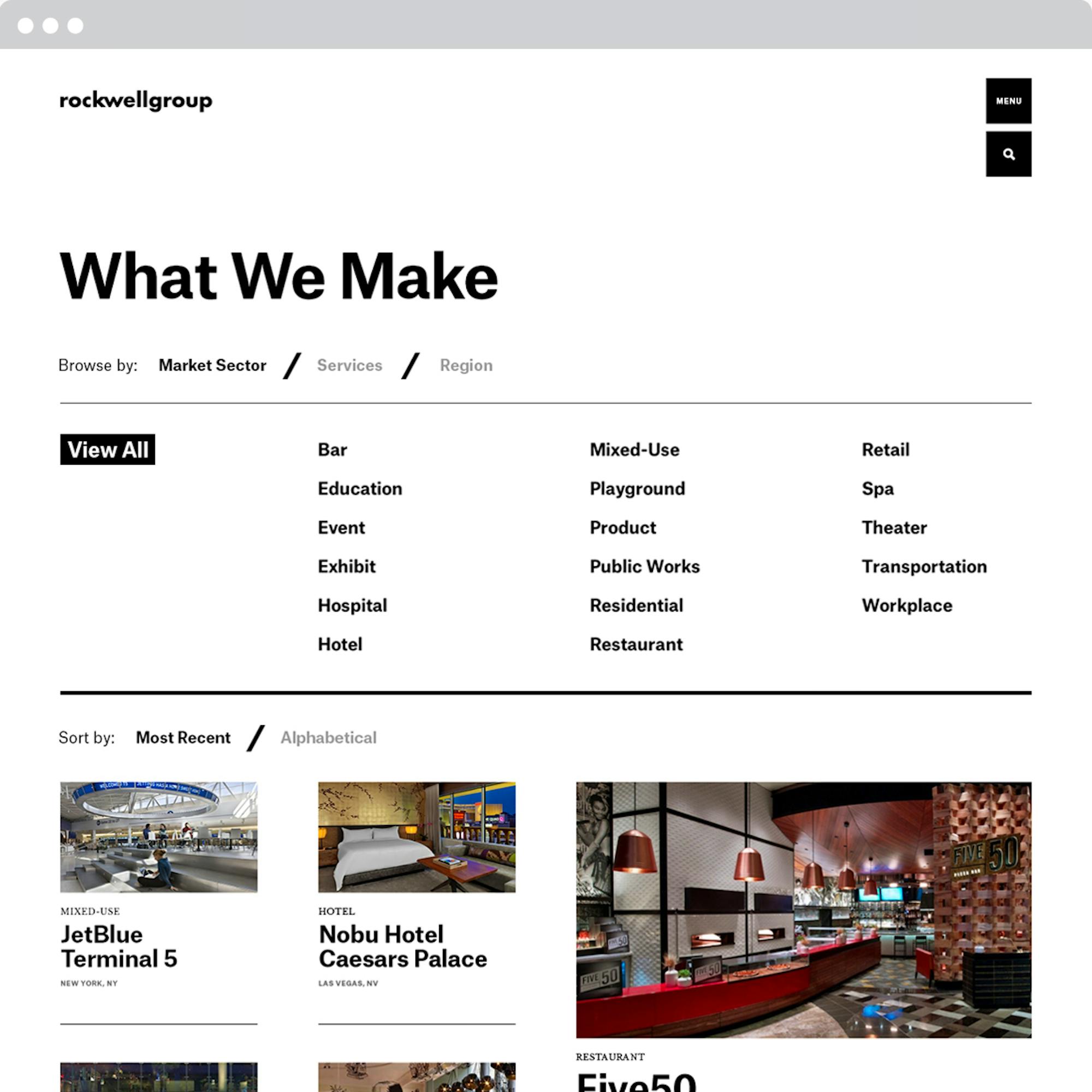
An Elegant Search
Visitors to Rockwell Group’s website either know exactly what they’re looking for, or are looking for inspiration. It’s why the new content structure and navigation in the “What We Make” section was designed to be a much more intuitive and easy way to help anyone find what they’re looking for, or discover new projects or ideas that they might not have considered.
— 03
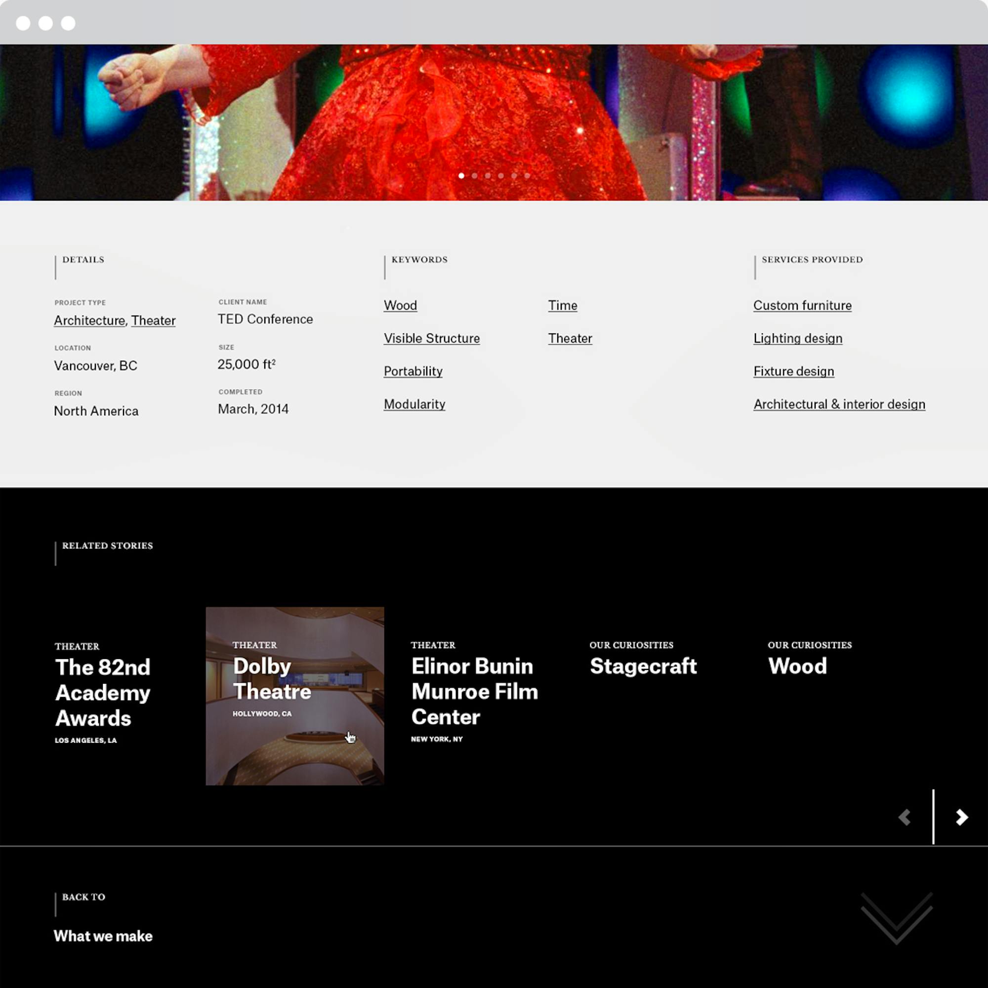
An End That’s Really Just the Beginning
A “transporter” feature is integrated throughout the website, which allows users to continuously scroll right into another project, curiosity, or section page.
2
Deconstructing the Project Case Study
The project pages on the new rockwellgroup.com focus on the rich story of the space, from the very beginning to the very end.
The Beginning
Rather than start with a straightforward task or challenge, most project stories start with a high-level question to set the stage. For example: "What if your environment transformed with every step?" or "What if a restaurant could vanish at a moment’s notice?"
The Middle
Every story is meant to surprise and delight the reader with a narrative that is highly-immersive and engaging. Each piece of the website represents the user unwrapping and unfolding each story as he or she browses through. The point was to envelop users in every moment of the project from beginning to end, and encourage them to complete each journey.
The End
To Rockwell Group, the completion of any project is just the beginning of its life. To celebrate this rich afterlife, we incorporated modules like social media—which can pull in content from Instagram and Twitter to expose users to how the space is being used over time. It also feeds in news articles and announcements.
3
Marrying Physical and Digital
For both Rockwell Group and our Code and Theory team, designing the new rockwellgroup.com was as much a creative exercise in the importance of storytelling in business, as it was about the ever-increasing overlap of digital and spatial design.
Like every Rockwell Group-designed space, there is an underlying intelligence to every section of the website.
It’s a website that acknowledges that spaces and ideas are living, breathing things, and celebrates them in a unique way. The site has already ignited a whole new way for Rockwell Group to talk about the work they do, and the impact it has on the world.


