The Council on Foreign Relations
Links
CFR.orgThe Council on Foreign Relations (CFR) has established itself as a leader in international relations, providing nonpartisan in-depth analysis and policy recommendations on foreign affairs since 1921. As a nearly 100-year-old organization with a 10-year-old website, CFR needed a digital refresh to modernize the site and enrich its publishing capabilities.
The Council on Foreign Relations (CFR) is an independent, nonpartisan membership organization, think tank and publisher dedicated to being a resource on foreign relations. The organization helps people better understand the world and the foreign policy choices facing the United States and other countries.
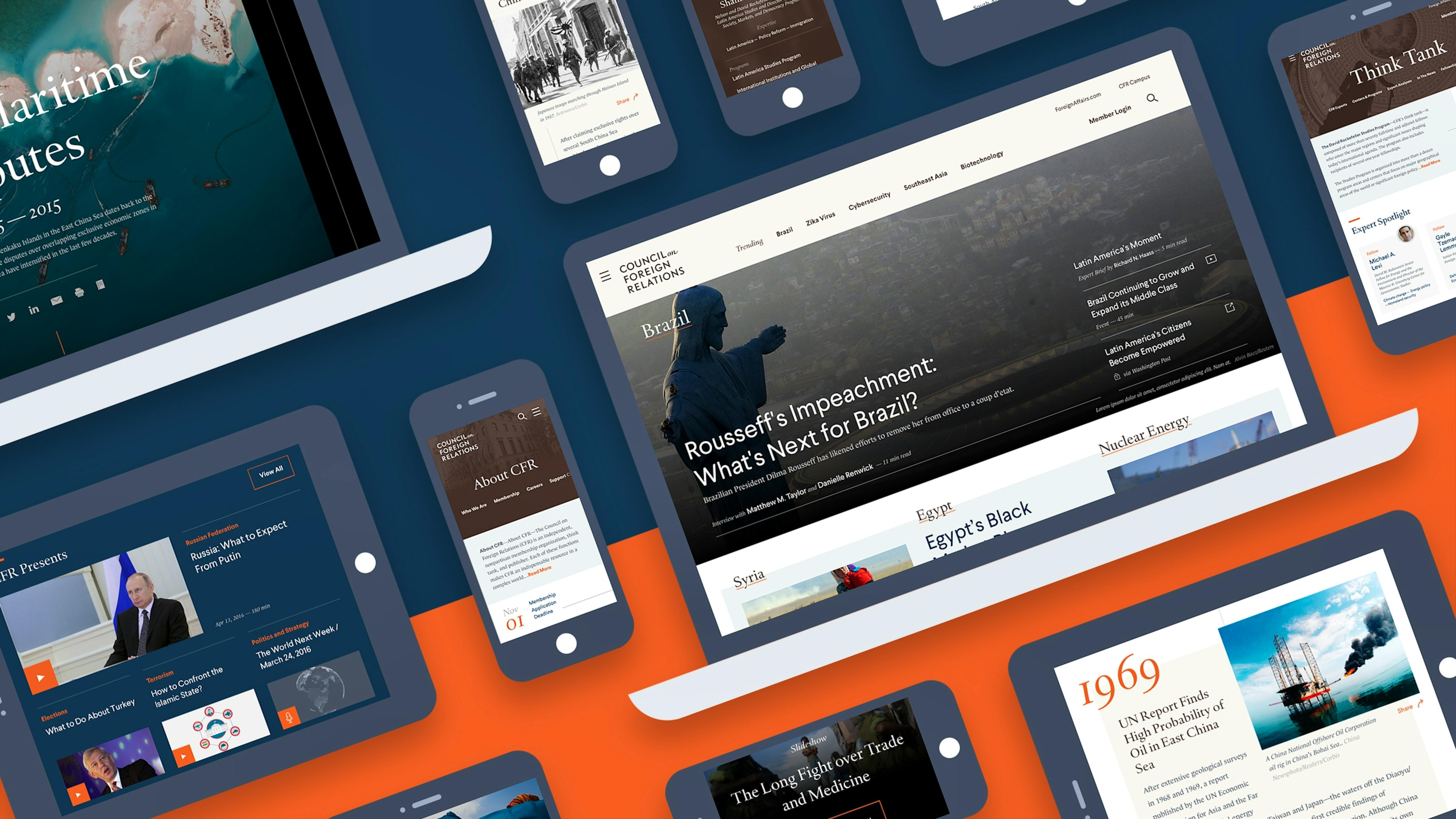
Code and Theory partnered with CFR to re-platform its flagship digital property, CFR.org, with the goal of modernizing its look and feel while maintaining its heritage, authority and prestige. This included creating a refreshed user experience that captivates users ranging from expert to novice and supports the organization's mission to expand and inform foreign policy conversation in the United States.

1
The Challenge
A Siloed Experience Lacking Flexibility
While CFR's original website offered incredibly rich content ranging from editorial pieces to long-form think tank reports, the site's organization made it hard to access. Code and Theory was challenged with creating a cohesive site experience that would be clear for users and streamlined for internal teams.
The site's static template-based system needed to be shifted to a more flexible, modular approach so that a wide variety of content creators could build out what they needed without using totally separate design systems.
2
Experience Insight
Understanding the Wide Variety of Audiences
CFR offers a unique mix of analysis, background information, context, policy recommendations and deep-dive policy study across a tremendous range of issues. It is a trusted resource for journalists, government officials, educators and students, civic and religious leaders, business executives and CFR members.
This wide variety of audiences means users with only a basic understanding of a foreign policy issue may come to the site looking for more background and context. Other visitors might be looking for expert commentary and recommendations while crafting actual foreign policy.
This spectrum of familiarity with the material challenged Code and Theory to develop innovative ways to help users find the right content based on their level of understanding.
3
The Solution
Foundational. Editorial. Institutional.
From the inside out, we built an ecosystem that promotes content to its fullest potential through a user-centric site architecture powered by a new collaborative editorial workflow that democratized content creation and empowered content creators. Content across all formats is dynamically aggregated into rich topic pages enhancing the experience for users without adding additional editorial burden.
The new platform is built around flexibility, variety and scalability. Moving away from static page templates, a modular system offers reusability and makes it possible to grow the site as a system.

Communicating the Breadth of Offerings
To improve discoverability, the site taxonomy was refreshed to surface more user-friendly terms that still meet the needs of the internal teams. Site search was reimagined, delivering better visibility for experts, making it easy to find and filter content across all formats, and dynamically displaying related content hubs like topic pages and program pages. To better leverage side-door traffic, trending keywords were added to the global navigation, improving the communication of important issues in CFR coverage.
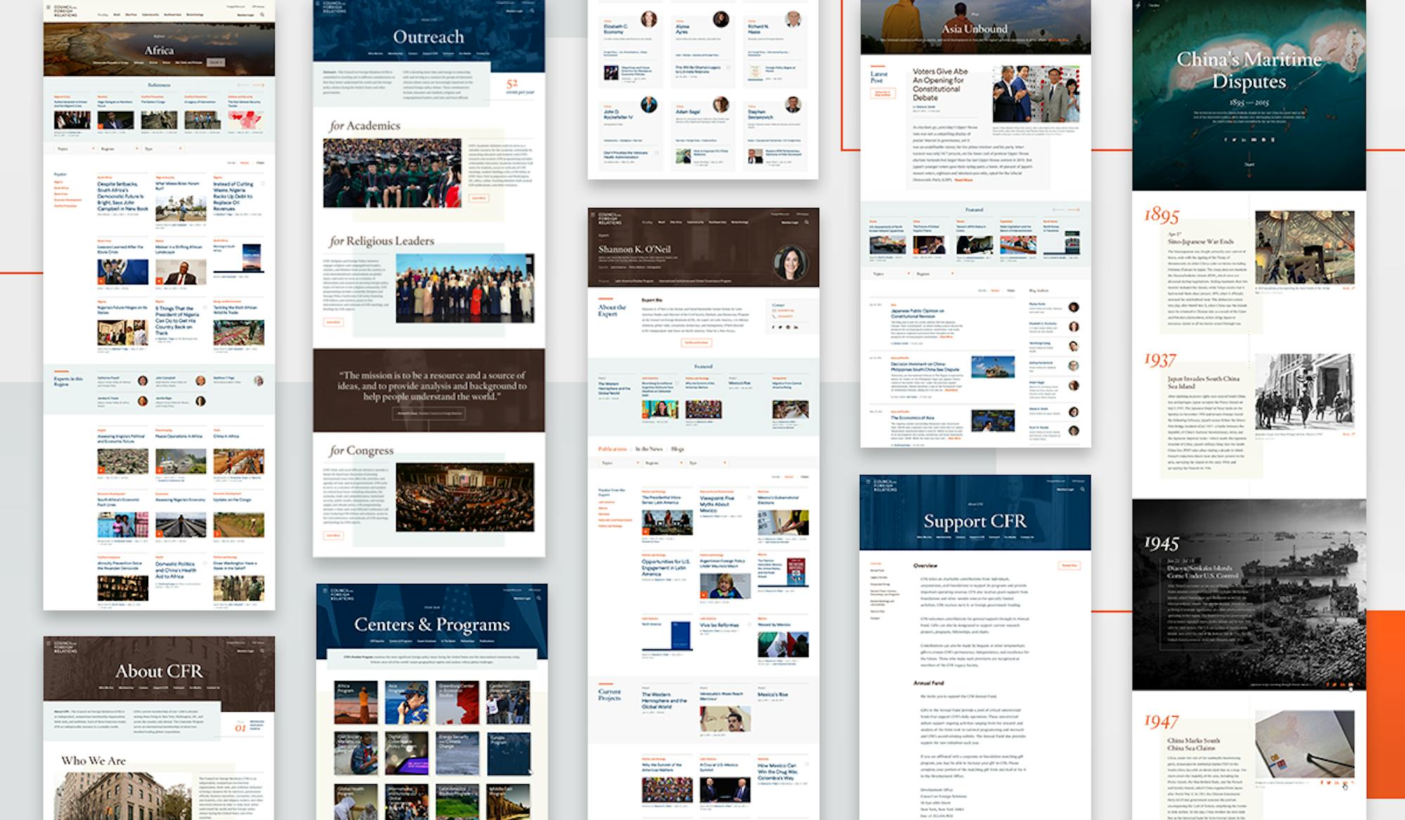
To better promote the offerings of the organization, we gave special attention to informational pages, building a modular system that worked for hundreds of largely evergreen pages. This makes it easier for visitors to easily understand what CFR does and get involved with membership programs, education initiatives and outreach programs.

An Immersive Reading and Watching Experience
The primary component of the site is a vast number of articles of varying lengths and “reading levels.” To empower the authors and editors, an article toolkit was developed, offering a set of features that can be used directly from the CMS by anyone. While the old site required special teams to develop assets and only selective use of publishing features, this new article system offered the full suite of options (with a low learning curve) to all publishing teams.
A suite of user-centric features were also developed. Top-of-page pathing allows users to easily find related content from novice to expert; a seamless transporter at the end of the article offers related options. For event videos, we introduced a chaptering system to help users navigate long videos and built an interactive transcript and mini video player that makes it easy to watch the video while reading along.
4
The Conclusion
A Modern & Responsive System
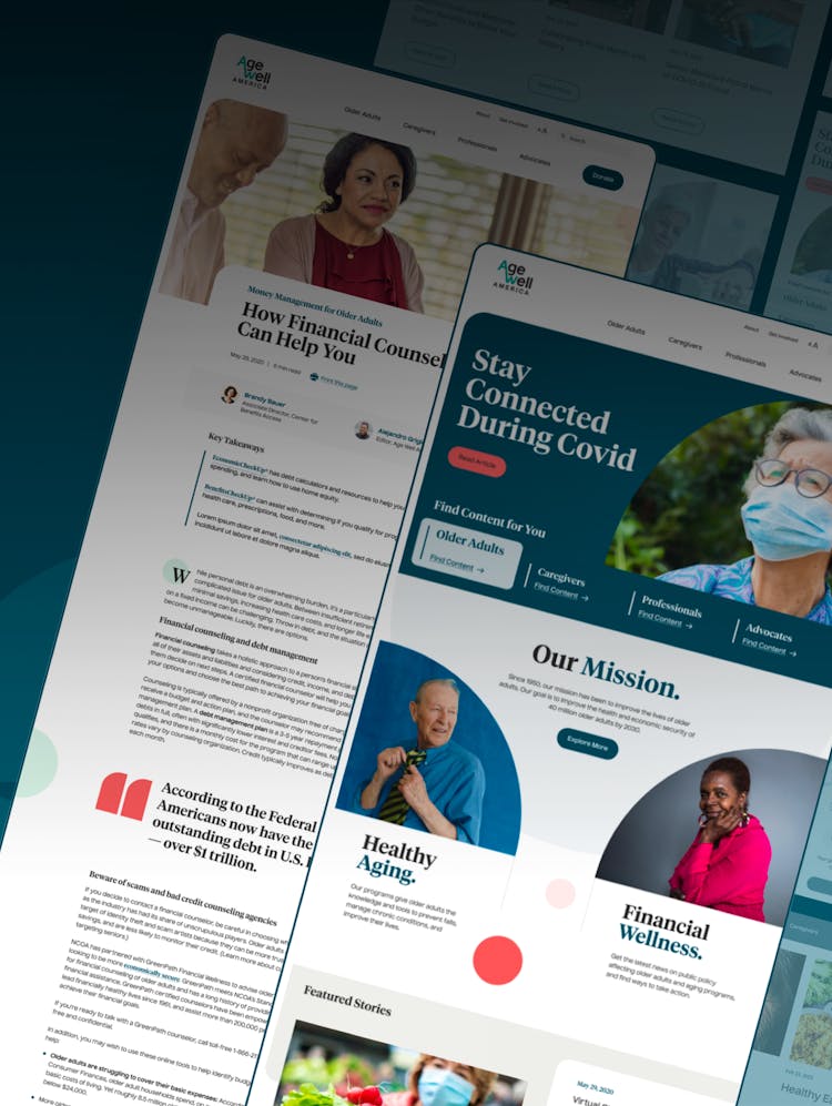
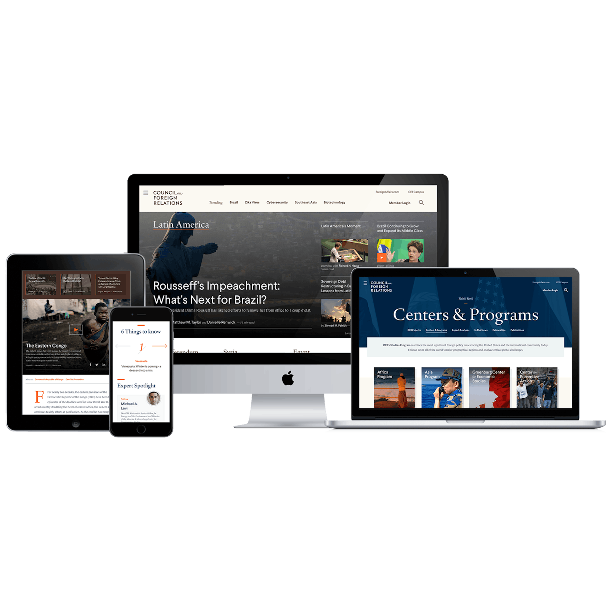
We rebuilt the CFR site from the ground up with the latest open source CMS platform and a totally reimagined site system and publishing model. We designed and optimized the site to work seamlessly across all screen sizes, taking what were once piecemeal responsive pages and thinking responsively across the whole site. The premium brand of the Council on Foreign Relations was modernized for digital and was brought to life on the new site.

