The First Modern Mutation in Digital Publishing
The dominant story about modern media is that the publishing industry is dying. Rapidly decreasing ad rates are influencing the imagination of the industry itself; rather than producing journalism and great experiences, digital publications are rushing to generate the most revenue possible.
This dynamic has produced the design and content conventions that define present-day publishing: under-written posts composed to chase the maximum random audience about trending topics, blasted endlessly on all social channels, and consumed somewhere else, like Facebook. This system is unsustainable. It redirects creative ambition to churn out the least interesting advertising or social media gimmick.
Founding editor and publisher, Joshua Topolsky saw an opportunity in this chaotic, unpredictable media landscape. The core insight was that quality matters more than quantity. Quality storytelling, quality design and interface, quality ads, quality audience. The Outline is the anti-Buzzfeed. The only thing it's scaling up is its creative ambition.

1
The Challenge
The conventional world of digital media was founded on desktop design principles. In that world, the article body is the most fundamental element. As a result, every post has to be an article in order for it to be told. It is almost too obvious a point to make without sounding pedantic; nevertheless, a new platform offers that paradigm a meaningful challenge. There are some stories best told in new formats: like outline bullet points; short videos, and other snapshots of information. These posts do not fundamentally require a page format that automatically includes a byline, dateline, lead art, side-rail, and ad unit. The Outline established a system that puts the story at the center of the post. In other words - the story determines the format; not the other way around.
It is impossible to create a differentiated digital publication through visual design alone.

2
The Insight
A Sea of Homogenized Content
Something historic happened around 2012 that changed the digital publishing industry that set the stage for The Outline. The whole notion of responsive design is that design and technology accomplishment can combat an existential threat to publishing. This accomplishment created new industry standards and conventions that made it relatively easy to redesign old publications. Cash-strapped publications devoted limited resources to upgrading their designs to maintain visual standards. As a result, a visual pattern emerged that made it much more difficult to distinguish a publishing brand through aesthetics alone.
Additionally, the volume of content required to maintain audience growth effectively homogenized the editorial content across most mainstream publishing brands. This happened because there were not enough editorial resources and time to produce truly differentiated voices and formats. The credit for all of this goes to the iPhone and the digital design community. It was a quiet revolution that has yet to be acknowledged.
Intuition-Led Digital Experience
The Outline is the deliberate alternative to the conventions of digital publishing.
It starts with the platform itself; Code and Theory knows that the majority of readers quickly consume material on smartphones, that quick consumption means scanning headlines and occasionally reading articles. Quickly scanning through things is a common and fundamental aspect of the most popular apps like Snapchat and Tinder. The Outline borrows those conventions to create a native digital experience. It is user-experience design that is so intuitive that it appears almost invisible. In this vein, The Outline is not inventive as much as it is resourceful; it answers the question of what Tinder would look like if it replaced profile pictures with premium headline cards.

3
The Solution
Pioneers On the Digital Frontier
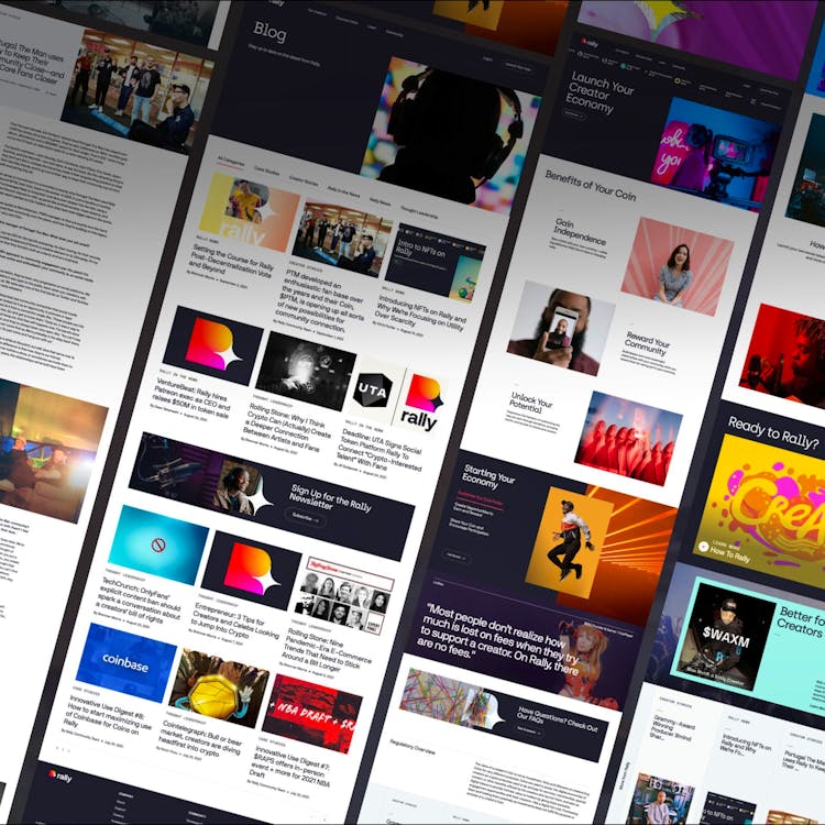
The Outline is built on an entirely new kind of publishing platform. All previously held conventions about publishing design and formats have been challenged and modified.
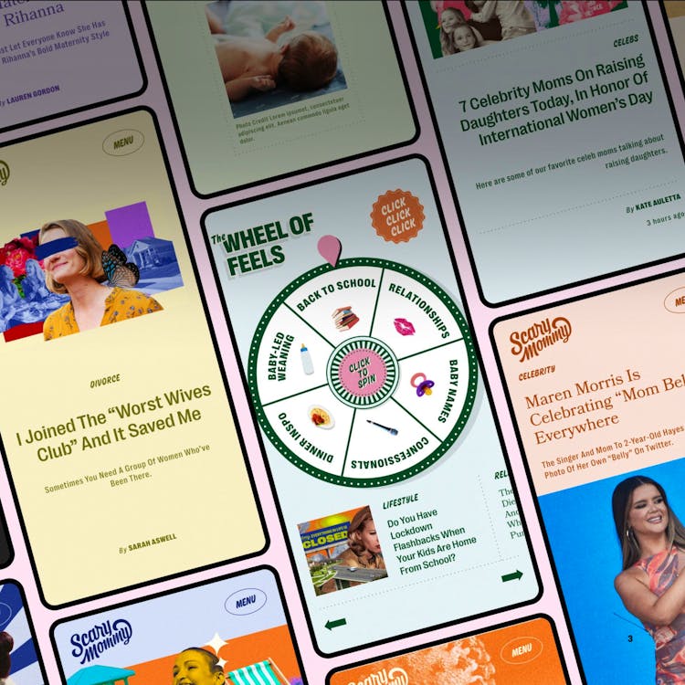
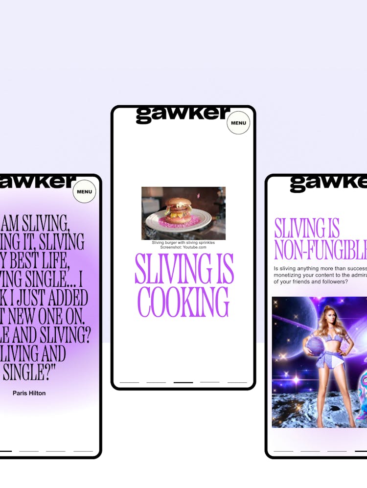
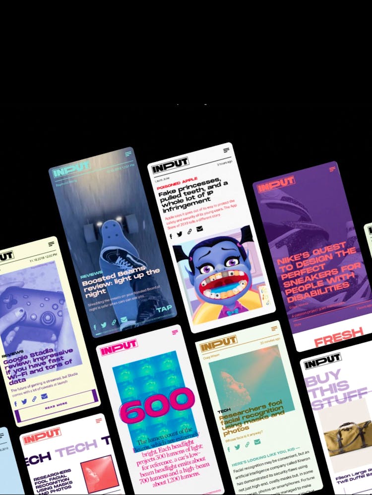
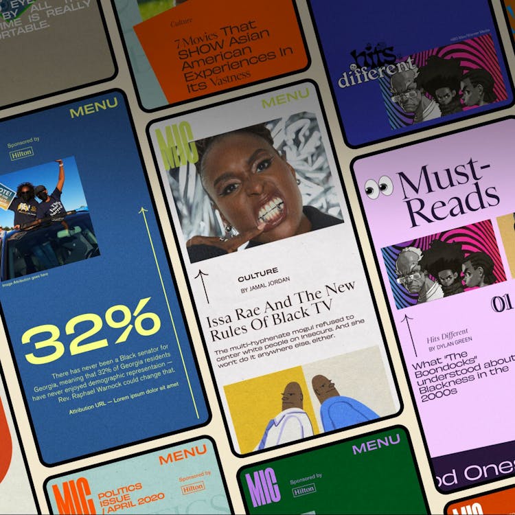
For example, headlines on The Outline are a completely expanded component of every piece. Every post on the site is given a fully art-directed digital card that offers a variety of formats. Headlines might be bullet-pointed arguments, evocative phrases, interactive visuals, data visualizations, or pull quotes. Some headlines are designed to tell a complete story; some are used to frame a long-form essay.
The Outline understands that the digital era should make it possible to tell more stories in many more ways and that the details matter. The only way to make that kind of thinking possible is to redesign the entire platform and to start experimenting.
Curated For The Few
Design conventions are not the only source of change and experimentation. The industry standards that define audience and advertising successes are also getting re-designed at The Outline. The unique visitor is going to evolve into the engaged fan of the brand; “The Outline isn’t for every body, it’s for you.” The target audience is a specified set of trend-setting consumers who are looking for quality content and interested in authentic cultural experiences. The display ad is going to evolve into a story-telling package; the audience that follows The Outline will also appreciate and take seriously the stories that partner brands will want to tell. This type of relationship is at the heart of how The Outline generates and derives value for all partners.
A Unique Experience With Each Swipe
By constantly offering unexpected experiences, the app will condition the user to consistently swipe ahead. The Outline is built up like a web-version of Snapchat Discover. Each post fills up the screen with a bespoke visual message. Sometimes the message is contained by the screen itself; other times it tries to get the user to scroll into and read the post. Each type of post is represented by an exponentially varied visual system that allows each it to have its own identity.
The Invisible Path
The difference between posts on The Outline is more than visual. There are posts that offer interactions that replace a traditional article text.
For example, there are voting cards that ask the user to select one answer over another (that answer determines what other posts get served). There will be video game cards that are actual interactive video game experiences. There will be videos to watch. There will be ads to see that use the visual and interactive language of cards to let brand partners tell their own story to The Outline audience.
This entire experience - the action of swiping from post to post, card to card, is called “The Path.” The Path is the invisible feature of the whole site. It is a perpetual feed that offers something that no other platform or experience can provide. It is the reason that The Outline is the first digital mutation that actually solves the problems that digital publications are trying to overcome.

4
The Conclusion
The fact that this site exists is a testament to the power and clarity of the original vision. This project kicked off in mid July. It was conceived, defined, designed, developed (with a custom CMS and ad platform) in 5 months. This means that the team operated with a clear direction and total cohesion.
In the span of time it can take other publications to launch an email newsletter via a 3rd party application, Code and Theory and The Outline produced the future of digital publishing.

