The Scene
An Unprecedented Digital Convergence
For many around the world, Condé Nast represents the gold standard of publishing. With pre-existing content streams from a portfolio of magazines that includes Vogue, The New Yorker, Variety, Wired, W, Condé Nast Traveler, Bon Appétit, GQ and more, we were challenged to conceive and craft a one-stop destination for all of Condé Nast’s video content. Aligning its digital video experience with contemporary content consumption habits, we set out to build a platform and editorial system that honored the design pedigree that has made Condé Nast the authority in modern publishing.

Why go to The Scene for online video before direct sources like Wired, Vogue, or aggregators like YouTube?
1
The Experience Insight
Since the Condé Nast portfolio appeals to a diverse range of readers and content consumers, our analysts worked with the Condé Nast digital team to paint a clear picture of The Scene’s particular audience. We determined that The Scene should be built for the “cultured millennial” user, aged 27 and up, with “more money than time.” With an established career, they’re well on their way to curating an aspirational lifestyle—and that includes how they consume digital content. We had to give these self-tastemakers a platform to discover, save and share the content they value.
Using this audience as a foundation for our designs, we determined that The Scene should focus on quality curation and novel, editorialized groupings of video content across brands, rather than a comprehensive “news-feed” style aggregator. With this “less is more” approach, we brought The Scene to life.
2
The Solution
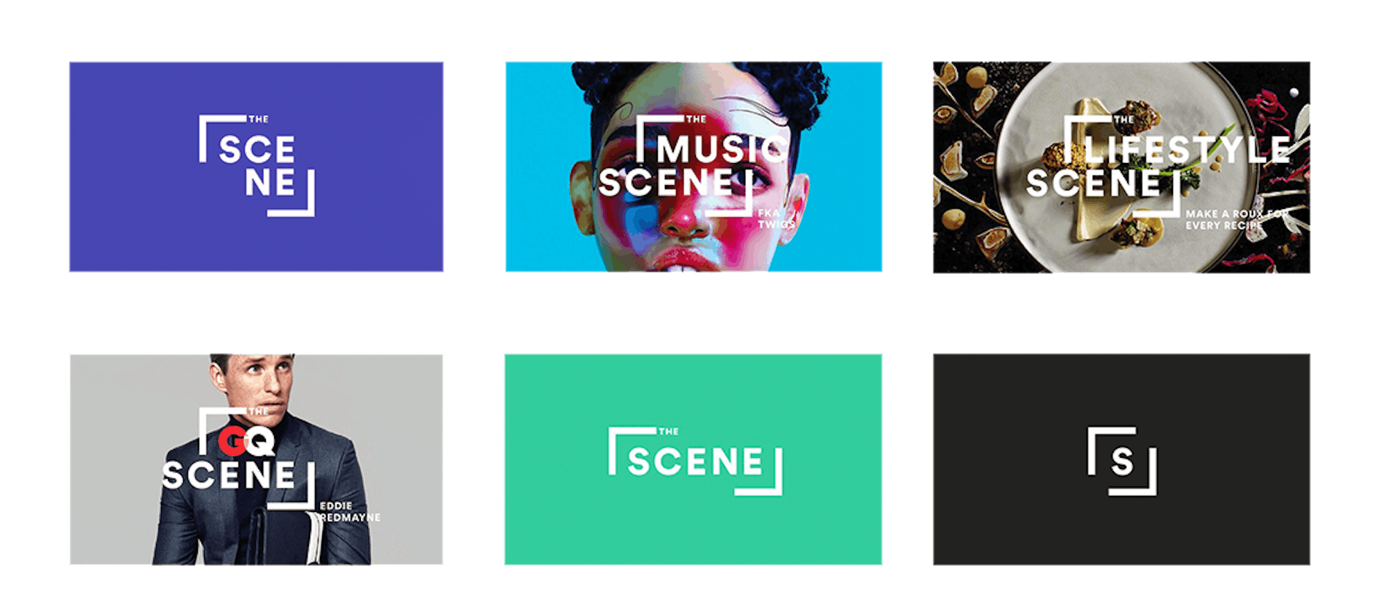
Redefining the Brand
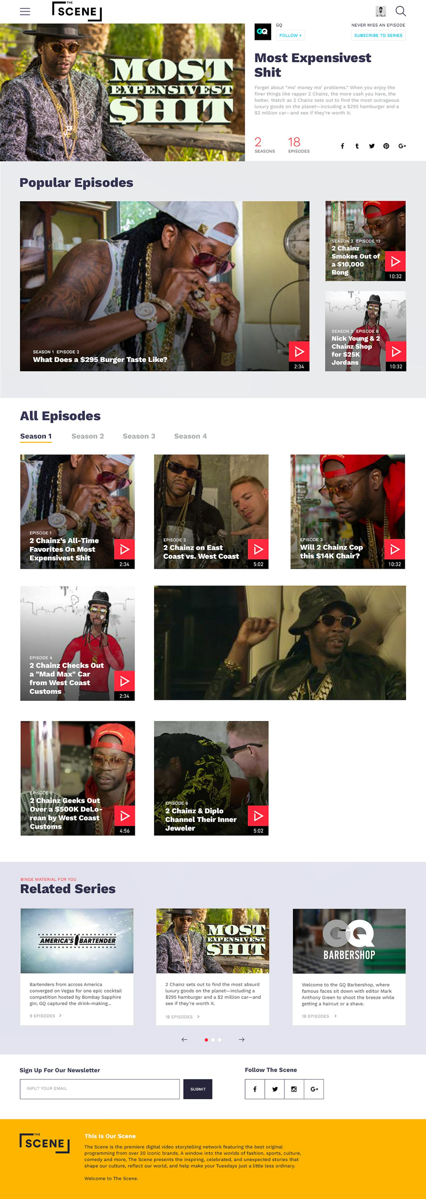
The Scene is a video platform that surfaces original content from Condé Nast brands like Vogue, Vanity Fair, GQ and Wired, and content from partners like BuzzFeed and Warner Music Group.
A new brand strategy positioned The Scene as a premium curator and empowered it to assert its own identity within the Condé Nast network. Based on this approach we designed a user experience to allow editors to re-title and package videos to create a narrative unique to The Scene.
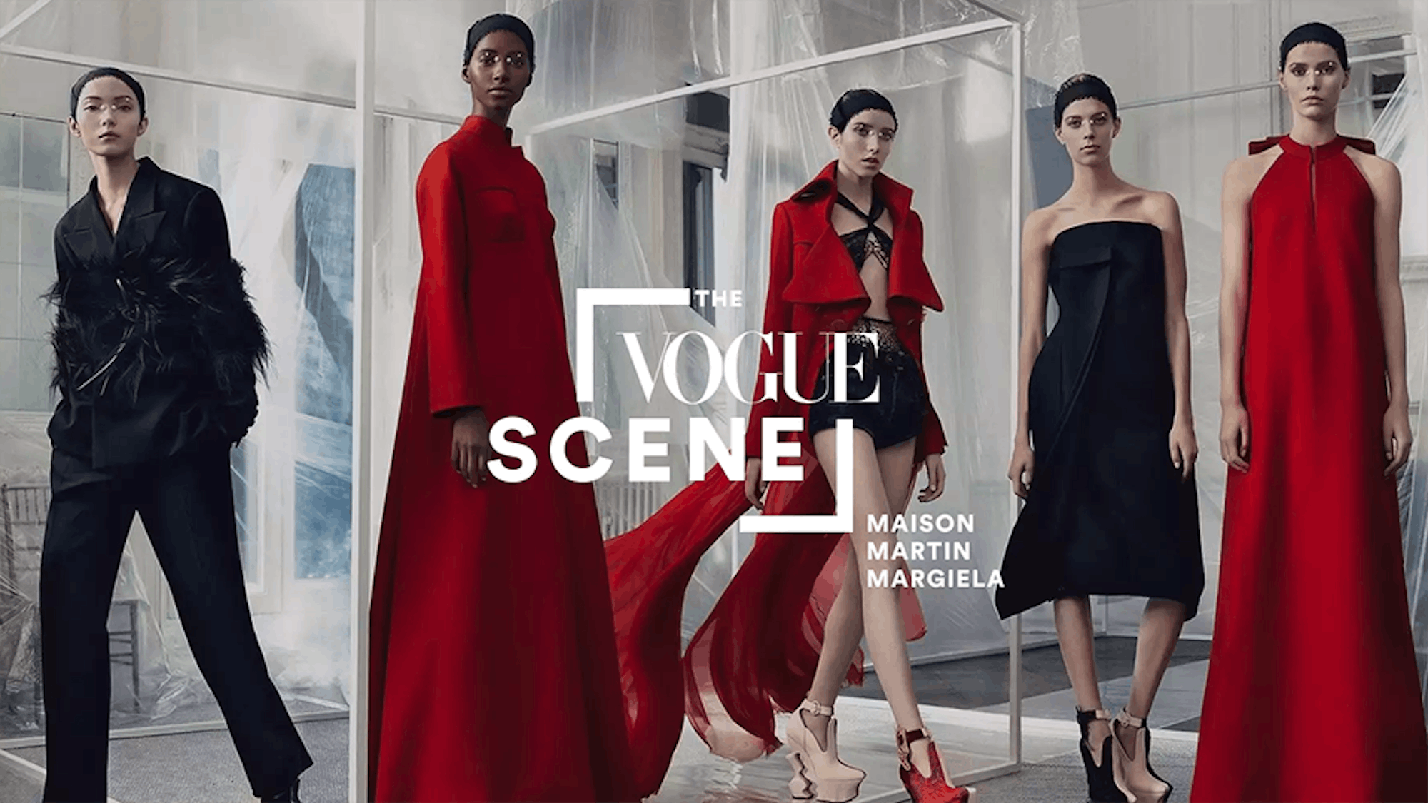
Contextualized & Curated
Condé Nast publications produce a high volume of premium video content. In order to get more mileage and exposure out of this precious content, and to celebrate the breadth of magazines, content packages form the basis of The Scene. We empowered the new site’s fresh editorial team with a means to create engaging packages of video content from across the Condé Nast ecosystem, and, in turn, craft a narrative and respond to trending culture and current events.
Content packages allow The Scene to contextualize videos to tell a fuller story. A Vogue-produced video taking viewers behind-the-scenes on their latest cover shoot with Jennifer Lawrence, for example, might be grouped with related videos featuring the star from W, GQ, or Vanity Fair. Content packages also allow The Scene to respond to trending culture and stories. If the Oscars happen on Sunday, site visitors will be greeted on Monday with a content package of the three best interviews from the runway.

One Content Type, Infinite Permutations
In crafting The Scene from scratch, we were faced with a perplexing visual and user experience design challenge. The Scene is based on a single content type—video—as opposed to usual sites that create a visual and browsing rhythm by mingling different forms of content (photo, audio, video, charts, text, social content) side by side. Rather than cluttering the site, we evoke the fact that the available content is video by having hero clips from each video play automatically in the background of the site as users scroll over different content modules. In order to break up the content and let the reader breathe, content sub-categories—like Travel, Food, Leisure, and Entertainment—are presented as visually-compelling breakers.

A Navigation Built Around Modern Content Consumers
The whole site is based around the experience principle that most modern readers will enter the site through a side door, as every aspect of the site is inherently shareable. When you enter the site through a video link, you can watch that video as you scroll and explore. The video will stick to the top left of the screen, meaning you can still access great content and line up your next video while enjoying what brought you to the site in the first place.
We wanted to make browsing The Scene as passive an experience as possible. Users are asked to make very few decisions, and are empowered to see a breadth of content without being pathed away from the site.

A Mobile Bounty of Premium Video
In May, The Scene’s mobile and tablet app launched in the App Store to rave reviews. The app features an even more leaned-back, passive browsing experience than the desktop site. Users have the option to toggle on or off daily offline packages, which will activate the automatic download of three great videos for consumption on or offline (like on the subway). Featuring a video overlay experience inspired by Facebook’s mobile video consumption experience, users also see personalization features such as a Tinder-style swipe functionality that helps the app recommend video content more precisely attuned to a user's interests.
3
The Future
The Scene is already establishing itself as a destination in its own rite for quality Condé Nast content, and has received positive coverage in the Wall Street Journal, Adweek, Ad Age, Politico, and Variety. In addition, the app was featured by the Apple App store after its launch and currently enjoys a coveted 5-star rating from users.
While it’s too early to gauge clear metrics from the site and app, we anticipate positive momentum in all of the following areas:
- Increasing videos viewed (2+)
- Decreasing bounce rate
- Increasing time on site
- Increasing time on video


