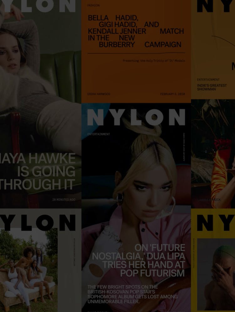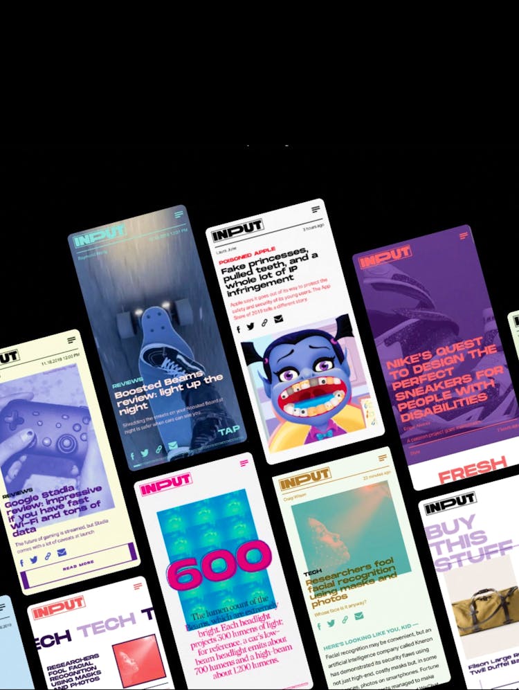
The Webby Awards
An inspiring new digital home for the arbiters of the best on the web.
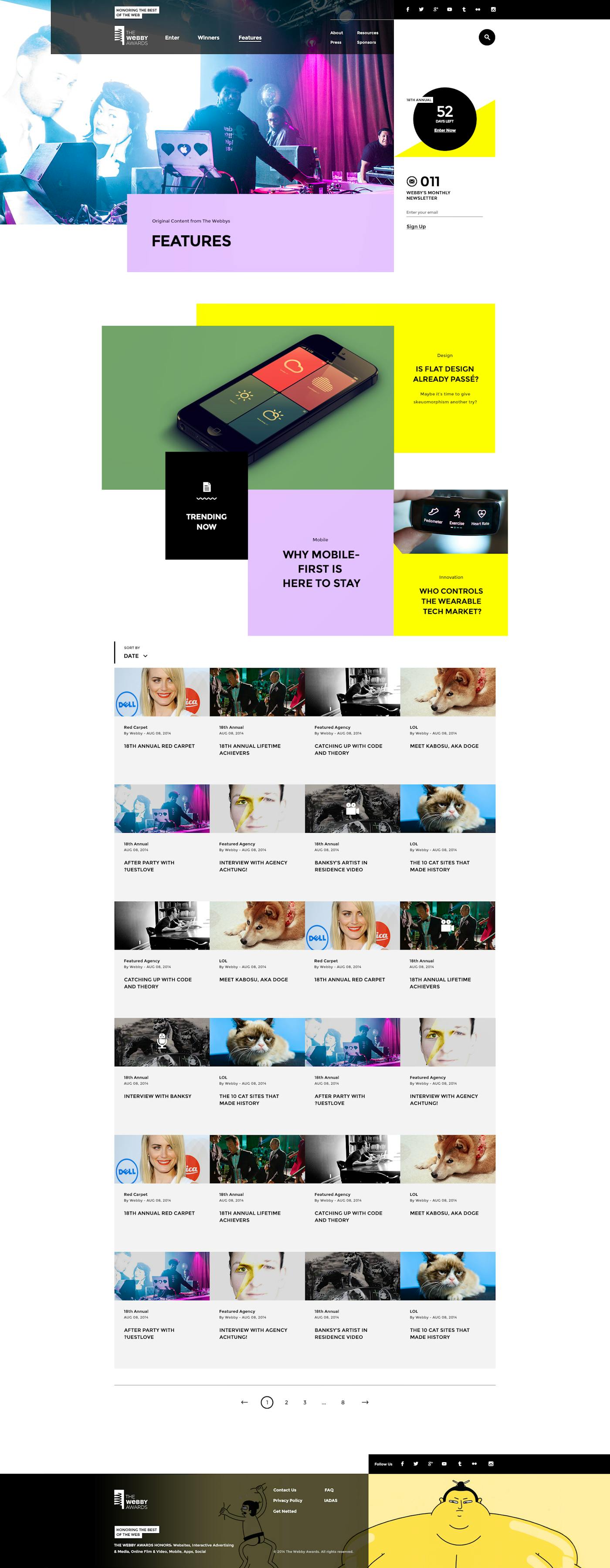
When The Webby Awards approached Code and Theory to design its new website, we immediately recognized the magnitude of our task: create a home to showcase the most brilliant work on the web, and capture every visitor’s imagination.
We welcomed the opportunity to set a new standard for The Webbys and help redefine what the digital presence of the web's leading international awards show should be.
"Transforming our Internet presence with the visionaries at Code and Theory has allowed us to create a new home for the legacy of past Webby winners to live on, inspiring creativity and innovation in the people who view their work."
1
Editorial Flexibility
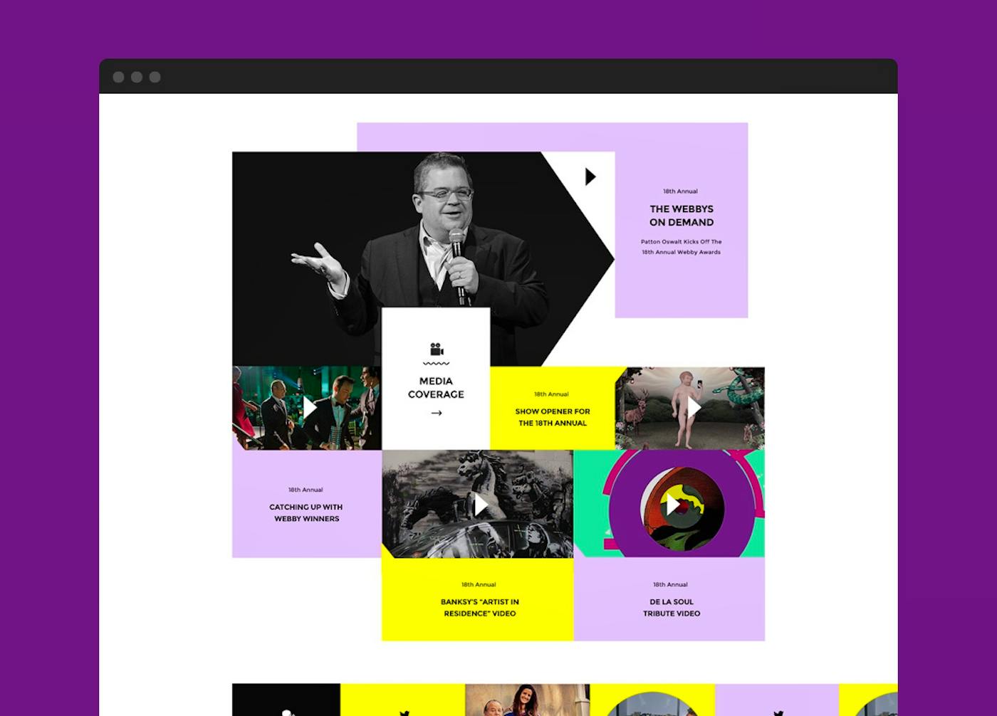
The new modular design system gives The Webby Awards staff enormous editorial freedom to tell the evolving story of the internet.
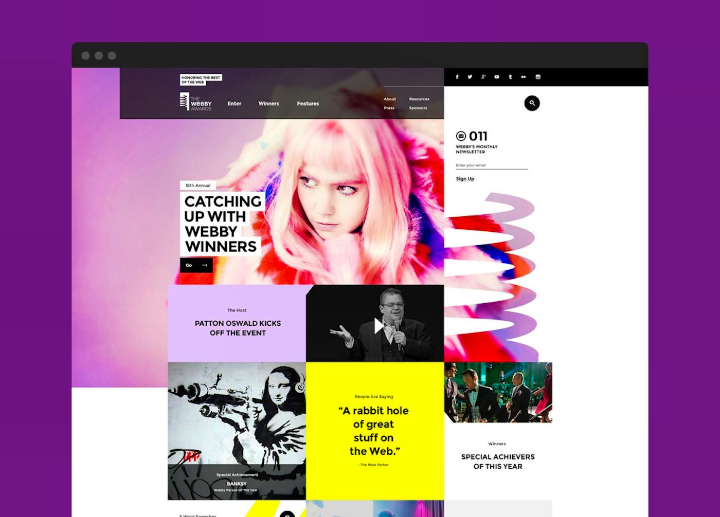
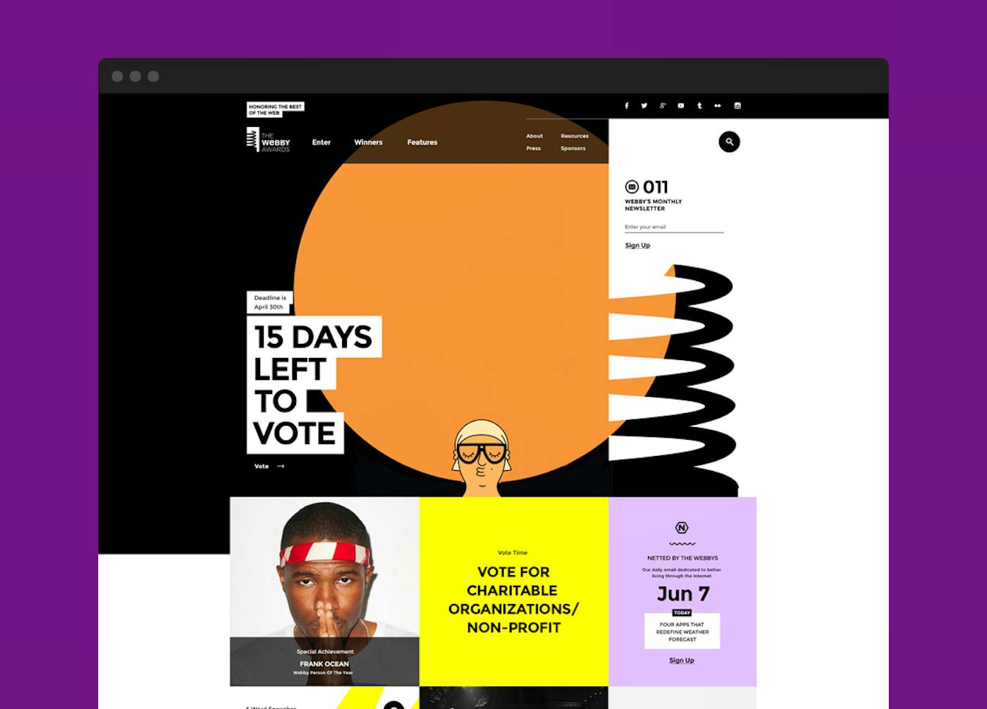
Flexibility was a key design element for an institution that changes focus seasonally, depending on the current cycle in the awards calendar. We intentionally made it seamless for the Webbys team to change the layout and structure of their homepage in order to surface and highlight the most important information during any particular time of the year.
2
Deeper Storytelling
The Webby Awards has earned the distinct reputation as the official arbiter of the best of the web.
They have built an incredibly extensive archive of the internet’s history, culture and curiosities, so it only made sense to create better tools to share each of these stories in a much more engaging way.
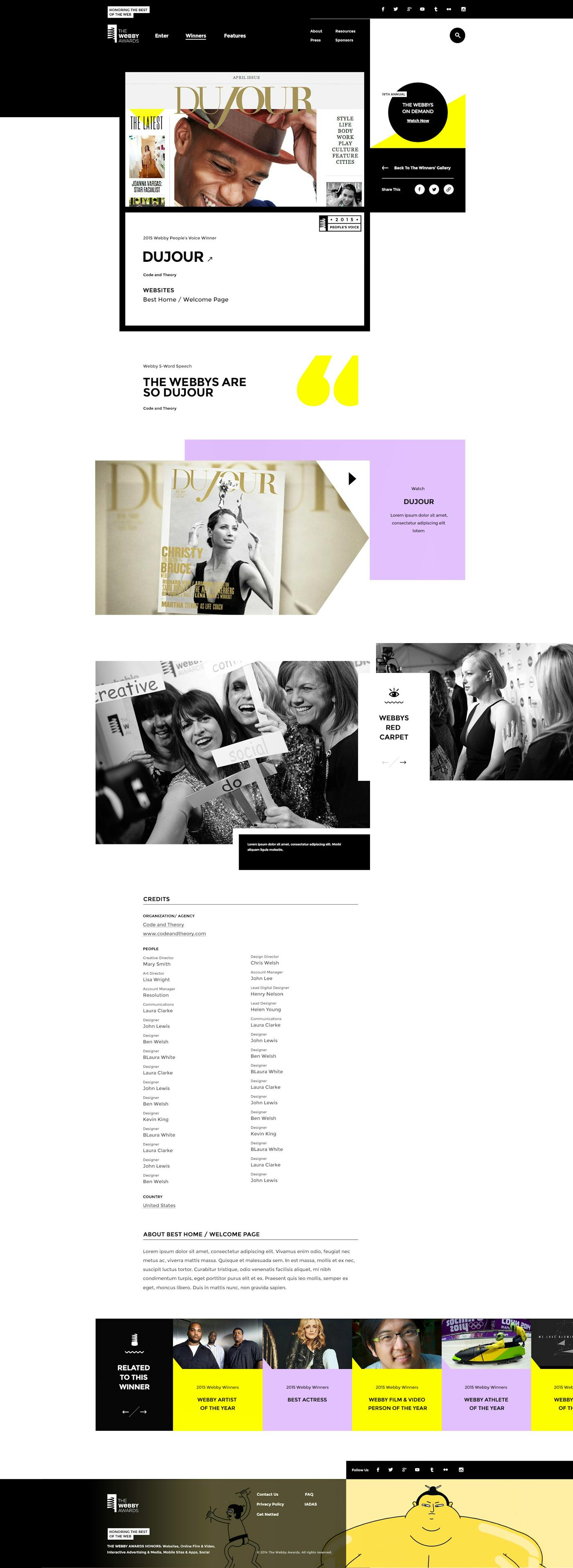
The new site allows staff to draw upon an extensive toolbox to create and share articles, and engage in storytelling at a deeper level. For example, staff editors can tap into existing packages of content and easily reuse them on other parts of the site.
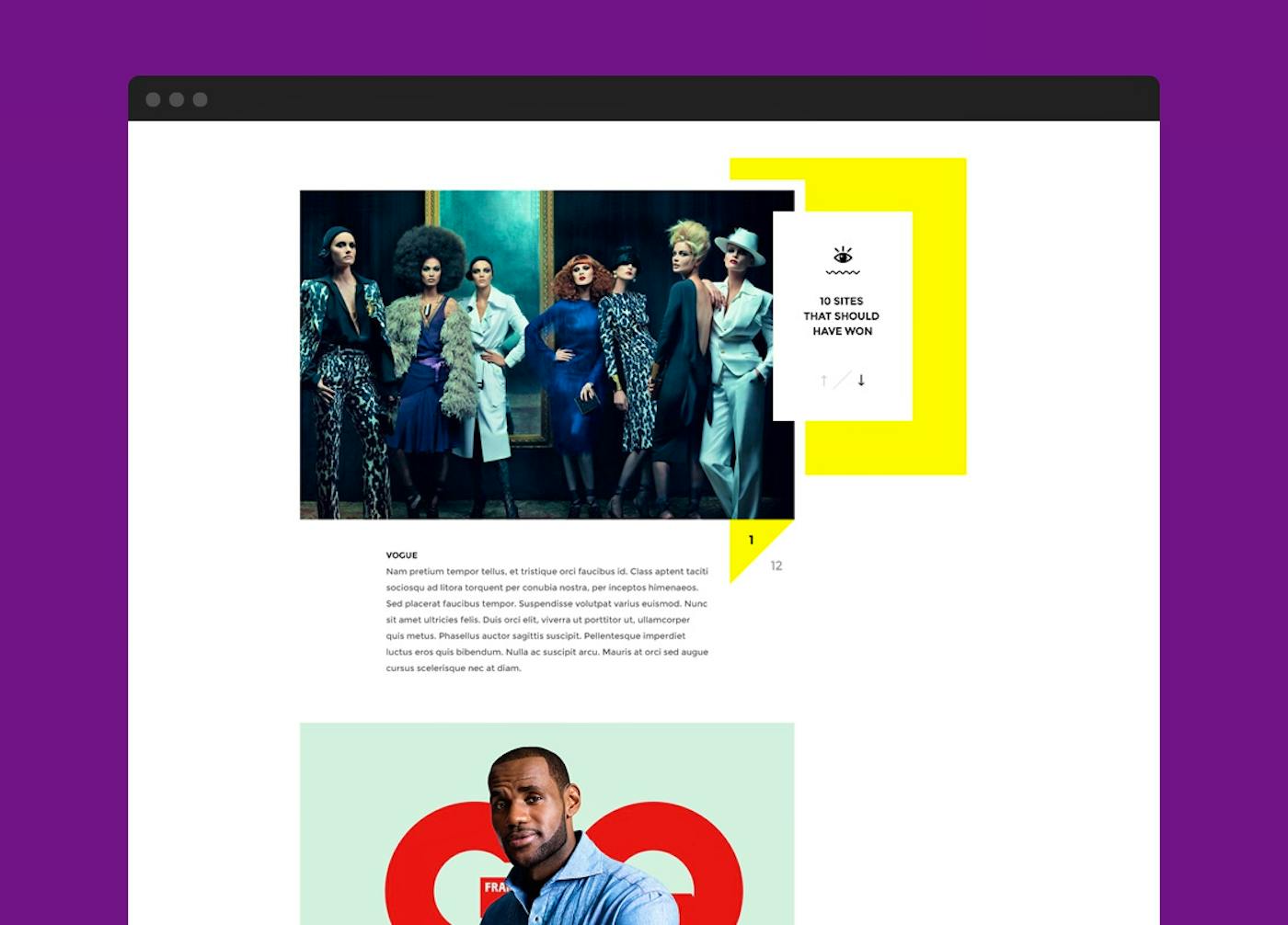
New modules enable a broader capacity for small, medium or full-width images, and galleries, video, and pull quotes—all of which help users engage with content more intimately, and draw them deeper into a well of inspiration and creativity.
3
Simple and Accessible Design
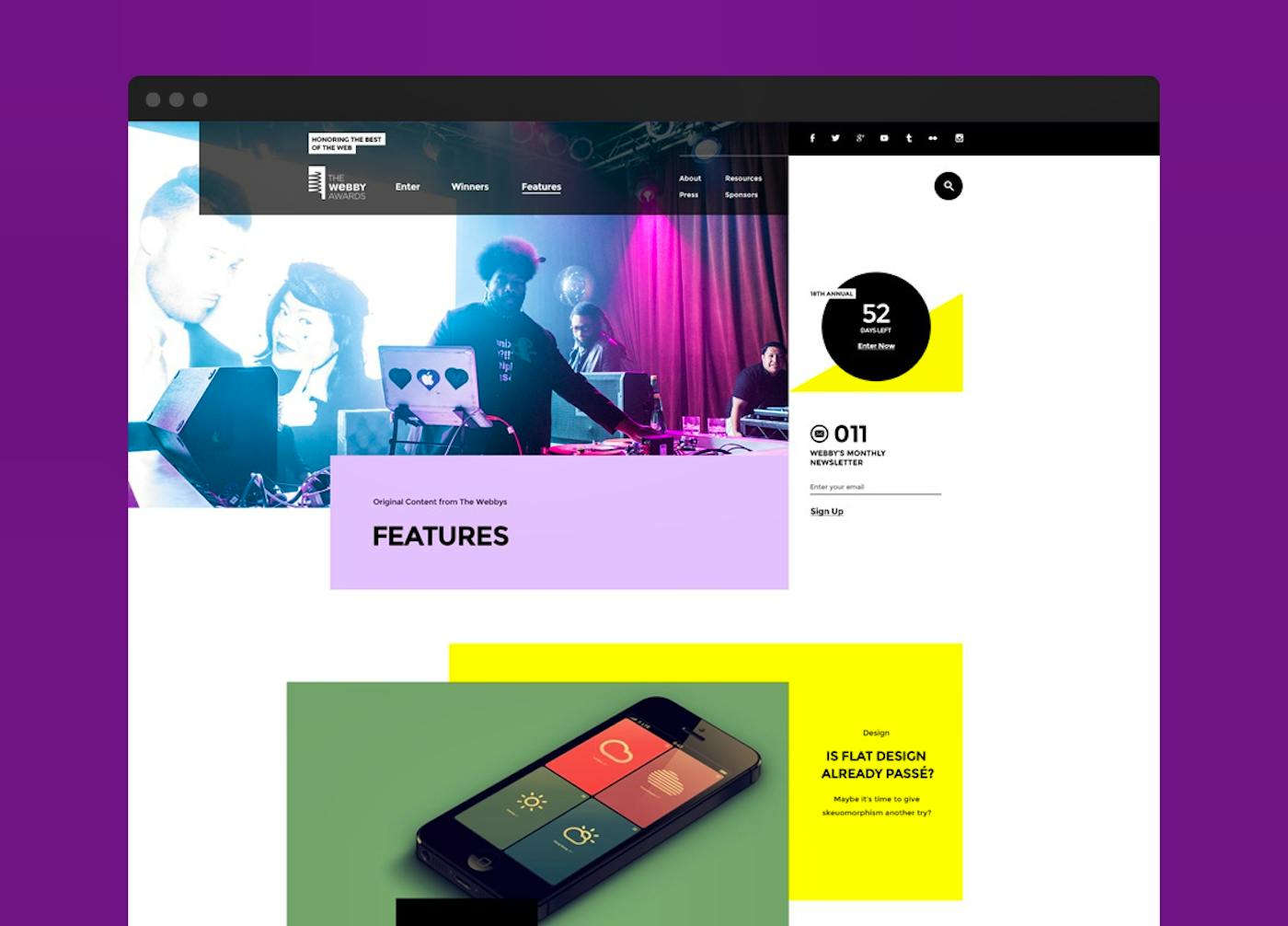
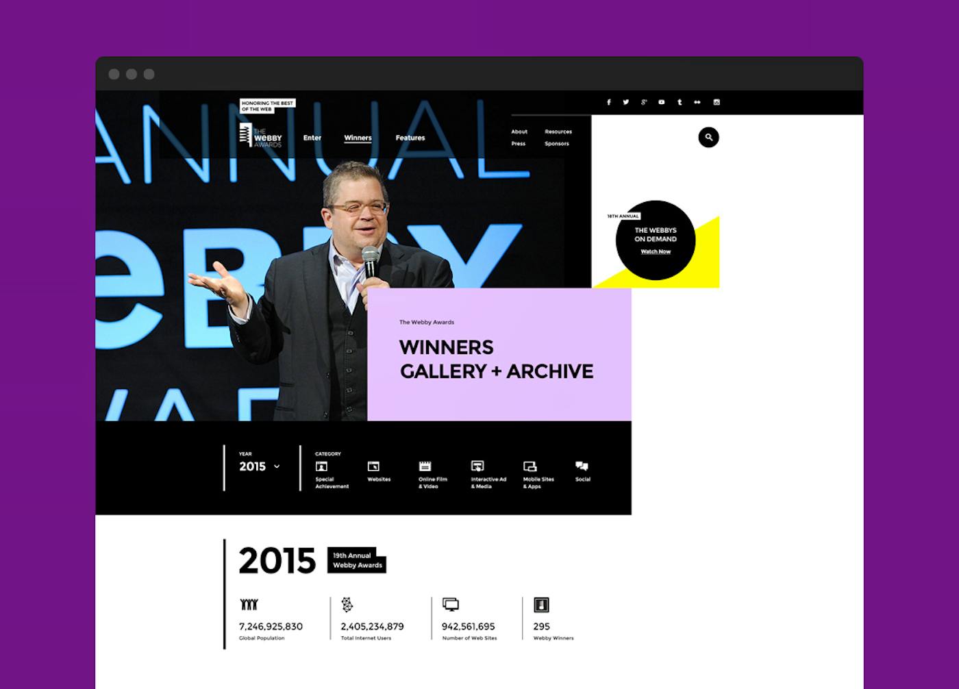
We intentionally designed a website that would appeal to The Webby Awards' broad audience, and not just to other designers.
We strived to make the design easy to scan and read. We focused on typography and design simplicity over textures and graphical elements as a way to let the Webby winners shine.
The result is a grid that is quirky and unique, but not exclusive. It's equal parts playful and serious. It respects the prestige of The Webby Awards while offering an element of fun across the entire experience.
It allows for work on the web to shine through while still representing the power of the medium itself.
Related Project

Hearst | Creating a Differentiated Yet Useful Site Experience
Related Project
